| Image |
Comment |
| 05/06/2005 11:38:48 AM |
In My Dreamsby JeileenComment: When zooming during exposure the subject always ends up dead center. Not a bad thing however I think the impact of this image could be improved if the focal point were more to the left and closer to the bottom. 9 |
 Photographer found comment helpful. Photographer found comment helpful. |
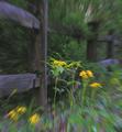
| 05/06/2005 11:33:24 AM |
Garden Waltzby NeilComment: Camera movement during exposure can produce some very interesting effects. This image feels a little out of balance. This could be due to the juxtaposition of the light and dark areas of the image. In general, light areas on top and dark areas on the bottom work best however in this image I think having the lighter area in the bottom right would improve the impact of the image. |
| Photographer found comment helpful. |
| 05/06/2005 11:26:16 AM |
The End of the Roadby smoon273Comment: The colour scheme seems to work however there doesn't seem to be a connection between all the objects in the composition. |
| Photographer found comment helpful. |
| 05/06/2005 11:24:54 AM |
|
| Photographer found comment helpful. |
| 05/06/2005 11:24:16 AM |
living 2 livesby ZSANNAComment: Interesting idea. More separation between the two heads may have worked better. |
| Photographer found comment helpful. |
| 05/06/2005 11:22:28 AM |
Mystic dreamsby BrinComment: Great idea and the colours are wonderful. However I think if the person were slightly more distinct it may work better. The torso seems to be non-existent. |
| Photographer found comment helpful. |
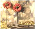
| 05/06/2005 11:20:04 AM |
Dreamin' of Homeby rayg544Comment: Good idea with the ghost image though it may be too transparent. Just a little more time with the person in the image may portray the idea better. |
| Photographer found comment helpful. |
| 05/06/2005 11:17:57 AM |
A Future - Free of Boundariesby glad2badadComment: The colours are very nice however the image feels out of balance. This could be due to the placement of the horizon. A lower or higher position of the horizon may have worked better. |
| Photographer found comment helpful. |
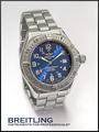
| 05/05/2005 05:47:47 PM |
Who says girls have all the fun? by snackwellsComment: *** Critique Club ***
First impression: I could picture this in a magazine.
Composition: Positioned well to draw the viewers attention to the face of the watch. The text is in a location so it is not distracting and the font seems to be of an appropriate size.
Exposure: Seems to be bang on. There are no extreme shadows or highlights.
Impact: This is a very modest image as is the subject matter and as an advertisement it would probably attract the right type of consumer.
Just one nitpicky thing is the lack of focus on some of the smaller text on the watch face in the centre of the dial. I can't tell if this is related to how the picture was taken or is present on the watch itself.
All in all a very good shot.
Keep shooting.
Colette |
| Photographer found comment helpful. |
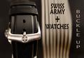
| 05/04/2005 04:41:52 PM |
Swiss Army Watchesby TommyMoe21Comment: *** Critique Club ***
General: The tones are very pleasing and focus is on the brightest part of the image which is what draws the viewers attention.
Composition: The position of the watch itself seems to work however the image as a whole feels out of balance. This could be due to the sections of the image being of different widths and different intensities. It feels weighted a bit too much on the left. Removing the 'Buckle Up' text or changing its location may help. Also, the other text may help balance the image a bit if it were a bit lower in the frame.
Exposure: There are some areas of overexposure, on the buckle and in the background. However these areas are not large enough to present too much of a distraction. Changing the angle of view may have helped here.
Impact: Some impact is created by the tones used and the sharp focus. However, the misplacement of the text takes away from the impact of the other elements.
Keep shooting.
Colette |
| Photographer found comment helpful. |
Home -
Challenges -
Community -
League -
Photos -
Cameras -
Lenses -
Learn -
Help -
Terms of Use -
Privacy -
Top ^
DPChallenge, and website content and design, Copyright © 2001-2026 Challenging Technologies, LLC.
All digital photo copyrights belong to the photographers and may not be used without permission.
Current Server Time: 06/23/2026 08:38:13 AM EDT.