| Image |
Comment |
| 03/29/2004 06:37:50 PM |
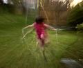
Speedy Girlsby dirtkahunaComment: Good panning... This shot feels slightly cramped on the left and right... I believe that some more open space on the right would create 'running' room for the subjects. = 5 |
 Photographer found comment helpful. Photographer found comment helpful. |
| 03/29/2004 06:37:09 PM |
Fast Ballby lear202btComment: Interesting motion blur, but there isn't much about the shot subjectively that grabs my attention. = 5 |
| Photographer found comment helpful. |
| 03/29/2004 06:28:08 PM |
|
| Photographer found comment helpful. |
| 03/29/2004 12:21:11 PM |
|
| Photographer found comment helpful. |
| 03/29/2004 12:20:33 PM |
No!by RoosterComment: Good blur... the redness feels a bit odd. = 5 |
| Photographer found comment helpful. |
| 03/29/2004 12:07:41 PM |
|
| Photographer found comment helpful. |
| 03/29/2004 11:36:29 AM |
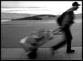
Destination Unknownby qmdiComment: The motion blur in this photo is nice. Compositionally, I would prefer some open space on the right side of the frame rather than the left. It would give the subject room to 'move' within the frame... = 7 |
| 03/29/2004 11:35:42 AM |
Ball on a stringby dsa157Comment: Good blur... this possibly lacks interest in composition. The negative space doesn't add much to the theme for me. = 5 |
| Photographer found comment helpful. |
| 03/29/2004 11:29:37 AM |
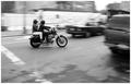
Intersectby JPRComment: I really like this shot... Black and white was a good choice here also.. the contrasts are excellent. This photo seems to create some intimacy between the two on the motorcycle... great work :) = 10 |
| 03/29/2004 11:28:24 AM |
|
| Photographer found comment helpful. |
Home -
Challenges -
Community -
League -
Photos -
Cameras -
Lenses -
Learn -
Help -
Terms of Use -
Privacy -
Top ^
DPChallenge, and website content and design, Copyright © 2001-2026 Challenging Technologies, LLC.
All digital photo copyrights belong to the photographers and may not be used without permission.
Current Server Time: 06/16/2026 10:49:41 AM EDT.