|
|
| Image |
Comment |
| 09/07/2009 01:10:46 PM | Tenby rmezzoComment: Greetings from the Critique Club...
This challenge is one that was rather easy to meet, so that aspect doesn't play a significant role in the results. A score of 5.69 is a little better than the 5.37 average of this challenge.
From my personal perspective, I love images that put shape and texture into the forefront of the composition. Your image does that rather well obviously due to the choice of subject. I also tend to like high contrast images, but this one seems to be just a little over the top in that aspect for me. On the other hand, what this image is lacking for me is some sort of theme that provides a high level of interest for me as the viewer. There is a good story of off balance and symmetry to go along with the shapes and texture, but it's just missing something else and I can't really put my finger on it. Generally when that becomes a problem, its a simple choice of subject that comes into play. |  Photographer found comment helpful. Photographer found comment helpful. |
| 09/02/2009 02:57:16 PM | Helical Wavesby PaulComment: Greetings from the Critique Club...
I can't believe this photo didn't finish any better than 5.33. I think you probably got bit by the challenge topic itself. You definitely met the abstract portion with no problem, but you have to keep in mind the finicky nature of the walmart shopper. What they don't see is the definitive macro element of the challenge. Your comment from Ja-9 goes to support this idea. She wasn't willing to give you the benefit of the doubt, and I suspect that most other voters probably followed that simple line of thinking.
As for the image itself, I think you have a beautiful shot. The smooth curves create a good bit of interest in this abstract. I think it's an excellent image and would have voted it in the 8 range if I had voted on this challenge... excellent work :)
| | Photographer found comment helpful. |
| 09/01/2009 12:12:01 AM | Spiralby TerComment: Greetings from the Critique Club...
I guess a 5.67 is not a bad score for a photo that isn't abstract in any way and doesn't really show much in the realm of macro photography either :) This photo is nicely done, but I think it could be stronger in quite a few ways... Personally I think this image is stronger if you rotate it 90° counterclockwise so the flow goes from top left to bottom right. Images like this are also difficult to critique. There isn't really anything technically wrong with this image, so everything I might offer is purely subjective. | | Photographer found comment helpful. |
| 08/31/2009 11:45:49 PM | Spiky Landscapeby tpbremerComment: Greetings from the Critique Club...
The two comments you received in this challenge, coupled with your own feedback on the image, do a rather nice job of summing up what happened here. On this website, bugs are done and done and done and done again :) They do make good macro subjects when they are well done, but this one is not particularly well executed. This particular photo also demonstrates on of the things I hate most about digital photography. The 100% crop, or any significant crop for that matter, is just something I'd rather not even hear about. In your image, its obvious from the artifacting and noise. You could never print this image, or others like it. Digital photography has given us a medium where billions of images are created and relatively few of them ever find their way into print form. I guess we have become content with looking at an image on the computer screen instead of a magnificent matted and framed print with some substantial size. I guess coming from a background where the final image was a PRINT makes me underqualified to judge the quality of a digital photograph ;) | | Photographer found comment helpful. |
| 08/30/2009 11:38:16 PM | Vacuum by JayTroopComment: Greetings from the Critique Club...
This photo meets the challenge with no doubt, but unfortunately, it doesn't go much beyond that. In the greater scheme of things, meeting the challenge is only the primary stepping stone of a successful image in these competitions. There is simply nothing compelling about your subject choice or your perspective. This challenge required taking a look at subject choices that have interesting curves, shapes, and textures and then getting creative with a photo composition. Your vacuum cleaner has curves, shapes, and textures, but in my humble opinion, they just don't interest me from this perspective. I'm not sure what you could have done to make this into a more intriguing image.
I see that you are new to DPChallenge, so my current suggestion to you is to spend some time looking around the challenges. You will see a lot of great images :) You will also see what sorts of ideas and themes it takes to rise to the top of the pack :) |
| 08/19/2009 11:27:30 PM | The Offspringby retzComment: Greetings from the Critique Club...
Meeting the challenge in this particular contest is sort of a given, so in order to do well, there are a couple other requirements. I can see the relationship between your band name and your photo, but beyond that, the image doesn't provide any significant impact to the viewer (me). Your focus on the subject is good, but compositionally, the image simply lacks interest. The cage corner in the lower left portion of the frame blocks the subject and creates, for lack of a more refined term, a distraction within the frame. It's unfortunate that you didn't receive any feedback on this image in the challenge that is worth reading, but that seems to happen frequently on images that are not 'bad' but not 'good' either. Middle of the road images don't garner much in the form of comments from the walmart shoppers.
As with any photograph, high levels of visual and/or emotional impact are the foundations for building a strong photo. | | Photographer found comment helpful. |
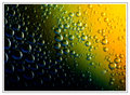
| 08/12/2009 11:58:29 AM | Lovely Bubblyby kingskingdomComment: Greetings from the Critique Club...
This photograph is excellent. I personally enjoy seeing them because they are colorful and the theme is about shapes and textures rather than a simple tangible subject. I remember a time here on DPC when photos like this one would always rise to the top of the heap, but the Walmart shoppers are getting too complacent these days and this theme and style is becoming stereotypical. I love the abstract modernism in this style, and this photograph would make a fantastic large print (18x12 or so) matted in black with a black frame to hang on a wall. 10th place out of 111 images is quite respectable though :) I just think images like this are worth more than 6.1 on a scale of 1 to 10. That aspect seems to show the complacency I mentioned earlier more than anything else. There is no critique I can offer for improvement. I like this image as presented without any modifications.
Excellent work :) | | Photographer found comment helpful. |
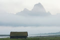
| 08/10/2009 09:57:14 PM | Boathouse and foggy mountainby yermunComment: Greetings from the Critique Club...
Landscape photography is much more difficult than most people realize. The scene before you in this photograph is rather breathtaking, but what seems to happen here is that the image itself doesn't communicate that level of awe to the viewer. I have been in this same situation many times. I look around at my surroundings and I'm simply overwhelmed with what I see and feel. My camera, on the other hand, can't seem to recreate the feel of the breeze on my face, the smells in the air, and the adrenaline rush that I feel while standing before the subject. I suppose an image like this will always have more personal appeal to the photographer who experienced the photograph than to an arbitrary viewer such as myself who looks through the digital window of my computer screen and tries to recreate the same experience.
|
| 08/09/2009 08:37:34 PM | No More Photos!by dixonp1Comment: Greetings from the Critique Club...
Portraits are tough choices for challenge entries. Any time you present a portrait, you must come up with some sort of hook that will connect a viewer with a subject who they have no previous connection with. In this photo, I am easily able to make a connection with your subject :) She's cute and she's showing an emotion that you woudn't normally expect to see, especially in a studio setting. I'm not a studio photographer in any way, but I can only imagine how difficult it can be to work with children. Capturing photos like this one is definitely a sign of an excellent portrait photographer, especially if you can do it with any consistency :) One of the reasons I'm not a particular fan of studio portraiture is the simple fact that the subject rarely shows me anything on an emotional side at all.
Your photo scored fairly well in the free study, so it seems that most people really enjoyed it. As far as the photo itself is concerned, I can't really offer you any suggestions for improvement. I really like it as it is. Your choice of background colors is fantastic, and I think that adds a lot to the overall impact of the image. The only aspect of this image that I don't like, and it's completely on a personal subjective level, is the border. I know parents and people who might purchase this photo probably eat that stuff up, but in my humble opinion, it's arguing with your subject for attention. I personally prefer borders as a tool that separate the image from its surroundings and help the viewer focus on the image rather than the environment in which it is located. I think that looking at this image on a computer screen would be greatly enhanced by leaving that element behind...
Keep up the good work :) |
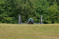
| 08/08/2009 05:47:29 PM | Trying to break the confederate line.by cowboy221977Comment: Greetings form the Critique Club...
I really think it's sad that only about 1/3 of the participants in this challenge took the time to vote on your image. That's unfortunate :(
This photo didn't really deserve a score of 4.4 to be quite honest. It lacks a high level of visual and/or emotional impact, which is a rather serious requirement to rise to the top of a free study challenge (or any challenge for that matter). The photo does show a carefully composed and well thought out composition though. I can see that it's not just some random image that was captured on a bus ride through a park :) Compositionally, I like what you have done here, but I think the image would be stronger if you had filled the frame a little more with your subject. Another technique that might have provided some more impact would have been to use a longer lens with a larger aperture to blur out the foreground and background to boost the presence of your subject within the frame.
I found the comments you receive rather entertaining as well. The only one that has much merit is the "Lacks wow factor" comment because, in a nutshell, that's the simple reason this photo didn't do well in this challenge. I didn't participate or vote in this challenge either, but if this photo placed at #409 out of 419 total images, the overall quality of images in this challenge must have been fantastic. Your score is probably also skewed because you didn't get an adequate sampling of voters to properly evaluate your image. Sad but true...
The comment about the soldiers is the kind of comment that really bothers me as a photographer. The person who left this appears to be a decent photographer based on his scores and the quality of his images, but this comment, to me, is simply insulting and shouldn't have been provided as it is. I think it's insulting when someone tells you that you should have photographed something other than what you chose to shoot. I'm sure if he was shooting this subject he would have rounded up some soldiers from somewhere or passed up on the shoot because the subject as it is wasn't worthy. Bah...
The comment about flat colors isn't really significant either. Most photos you see that have hyper-saturated colors usually have a good bit of noise from the post processing.
At any rate, don't let the score on this photo get you down...
| | Photographer found comment helpful. |
Home -
Challenges -
Community -
League -
Photos -
Cameras -
Lenses -
Learn -
Help -
Terms of Use -
Privacy -
Top ^
DPChallenge, and website content and design, Copyright © 2001-2026 Challenging Technologies, LLC.
All digital photo copyrights belong to the photographers and may not be used without permission.
Current Server Time: 07/16/2026 10:35:33 AM EDT.
|