| Image |
Comment |
| 05/06/2002 11:50:00 AM |
Time for Cookiesby jimmspComment: Nice shot! however, I don't think I can score this one before i do the taste test :)) nice shot! |
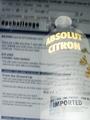
| 05/13/2002 08:41:00 AM |
Absolut Inebriation.by GordonComment: Gordon, your photos never cease to amaze me... Your photogrpahy is great... This is a sad representation of the voters, not the photographer... Keep up the outstanding work... :) |
 Photographer found comment helpful. Photographer found comment helpful. |
| 05/06/2002 07:58:00 PM |
Absolut Inebriation.by GordonComment: Whoever made this photo needs to be sure to get it in the "how'd they do that" section of this website. This is my favorite photo in this challenge. I saved it for last to vote on because I have been trying to figure out how it was done and I'm stumped. I thought about the possibility of a multiple exposure, but in my novice abilities, I don't know if that can be done with a digital camera or not. The bottle is very translucent and I am absolutely amazed with this. A strobe or a flash on the computer screen would have washed it out and I do believe this bottle has been flashed due to the lighting level difference... Please fill us in on this capability! I hope you aren't getting a lot of hassle about this one... Great Shot! = 10 |
| Photographer found comment helpful. |
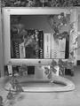
| 05/06/2002 10:18:00 AM |
Apple does Windowsby AndyLeeG4Comment: This is a neat concept! I like it. What puzzles me on this one is why you chose black and white? Good job! |
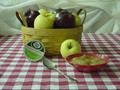
| 05/06/2002 02:45:00 PM |
Applesauceby sweetk1685Comment: This is a nicely planned photograph. I think it needs a little more light to bring out the color some more. Good job! |
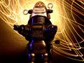
| 05/06/2002 03:01:00 PM |
robot in your placeby gesellComment: Nice lighting here... I almost want to see this photo in a vertical orientation and see the whole robot. Good job! |
| 05/06/2002 04:10:00 AM |
|
| 05/06/2002 09:53:00 AM |
Michelobby bobgaitherComment: Dos Cervesas, por favor :) This is a nice shot. I would definitely like it better if the bottle and the bottom of the glass were not cropped out... |
| 04/29/2002 07:49:00 PM |
|
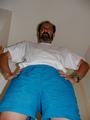
| 04/29/2002 08:37:00 AM |
Hi Dad!by lcgleahComment: Dad looks mad! I hope you didn't wake him up to take this shot.. :) |
Home -
Challenges -
Community -
League -
Photos -
Cameras -
Lenses -
Learn -
Help -
Terms of Use -
Privacy -
Top ^
DPChallenge, and website content and design, Copyright © 2001-2026 Challenging Technologies, LLC.
All digital photo copyrights belong to the photographers and may not be used without permission.
Current Server Time: 06/11/2026 08:05:21 PM EDT.