| Image |
Comment |
| 06/24/2002 02:11:00 AM |
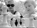
Baby's Day Outby YurMahBudEComment: The execution on this photo is nice... I like that part quite a bit but it's not really relaying a 'city life' theme to me... The exposure in the background is a littel 'hot' as well... = 5 - jmsetzler |
| 06/24/2002 06:37:00 PM |
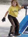
venice venusby DiamondgirlComment: This is definitely a cute photo! She looks like she is sidewalk surfing with some intensity :) I think that a little more breathing room for her in this photo would be a nice improvement, however. I would like to see the entire skateboard as well as the top of her head. = 6 - jmsetzler |
| 06/24/2002 10:14:00 PM |
The Lost Explorerby urbriderComment: This is a neat shot... expecially with the wet paint signs :) It looks like a bird got on the new paint already too :( Is that his surf board? I bet he could hang ten :) good shot! = 6 - jmsetzler |
| 06/24/2002 10:40:00 PM |
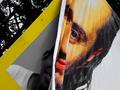
Transitionby sanandanComment: I think this is a great concept photo but i'm stretching to see the challenge met in this photo. I do see the art here and I do see the messages... = 6 - jmsetzler |
| 06/24/2002 08:00:00 PM |
Young At Heartby arnitComment: I like this shot quite a bit... I considered something similar for my own entry this week. Normally, I don't like the heavy shadows on people, but this one seems to work well for me... good shot! = 7 - jmsetzler |
| 06/24/2002 07:24:00 PM |
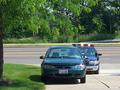
Life in the Fast Laneby wargloryComment: This is one of my favorite aspects of city life.. lol.. i had this happen to me last month :) = 6 - jmsetzler |
| 06/25/2002 04:30:00 PM |
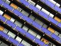
Apartmentsby RemieComment: Interesting angle on this shot.. I really like the diagonals. I'm glad that the title of this shot says "apartments" or i would have no clue what i'm looking at. Abstract is a good thing, but don't let your photo require a title for help on the interpretation. For those who can see it, it's ok, but for those who can't, you will probably get complaints since the rules state that the title should not save the photo. just a tip :) = 7 - jmsetzler |
| 06/28/2002 11:41:00 AM |
Two Stand-Up Citizensby lmhrComment: very nice shot and great depth of field :) I wonder if it would have been possible to get the top of the building in the image? Good work! = 9 - jmsetzler |
| 06/25/2002 08:00:00 PM |
Me! Candy!by LanSnakeComment: Is this a parade? this would be really cool with some of that parade passing through the image :) = 6 - jmsetzler |
 Photographer found comment helpful. Photographer found comment helpful. |
| 06/26/2002 09:17:00 PM |
|
Home -
Challenges -
Community -
League -
Photos -
Cameras -
Lenses -
Learn -
Help -
Terms of Use -
Privacy -
Top ^
DPChallenge, and website content and design, Copyright © 2001-2026 Challenging Technologies, LLC.
All digital photo copyrights belong to the photographers and may not be used without permission.
Current Server Time: 06/19/2026 10:37:11 PM EDT.