| Image |
Comment |
| 10/04/2004 02:13:52 PM |
Night Torchby crabappl3Comment: Excellent job with the exposure on this photo... I can 'hear' the sound of the burner... nice work :) |
 Photographer found comment helpful. Photographer found comment helpful. |
| 10/04/2004 02:12:55 PM |
All the Good Thingsby mbardeenComment: The sky is nice in this photo, as is the reflection. Other than that, I can't find a particular focal point. I like good landscapes, but I usually look for a strong focal point within the image... |
| Photographer found comment helpful. |
| 10/04/2004 02:11:48 PM |
Parrot Portraitureby buzzrockComment: Nice bird portrait.. the light seems just a little harsh overall.. there may have been some possible room for improvement there, but the overall detail is nice... |
| Photographer found comment helpful. |
| 10/04/2004 02:11:06 PM |
Solitudeby ZoomdakComment: This is a lovely landscape. The texture on the sufrace of the shoreline is a nice point of interest as well as the rock in the discance. I think that particular element is stronger than the sky in this shot. It may have been beneficial to shoot this from a very low angle, close to the ground. You could accent that texture by doing so and include less of the sky. The centered horizon seems to work ok in this image, but it may be stronger at a higher level with more foreground included... |
| Photographer found comment helpful. |
| 10/04/2004 02:08:46 PM |
Awakeningby kirbicComment: Nice landscape... the fog introduces an interesting element to the land. I think this photo is missing something... Maybe its a simple focal point. This is one area where I see landscape photos 'falling down'. I think every landscape photo needs at least one strong point of focus, and this one doesn't have that. The fog is offering some interest, but it doesn't really support any particular theme or subject. |
| Photographer found comment helpful. |
| 10/04/2004 01:00:18 AM |
|
| Photographer found comment helpful. |
| 10/04/2004 12:59:31 AM |
|
| Photographer found comment helpful. |
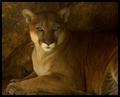
| 10/04/2004 12:59:05 AM |
Mountain Lion by moodvilleComment: beautifully soft... i love the lack of contrast in this photo.. the mountain lion blends nicely and the detail in this shot is exquisite... great work :) |
| Photographer found comment helpful. |
| 10/04/2004 12:57:53 AM |
|
| Photographer found comment helpful. |
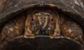
| 10/04/2004 12:57:30 AM |
Mr. Toadby spydrComment: I love the warm light here... great closeup :) |
| Photographer found comment helpful. |
Home -
Challenges -
Community -
League -
Photos -
Cameras -
Lenses -
Learn -
Help -
Terms of Use -
Privacy -
Top ^
DPChallenge, and website content and design, Copyright © 2001-2026 Challenging Technologies, LLC.
All digital photo copyrights belong to the photographers and may not be used without permission.
Current Server Time: 06/12/2026 12:32:29 PM EDT.