| Image |
Comment |
| 07/23/2002 05:10:00 PM |
bowby zacowacoComment: excellent texture... excellent choice of subject as well... The only critique I have for this photo is a personal taste of mine... I would like to have seen this shot done from the exact same vantage point with the camera rotated about 15 or 20 degrees to the left to create a stronger diagonal in the image... great shot :) = 9 - jmsetzler |
| 07/28/2002 04:54:00 PM |
Chained to the Dreamby AgamemnonComment: this is an interesting black and white... I love the composition, but it loosk a little over processed.. i'm not sure if it's sharpness or level adjustments... = 7 - jmsetzler |
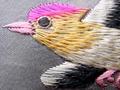
| 07/26/2002 10:46:00 AM |
Grandma's Pillowby Crystal StreamsComment: this is ineteresting texture... I wish the background around the outside of the bird design was a little darker to offer some more contrast in the iimage... The lighting may need to be reduced a little bit as well... = 6 - jmsetzler |
| 07/26/2002 12:10:00 PM |
You Pick the Texture?by TracyComment: interesting array of textures here... I can't say that the image holds a lot of subjective value for me though... = 5 - jmsetzler |
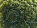
| 07/23/2002 10:07:00 PM |
Arborescenceby DezComment: interesting texture... what is this? The lighting is quite interesting for sure.. = 6 - jmsetzler |
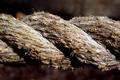
| 07/26/2002 06:20:00 PM |
Strands of Fibersby cthenkComment: very nice detail in your texture... I would love to see this rope spitting the frame diagonally rather than horizontally... good work :) = 7 - jmsetzler |
| 07/22/2002 12:25:00 AM |
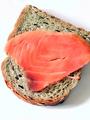
No cream cheese?by amnonComment: very nice photo.. i'm curious why you decided to crop one small corner of this subject? I think the texture here is great but I'm stumbling on the framing... i can't make up my mind if a tighter crop would have been better than clipping a small corner... = 8 - jmsetzler |
| 07/27/2002 02:44:00 PM |
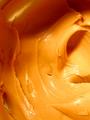
Damn Skippyby spidermanComment: u know what? i hate peanut butter. but, if i liked peanut butter, this photo would make me hungry :) the lighting in this image works well for me... maybe a little added sharpness would be nice as well.. good shot :) = 7 - jmsetzler |
| 07/23/2002 09:55:00 AM |
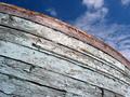
Messy Paintby levi2004Comment: i think this would have been really nice with some more even lighting and no horizon line across the top of the image... A little more downward angle on this shot from a slightly higher vantage point would remove the horizon and probalby give you better depth of field as well... = 5 - jmsetzler |
| 07/26/2002 11:38:00 PM |
Concrete and Textured Titaniumby daysezComment: This is an excellent photo... i'm dying to know the process behind this one. Is this a night shot that has been color modified? The framing with the diagona arch on the left is excellent... kudos :) = 9 - jmsetzler |
Home -
Challenges -
Community -
League -
Photos -
Cameras -
Lenses -
Learn -
Help -
Terms of Use -
Privacy -
Top ^
DPChallenge, and website content and design, Copyright © 2001-2026 Challenging Technologies, LLC.
All digital photo copyrights belong to the photographers and may not be used without permission.
Current Server Time: 06/21/2026 09:24:14 PM EDT.