| Image |
Comment |
| 11/23/2010 10:27:33 PM |
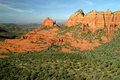
Sedona Reds and Greensby jcwoods1Comment: Greetings from the Critique Club...
This is a fairly nice landscape shot and the colors provided allow it to meet the challenge in its own way for sure. The composition is acceptable and there isn't really anything 'wrong' with the image as it stands. As far as the challenge is concerned, I think there are two specific parts of this image that kept it from scoring above a midline score.
1) The concept of complementary colors is not 'slap you in the face' strong with this photograph. The photo does fit the challenge, but not with the strength required to have an above average finish.
2) The landscape itself is beautiful, but there isn't really a stand-out strong point that makes it a very powerful landscape image. One of your commenters used the term 'flat' and I think that fits this image very well. The time of day and/or weather conditions didn't lend themselves to strength in contrast for some reason.
Good luck in the future :)
|
| 11/23/2010 03:30:31 PM |
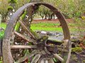
And a River Runs Through It...by PetRockComment: The old wheel might have been a better subject for this photo than the river, as indicated by your title. But since the river is getting the focus by the camera and the title, I have to assume that was your intent. I'm not sure why you chose this path though... |
| 11/23/2010 03:26:05 PM |
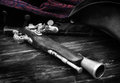
Box Lightby stantheman1313Comment: Greetings from the Critique Club...
This image, at all levels, embodies the theme of the challenge very well. After reading your setup info, I think you did an excellent job with what you had to work with. Maintaining a sense of three dimensions within this composition also adds a lot to the theme. I can't really offer you a suggestion for improvement on this idea. I like the way you executed this one. Simplicity is often the best solution, and this image answers that call quite nicely... good work! |
 Photographer found comment helpful. Photographer found comment helpful. |
| 11/22/2010 09:41:51 PM |
Diffractionby nmrmakComment: Greetings from the Critique Club :)
This is an interesting abstract of light play that creates an interesting view of contrast and texture. In the true sense of the term, texture is defined by shape, but I believe the lack of definitive shape outside the realm of the abstract was the undoing of this photo in terms of the challenge.
I do, however, love your approach to this topic. My personal philosophy in photography is to study the specific elements of any particular subject that make it interesting and focus on them instead of the object/subject as a whole. You will find this path quite rewarding in the personal aspects of this hobby, but not so much in the public aspect as shown by the results of the collective vote on this website :)
Keep up the good work :)
|
| Photographer found comment helpful. |
| 10/19/2010 10:36:32 PM |
Into the Abyss by MadisonPolanskyComment: Greetings from the Critique Club...
This photograph was treated rather harshly by the vote in my opinion. But my opinion is just that. From viewing your profile, I see that you are rather new to the site, so welcome aboard :)
I find this photo quite appealing. I'm a fan of black and white and I tend to use it frequently in my own photography. Removing the color forces the viewer to focus on shapes and textures which is probably a good idea when the topic is as simple as metal on metal.
I think where this image failed in the voting was probably the abstract nature of the subject. I'm guessing that voters that gave the image more than a 5-second view found themselves lost in the idea of what they were looking at rather than what they actually see. This, in my long experience with this website, is problematic. I often found myself shooting photos for what I thought the viewer here would like to see rather than shooting what I thought was a nice photo. Unfortunately, that sorta pushed me away from challenges and I don't participate much these days. It's always a trade-off...
Good luck in the future :)
|
| 09/26/2010 09:07:52 AM |
Buccaneerby TiNComment: What is the 'subject' of this photo? What is the most important part of the image? What do you want your viewer to see? |
| 08/16/2010 12:48:09 AM |
|
| Photographer found comment helpful. |
| 08/01/2010 02:08:49 PM |
|
| Photographer found comment helpful. |
| 08/01/2010 02:03:25 PM |
|
| Photographer found comment helpful. |
| 08/01/2010 02:02:59 PM |
|
| Photographer found comment helpful. |
Home -
Challenges -
Community -
League -
Photos -
Cameras -
Lenses -
Learn -
Help -
Terms of Use -
Privacy -
Top ^
DPChallenge, and website content and design, Copyright © 2001-2026 Challenging Technologies, LLC.
All digital photo copyrights belong to the photographers and may not be used without permission.
Current Server Time: 07/16/2026 03:56:06 AM EDT.