| Image |
Comment |
| 09/19/2002 09:55:00 AM |
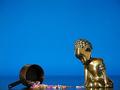
oops!by GinaRothfelsComment: very nice :) The blue background sets off the gold toned statue very nicely. Giving 'life' to inanimate objects is intriguing to me... good work :) = 9 - jmsetzler |
| 09/19/2002 03:48:00 PM |
Eleven Dominosby EizlAwComment: This is a very interesting idea :) I like the concept quite a bit... the light on the first domino on the left seems a little bright, but everything else works nicely :) Meets Challenge: 10 Technical Merit: 7 Artistic Merit: 7 Creative Merit: 8 WOW Factor: 7 Score: 8 - JMSetzler |
| 09/20/2002 01:44:00 PM |
crosswalkby austComment: This is a good example of negative space.... the subject of the image seems to be a bit weak to me though... I'm looking for some excitement that is not here :( the perspective of the guy walking across teh billboard is interesting though :) - jmsetzler |
| 09/17/2002 03:54:00 PM |
|
 Photographer found comment helpful. Photographer found comment helpful. |
| 09/17/2002 10:18:00 AM |
Tormentby oniComment: This is really impressive. I RARELY get impressed with an image where the subject is centered like this one. The illumination of the water drop in this image is working very well here... it almost creates a yin/yang with the dark and the light inside the drop. I also like the texture of your surface. The theme or torment suggested here is quite impressive... This shot gets a 9 this week... I would go to 10 if the lighting control was a little stronger in the upper left portion of the image. it's just a tad bit hot up there to suit my taste :) Great shot... - jmsetzler |
| 09/19/2002 01:25:00 PM |
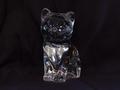
Crystalby AntithesisComment: This is an interesting idea... i don't particularly care much for the dead center view of thei subject though... Off center to one side or the other would appeal to me in a much stronger way.... Meets Challenge: 10 Technical Merit: 5 Artistic Merit: 7 Creative Merit: 7 WOW Factor: 5 Score: 7 - JMSetzler |
| 09/17/2002 12:00:00 PM |
Running Outby Gene L.Comment: This is quite nice... I have looked at this photo several times.. There is a quirck about it that I coulnd't figure out until now. First of all, the negative space concept here works very well. The issue that is causing me problems is that the watch and the glass are each competing for attention and they are at opposite corners of the frame... This accents the 'negative space' concept for me, but it keeps me from being able to see the composition without having to move to each individual component... does that make any sense at all?? = 8 - jmsetzler |
| 09/16/2002 01:29:00 AM |
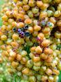
Ladybugby fsieradzkiComment: This is a nice photo of a ladybug :) If the rest of the image besides the lady bug is the 'negative space' element, it is competing very hard for attention with the ladybug... - jmsetzler |
| 09/16/2002 04:45:00 PM |
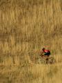
Cross Countryby falveyComment: This is an excellent photo... I don't know if it would have been possible or not, but I would love to have seen this one horizontal to provide the rider much more room to move.. good work = 8 - jmsetzler |
| 09/23/2002 04:11:00 PM |
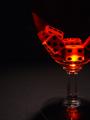
Blood Sportby jmsetzlerComment: My idea with this photograph was to make as much of the glass disappear as possible... I setup this glass on black posterboard with black posterboard as a bakcdrop as well. I filled the glass with water and added one drop of red food coloring. I made about 75 shots with the light at different positions, and this is the result that I liked best. The theme on the "Blood Sport" photo is one of the gambles/risks involved with drinking. The dice are symbolic of the gamble and the blood red liquid is symbolic of the alcohol and tragedies that are sometimes caused by it. This photo scored ok but it didn't stir up many comments... |
Home -
Challenges -
Community -
League -
Photos -
Cameras -
Lenses -
Learn -
Help -
Terms of Use -
Privacy -
Top ^
DPChallenge, and website content and design, Copyright © 2001-2026 Challenging Technologies, LLC.
All digital photo copyrights belong to the photographers and may not be used without permission.
Current Server Time: 06/25/2026 12:50:45 AM EDT.