| Image |
Comment |
| 12/09/2002 03:46:12 PM |
Sherlock Holmes: The Case of the Blue Shadowby KaveyComment: Greetings from the Critique Club :)
Hi Kavey :)
I think this shot has quite a bit of visual impact. The 'blue' here is definitely strong and significant in the shot. As I commented in my original comment on this photo, I really like the curved shadow. I think that's a nice touch for sure :) Did you try a straight shadow with some different light angles as well? I believe that the impact would have been equally high in that interpretation as well.
I read through your comments on this shot... I disagree with a lot of them... I don't believe that shooting only the shadow would have had much impact at all. The only impact i think that would have produced would have been comments asking to see where the shadow came from :) Your directional lighting is working very well in this shot. I don't see any issues with that at all. I would have experimented with several background scenarios on this shot as well. i would have tried some cloth with some smooth wrinkles and curves in it as well... white cloth :)
Great shot and keep up the good work :)
John Setzler
|
 Photographer found comment helpful. Photographer found comment helpful. |
| 12/09/2002 03:36:43 PM |
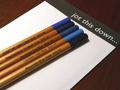
jot this downby miss parkerComment: Greetings from the Critique Club :)
I think you did a nice job with the composition on this photo. Strong diagonals always, IMO, seem to help a photo. Your subject orientation here emphasises that very nicely.
The photo itself doesn't seem to 'inspire' me for the challenge topic. I do completely understand how this photo does meet the challenge though. I'm still looking for that something special in this image. The visual impact provided by this photo is not strong enough to really demand high scores from the voters.
I can't really make any suggestions on how to improve this particular image. The sharpness could possibly be increased a little, but other than that, I don't see anything else that would be an improvment.
Did you shoot some other ideas for this challenge? Maybe a different subject would have had some higher impact this week...
Keep up the good work :)
John Setzler
|
| Photographer found comment helpful. |
| 12/09/2002 12:20:56 PM |
INK by marboComment: marbo, congrats on 3rd :) This is an interesting shot.. I was just curious if the 'star' effect is natural or if you used a star filter on this shot... great work :) |
| Photographer found comment helpful. |
| 12/09/2002 12:19:28 PM |
|
| Photographer found comment helpful. |
| 12/09/2002 12:17:17 PM |
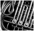
Corne by muckpondComment: My favorite in this challenge... excellent work and kudos on choosing black and white :) = 10 - setzler |
| 12/09/2002 12:16:40 PM |
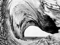
Driftwoodby GraciousComment: This is a great shot... It reminds me of some Edward Weston shots I have seen in the past... = 10 - setzler |
| Photographer found comment helpful. |
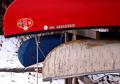
| 12/09/2002 12:12:44 PM |
Something old, something new, something borrowed, something blue.by RiderGalComment: This is a particularly nice photo... I really enjoy the contrasting theme of the summertime canoe fun and the snow covered background. When warm weather comes back to your part of the world, maybe these boats will be back in service again :) I also love the color combination here... great shot :) - setzler |
| 12/09/2002 10:38:03 AM |
Feeling Blueby dimitriiComment: Greetings from the Critique Club :)
This is a beautiful pet portrait. I love the implied 'blue' expression in the dog's eyes. Capturing an emotion in an animal is a challenging task and you have done very well with it here :)
I really like the opposing diagonal created between the line connecting the eyes and the color on the dog's nose... That's a nice bit of 'eye candy' in this image...
As I look at your camera settings, i can see that the ISO 800 is the cause of the grain in this image as well. In my opinion, that grain is not well suited to this particular image. If you had converted to black and white, that grain would look more appropriate possibly.
Very interesting photo... keep up the good work :)
John Setzler
|
| 12/09/2002 09:00:56 AM |
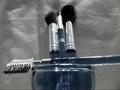
I think I shall wear blue todayby Gracechild7Comment: Greetings from the Critique Club :)
I do see the beginnings of a nice still life in this photo. There are a few things, IMO, that would have made this shot quite a bit stronger, and some of those things have been covered in the comments you have received so far, but some haven't.
First of all, since the theme of the challenge was blue, I think you need to find a way to make your blue stand out more in this shot. It doesn't contrast very well against your choice of background. The way the lighting is broken up over the background in this photo is also somewhat distracting from your image. You could reduce the effect of this by not having your subject so close to the background and by more evenly lighting the background.
I believe that this shot could be quite a bit stronger compositionally by using your subjects to create some diagonals. If you rotate the 'jar' about 90 degrees clockwise to let the brushes create a diagonal to the right, it could be more pleasing to the eye.
The theme of your photo is quite nice...
Keep up the good work :)
John Setzler
|
| 12/09/2002 08:41:08 AM |
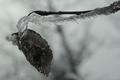
Ice Coldby spillerComment: Greetings from the Critique Club :)
This is a really neat photo. I like the 'abstract' nature of it. I also think you chose a very nice composition on this shot. Tying the ice into the theme of 'blue' was a bold attempt with black and white. The visible detail in this shot is quite nice, but, IMO, it is a tad on the dark side. I personally would have liked to seen this shot a tiny bit brighter for this challenge.
I think this photo is a bit underrated as far as the score is concerned. Reading through the comments you received, there are two items that stand out. 1) It's not blue. 2) What is it? Unfortunately, I believe that the majority of the voters probably rated your photo lower because it did not contain any blue. I know what the challenge description said, but I don't believe voters give much latitude on a bold attempt such as this one. Those who could not tell what this is probalby have a sever monitor calibration issue, or they just didn't give it more than 2 seconds of view time.
I think you can improve this image quite a bit more with some minor level adjustments and maybe a quick pass of the sharpen filter. Ice is a challenging subject to expose nicely...
Cheers and keep up the good work :)
John Setzler
|
| Photographer found comment helpful. |
Home -
Challenges -
Community -
League -
Photos -
Cameras -
Lenses -
Learn -
Help -
Terms of Use -
Privacy -
Top ^
DPChallenge, and website content and design, Copyright © 2001-2026 Challenging Technologies, LLC.
All digital photo copyrights belong to the photographers and may not be used without permission.
Current Server Time: 07/17/2026 12:33:12 AM EDT.