| Image |
Comment |
| 02/03/2003 09:12:44 AM |
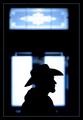
Stetson Silhouetteby GordonComment: Greetings from the Critique Club :)
Hi Gordon...
Gordon, this is a great shot... The silhouette is very strong and sharp. It stands out nicely against the background. Your long lens and focal length choice really makes this photo pop. For some reason that I can't really explain, I like the blue hue on this image. It just seems to work really well with the silhouette.
I can't really offer much suggestion for improvement without significantly changing what you have in this image. I understand that the window/door concept of this shot is strengthened by the window in the top portion of the image, but, toss the challenge conecept aside for a moment... I like that part cut out completely. Making a square shaped image from the bottom portion of the frame seems to be equally strong. Cutting off the top third or so of this image really makes the 'cowboy' become a much stronger part of the image.
I like your alternative view of this challenge as well. This was probalby my favorite shot of the week where a window/door was not the subject of the photo.
Great shot and keep up the good work :)
John Setzler
|
| 02/03/2003 12:15:11 AM |
|
 Photographer found comment helpful. Photographer found comment helpful. |
| 02/02/2003 05:12:56 PM |
Door In The Floorby magnetic9999Comment: I like the digital manipulation on this shot quite a bit. The surrealism here adds nice impact to image. The maniuplation is clean enough to make it look real :) - setzler |
| Photographer found comment helpful. |
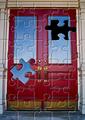
| 02/02/2003 05:08:58 PM |
Puzzling Doorby DougPazComment: very interesting use of digital manipulation. The cut of the puzzle piece is a little rough though.. .maybe cleaning that up a tad would help a bit :) - setzler |
| Photographer found comment helpful. |
| 02/02/2003 05:07:54 PM |
My left footby av8orboyComment: Interesting alternative view of the challenge... subjectively, the photo lacks impact for me... maybe if you shaved first it would make a more appealing image :) - setzler |
| 02/02/2003 05:03:59 PM |
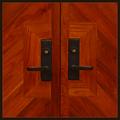
Adornmentby crabappl3Comment: I like the pattern of the woodwork in this image quite a bit. The color seems to be a little flat and the contrast is also a tad weak. Whoever did the b/w version of this shot managed some excellent contrast :) - setzler |
| Photographer found comment helpful. |
| 02/02/2003 05:02:43 PM |
Subtle Squareby BJComment: subjectively this photo works well, but I believe the color is too flat for high impact... - setzler |
| Photographer found comment helpful. |
| 02/02/2003 05:01:07 PM |
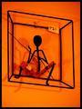
Living in a squareby GinaRothfelsComment: I love this... the color is phenomenal and I love the way the shadows create extra impact on this shot. I assume this is a piece hanging for sale in a shop somewhere maybe... I really would have like to see the P21 sticker removed, but it may not have been possible... = 10 for submitting this anyway... great shot and keep up the good work :) - setzler |
| Photographer found comment helpful. |
| 02/02/2003 04:59:08 PM |
dimensionby jurasComment: this is an excellent black and white. I love the way the light and shadows create texture here... great work.. = 9 - setzler |
| Photographer found comment helpful. |
| 02/02/2003 04:58:30 PM |
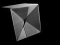
Squared Circleby iraeComment: great shot... i really love the concept on this one :) It reminds me slightly of a shot that I have done in the past... I commend you for working with a subject that stirs negative emotion. I don't think I have ever really studied the shape and composition of this scene before.. = 9 - setzler |
| Photographer found comment helpful. |
Home -
Challenges -
Community -
League -
Photos -
Cameras -
Lenses -
Learn -
Help -
Terms of Use -
Privacy -
Top ^
DPChallenge, and website content and design, Copyright © 2001-2026 Challenging Technologies, LLC.
All digital photo copyrights belong to the photographers and may not be used without permission.
Current Server Time: 07/19/2026 03:45:34 AM EDT.