| Image |
Comment |
| 02/10/2003 07:56:15 PM |
Round by albright1Comment: beautiful architecture shot... I love the yellow glow being cast by the sun on this shot... great work :) - setzler |
 Photographer found comment helpful. Photographer found comment helpful. |
| 02/10/2003 07:01:25 PM |
Sun Rise Cliche'by justineComment: Greetings from the Critique Club :)
Hi Justine :)
I particluarly like the composition of this flower shot. The yellow and black also create a powerful contrast, which also works very well here. The water drops add an interesting element with the light reflections in each of them.
You did a nice job of meeting the 'cliche' challenge as well. This particular composition is quite common and you make a nice interpretation of it :)
I believe that a minor increase in depth of field would make an improvement on this shot. I don't realize any enhancement of having some of the petals out of focus here. F4.5 or F5.6 would probably bring that extra detail into focus here.
Keep up the good work :)
John Setzler
|
| Photographer found comment helpful. |
| 02/10/2003 05:30:27 PM |
Different perspectivesby GordonComment: The perspective and symmetry of this image work very well together. I believe that one of the most fascinating elements of the 'perspective' here is how the people in the shot give perspective to the size of the architecture. I believe that the vertical composition also enhances the 'height' of the building... The only element that appears to be a little strange here is the lighting. There is a strange balance between white and yellow in this shot... - setzler |
| 02/10/2003 05:22:44 PM |
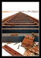
End of the Lineby DavenitComment: excellent perspective shot... the deep depth of field works very well here also... the symmetry of the tracks and the clutter in the bottom of the frame offset each other nicely... great shot :) - setzler |
| Photographer found comment helpful. |
| 02/10/2003 05:15:11 PM |
The Cold Wheelby YomiComment: Greetings from the Critique Club :)
I think this is a lovely composition. The exposure length for the water is just about perfect. My issues with this particular shot seem to contradict your own ideas in your description. I would love to see this exposed a little more to bring out the detail in the water wheel. I think you would get your cold and dead feel simply from the lack of color in the scene, and maybe by adding some of your blue tint as well. That old waterwheel seems to be the 'subject' of the photo and having some more visible detail there for the viewer would be a great change, IMO. I would love to see your original before darkening if you are willing to share....
keep up the good work :)
John Setzler
|
| Photographer found comment helpful. |
| 02/10/2003 05:06:35 PM |
Lukeby connieComment: Luke is a beautiful dog :) you have done a great job capturing this portrait with an interesting perspective also... the black ane white works really well here... great shot ! = 10 - setzler |
| 02/10/2003 04:10:42 PM |
|
| Photographer found comment helpful. |
| 02/10/2003 04:05:00 PM |
Rosesby zadoreComment: Greetings from the Critique Club :)
Hi Zadore...
This is an interesting concept of before and after... Just one note of interest on the composition... General rule of thumb says that photos read like a book... left to right and top to bottom. You may have considered mirroring this image horizontally to compose the new fresh rose on the left (before) and the old dead rose on the right (after) just for the simple sake of creating a fluid composition to match the challenge title.
The glass in the bottom of the frame isn't really contributing much to the image. I would have considered cropping that part out possibly or recomposing the shot to eliminate that. It's shadow on the backdrop is a little strange looking also.
I do like the choice of the dark backdrop. Moving it a little further into the background would have reduced the dominance of the lighting on it and possibly, with a shallow depth of field, created some nice light gradient on the background...
Keep up the good work :)
John Setzler
|
| 02/10/2003 03:15:49 PM |
Flip sideby JackoComment: very well executed shot... the strong diagonal of the stem works well here.. the color contrast is also excellent :) - setzler |
| Photographer found comment helpful. |
| 02/10/2003 03:05:10 PM |
Screen Door Portraitureby greenem2Comment: Greetings... This is a great shot.. severely underrated in my opinion... keep up the great work.. i always look for your stuff :) |
Home -
Challenges -
Community -
League -
Photos -
Cameras -
Lenses -
Learn -
Help -
Terms of Use -
Privacy -
Top ^
DPChallenge, and website content and design, Copyright © 2001-2026 Challenging Technologies, LLC.
All digital photo copyrights belong to the photographers and may not be used without permission.
Current Server Time: 07/18/2026 11:46:00 PM EDT.