| Image |
Comment |
| 01/11/2006 03:07:37 PM |
Second Familyby madison461Comment: Greetings from the Critique Club...
I think this photo meets the challenge well. I believe that it probaly didn't score particularly well for several reasons. It is a good candid photo of a mother and child, but there doens't seem to be any particular 'hook' to draw the disconnected viewer into the theme. The photo also appears to be underexposed. Your monitor may be a bit on the dark side possibly, but the image is rather flat and lacks good contrast. The subjects' hair color also feels quite odd. I run into situations like this with blondes when I'm shooting sports in some of my local gymnasiums. Mercury vapor lights tend to make blone hair turn green, which may be the case here as well. You may have had to do some desaturation to correct that, but I'm not sure. Some of those details aren't included in your own description, so I'm just making guesses based on my own experience :)
John Setzler
|
 Photographer found comment helpful. Photographer found comment helpful. |
| 01/11/2006 12:25:20 AM |
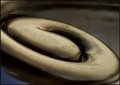
Koru in bronzeby kari1Comment: Greetings from the Critique Club...
I hate that this photo didn't score higher than it did. I'm gonna take a leap and say that the subject is too abstract for the general population. I love the image. The image is all about shape in it's purest form. The image is nothing but shape, and it's very well done. I find that when people are asking me what they are looking at, they generall don't like the image. However much that sucks, it's a fact of life around here. The only time I have ever seen abstracts do particularly well on dpchallenge is when the challenge calls for abstract. You did a great job here of making shape the dominant theme of your image.
John Setzler |
| Photographer found comment helpful. |
| 01/09/2006 03:26:00 PM |
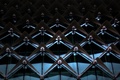
The Darth Invasionby tshanhonComment:
This image doesn't really require a critique. It scored very well and didn't receive any negative comments. I think it's an excellent image for the Pattern challenge and I wouldn't do anything differently and can't suggest any improvement. Nice work :)
John Setzler Message edited by HBunch - removed CC status. |
| 01/08/2006 01:04:10 AM |
Inevitabilityby SalarComment: Greetings from the Critique Club...
This photo seems to meet the challenge, but it does so in a more obscure way than the general public might imagine. Cut and dried interpretations of the challenge, unfortunately, tend to do better in most cases. Your photo shows a conceptual pattern of falling dominos rather than a physical pattern of repetition within the image itself.
This photo also feels a bit stark to me. I know that lots of people like to see pure white. Photographers seem to like this as well. For me, it feels too unnatural. It feels almost as unnatural as pure blacks where a subject looks like it is floating in space. That's just some food for thought :) Pure whites and blacks don't exist as freely in nautre as some photos would have us believe :) |
| 01/07/2006 08:02:32 PM |
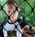
THROUGH THE SCREEN DOOR.by CONRADComment: Greetings from the Critique Club...
This photo has excellent pattern and texture qualities, but the overall subject choice is probably too weak to generate much appreciation in a competition. Compositionally, there is room for some improvement. Since this is a setup photo, there are a couple things you may have done to improve the overall impact. I would have tried to position his eyes squarely in the center of one of the openings. This photo is also a good candidate for a black and white. The color isn't really creating any significant impact, and removing it would force the viewer to spend more time considering the texture and patterns within the image :)
John Setzler
|
| 01/07/2006 07:17:52 PM |
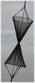
Top and Bottomby leovangeestComment: Greetings from the Critique Club...
I think this is an excellent photo. The patterns are dominant and the slight diagonal creates an excellent dynamic for this subject. I particularly like the long narrow crop as well. That really sets this image apart in my opinion. The only minor flaw in composition that I can possibly comment on is the proximity of the subject to the right edge of the frame in the upper portion. I don't really understand why this image didn't score better. I'm just guessing that the subject choice didn't draw much appreciation from the voters, but I really like it. Keep up the good work :)
John Setzler
|
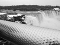
| 01/07/2006 07:12:58 PM |
Safety Textureby dahvedComment: Greetings from the Critique Club...
I think I may be able to help you out on why this photo didn't score well by asking you a simple question...
What's the subject of this photo?
If the subject is the waterfall, we need to see more of it. I believe your intent was to show the texture of the railing for the purpose of this challenge though. That being the case, it should be in focus. You didn't manage to achieve that in this photo. Your focus went to the waterfall instead and the textured rail fell inside the depth of field for your camera's settings on this shot.
John Setzler
|
| Photographer found comment helpful. |
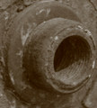
| 01/07/2006 07:05:47 PM |
Time is Rustedby marcelliebComment: Greetings from the Critique Club...
This photo scored rather poorly and I believe the comments you received sum up the result fairly well. It's simply out of focus. Your patterns are good though. You have concentric circles that are highlighted by the threads/lines inside the wheel. I believe the composition may also be a little too tight for comfort. The edge of your primary circle is practically touching the right side of the frame. This image is also fairly noisy and unclean. I'm not sure if this may be a crop out of a much larger image or not, but that would be my guess. As far as the poor focus is concerned, it could be that you were too close to the subject for the lens you used. I'm not sure there either.
This is a good idea for a photo but I think you can execute it a lot better with a little time and effort. Get a tripod, set up your composition, shoot it at a low ISO, and see your results improve :)
John Setzler
|
| Photographer found comment helpful. |
| 01/07/2006 12:36:55 AM |
Garlicby laindComment: Greetings from the Critique Club...
I think this is the first time I have ever drawn a last place image to critique. Here's my first impression of your photograph... You don't seem to care much about it yourself. You didn't post any of your own comments in the 'photographer's comments' box when you posted the image. This indicates to me that you either don't care much about it or that you just may possibly be addicted to the update button and had to submit something to the challenge.
You should always use the maximum number of pixels available for the challenge entry (640 on the long side). When you post smaller images like this one, you will usually get comments to that effect and lower scores. Detail is harder to see in small photos.
This photo appears to be out of focus. The subject doens't hold much interest for me. I'm assuming that you probably felt the same way about it since you chose to apply a filter to it to create the majority of the image impact. This usually doesn't do well either unless the challenge calls for it.
Better luck next time :)
John Setzler
|
| 01/03/2006 04:50:21 PM |
Trypanophobia - Fear of Injectionsby RissaComment: Greetings from the Critique Club...
Hi Rissa...
The color and starkness of this photograph works well in the overall theme. I believe that the composition could create some more impact in the long run by creating some diagonal flow in the image with the placement of the needles. The parallels are more static and diagonals creating triangles within the image would create some added dynamics in the composition. Just some food for thought :)
John Setzler
|
| Photographer found comment helpful. |
Home -
Challenges -
Community -
League -
Photos -
Cameras -
Lenses -
Learn -
Help -
Terms of Use -
Privacy -
Top ^
DPChallenge, and website content and design, Copyright © 2001-2026 Challenging Technologies, LLC.
All digital photo copyrights belong to the photographers and may not be used without permission.
Current Server Time: 06/10/2026 10:40:59 PM EDT.