| Image |
Comment |
| 03/31/2003 10:03:44 AM |
zebra dropsby shutterflyComment: excellent shot :) I think a little more light would create some more contrast and really make this photo punch hard... great work :) - setzler |
 Photographer found comment helpful. Photographer found comment helpful. |
| 03/31/2003 09:55:11 AM |
Color Wheelby kandyjComment: nice abstract... the color and patterns here work very well... - setzler |
| Photographer found comment helpful. |
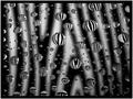
| 03/31/2003 09:46:20 AM |
In the Spotlightby aussieComment: This is a neat shot and I like the blue tint... the centered composition doesn't seem to work as well for me though... - setzler |
| Photographer found comment helpful. |
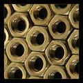
| 03/31/2003 09:45:03 AM |
Hexagonalby FranziskaLangComment: very nice study of patterns here.. the only improvement i could suggest woudl be either going to black and white or making some white balance adjustments to remove the yellow tint.... nice work though :) - setzler |
| Photographer found comment helpful. |
| 03/31/2003 09:43:48 AM |
Calla Lilyby jodiecostonComment: amazing photo... the softness of this shot is phenomenal and the curves are enticing... GREAT shot :) = 10 - setzler |
| Photographer found comment helpful. |
| 03/31/2003 09:37:30 AM |
Step Up to the Mikeby alanfreedComment: very nice macro... the detail and depth of field are excellent... I think it would be even better if the microphone was turned to an angle... great shot :) - setzler |
| Photographer found comment helpful. |
| 03/30/2003 10:31:26 PM |
curveby imagesloyolaComment: Greetings from the Critique Club :)
This image has a very interesting abstract quality to it... The cardboard roll patterns and the concentric circles create some nice shapes and textures in this image.
Compositionally, I believe either putting the subject a little more off center or creating a little tighter crop on the top and bottom would possibly enhance the overall image.
The color contrast in this image is excellent. The depth of field also nicely blurs out the environment and keeps the focus on the subject...
Keep up the good work :)
John Setzler
|
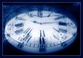
| 03/30/2003 10:20:27 PM |
Time Never Stopsby GotchyaComment: This is a really nice abstract... the color tone also sets it off nicely... great shot :) - setzler |
| Photographer found comment helpful. |
| 03/30/2003 03:51:14 PM |
|
| Photographer found comment helpful. |
| 03/29/2003 04:46:28 PM |
... I see industryby takethatComment: Greetings from the Critique Club :)
Hi Takethat...
This photo definitely meets the challenge theme of 'from above' without doubt. The camera angle also creates an interesting tilt on the horizon.
Compositionally, I think the photo is ok. I think it is simply lacking a strong subject overall. It's an interesting scene as a whole, but the subject material, in my opinion, is not creating a high impact photo for me.
When you start considering your ideas for challenge photos, you may want to spend equal amounts of time considering your subject choices and your challenge theme. This shot is all about the challenge theme, but weak on the subject in my opinion...
Keep up the good efforts :)
John Setzler
|
Home -
Challenges -
Community -
League -
Photos -
Cameras -
Lenses -
Learn -
Help -
Terms of Use -
Privacy -
Top ^
DPChallenge, and website content and design, Copyright © 2001-2026 Challenging Technologies, LLC.
All digital photo copyrights belong to the photographers and may not be used without permission.
Current Server Time: 06/26/2026 06:35:03 PM EDT.