| Image |
Comment |
| 05/18/2003 11:42:57 AM |
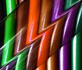
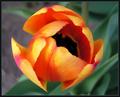
Zecondary Colorzby Pep VentosaComment: very interesting abstract... the colors are good but the exposure is a bit hot in places and the imperfections on the material used to create the distortion are a bit distracting in places... = 6 |
 Photographer found comment helpful. Photographer found comment helpful. |
| 05/18/2003 11:41:03 AM |
|
| Photographer found comment helpful. |
| 05/18/2003 12:15:21 AM |
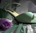
Limogeby BarbComment: interesting color... the image is a bit soft... can't say that it has much subjective appeal to me personally, but it is an interesting technique shot... = 6 |
| Photographer found comment helpful. |
| 05/18/2003 12:10:16 AM |
lillyby jbruno1397Comment: the exposure here and the lighting seem to diminish the secondary colors of green and pink... the light is possibly a bit too strong to make the colors stand out very well.. = 5 |
| 05/18/2003 12:08:16 AM |
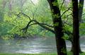
Rainy Day Greensby ruthiekComment: interesting composition and the rain is definitely different... I don't feel that this is a great 'secondary color' subject choice even though it is a secondary color... image is slightly soft... = 5 |
| Photographer found comment helpful. |
| 05/18/2003 12:06:27 AM |
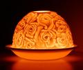
secondary coloryby AesculapiusComment: focus in the lower portion of the image seems just a tad soft... can't see any real reason to have selective focus in the center of the image rather than throughout the whole image... = 5 |
| 05/18/2003 12:04:07 AM |
|
| Photographer found comment helpful. |
| 05/16/2003 05:03:24 PM |
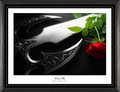
Valorby VipermikeComment: beautiful work... the composition and color, along with the excellent lighting really make this shot pop... great shot :) |
| 05/16/2003 05:00:46 PM |
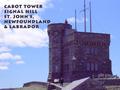
Cabot Towerby orussellComment: Greetings from the Critique Club :)
Hi Orussell...
The story behind the site you photographed is quite interesting....
I don't know if it would have been possible or not, but a different perspective could have made some improvements in this shot overall... the small building top in the lower right side of the frame is a bit distracting... I'm not sure if you had a way to remove that by shooting from a different angle or not.
The antennae on top of the building also seem to feel a bit odd with the center one cut off by the top of the frame....
The image also has an overall blue cast to it. It looks almost like the image was shot using an indoor white balance mode. Some color correction with photoshop may have been able to clear this up.
As a postcard theme, I think you have a good subject, but I would definitely look for an alternative composition if possible...
John Setzler
|
| Photographer found comment helpful. |
| 05/16/2003 10:27:56 AM |
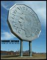
Sudbury, Ontario. Home of the world's largest nickelby BigSmilesComment: Greetings from the Critique Club :)
Hi Bigsmiles...
I think this image makes as good a postcard as any... It highlights an element of the community that would attract visitors. I don't think I can suggest any compositional improvements to the photograph....
As for the exposure, I think it may be just a tad under exposed. The color/tonal range looks just a tiny bit flat to me.
The text appears to be a little cramped also. In a postcard shot, it would be important to compose it in such a way that you leave room for any text that you want to add to the image.
Good work :)
John Setzler
|
| Photographer found comment helpful. |
Home -
Challenges -
Community -
League -
Photos -
Cameras -
Lenses -
Learn -
Help -
Terms of Use -
Privacy -
Top ^
DPChallenge, and website content and design, Copyright © 2001-2026 Challenging Technologies, LLC.
All digital photo copyrights belong to the photographers and may not be used without permission.
Current Server Time: 06/22/2026 10:36:52 PM EDT.