| Image |
Comment |
| 05/26/2003 12:06:24 AM |
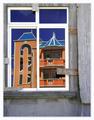
Splashby e301Comment: nice motion capture... good composition as well... = 7 |
 Photographer found comment helpful. Photographer found comment helpful. |
| 05/26/2003 12:02:41 AM |
|
| Photographer found comment helpful. |
| 05/25/2003 12:58:35 AM |
Successby rj324Comment: RJ,
Excellent silhouette :) This image reminds me of those 'inspirational' posters I see around with a title like "Success" with some inspirational proverb to go along with it... nice work :) |
| Photographer found comment helpful. |
| 05/25/2003 12:29:16 AM |
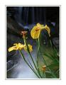
Irisby joannsComment: Beautiful photo... I love the punch offered here by the yellow... excellent job with the exposure as well... |
| Photographer found comment helpful. |
| 05/24/2003 11:58:43 AM |
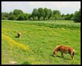
Green (and brown horses)by jajoneComment: Greetings from the Critique Club :)
Hi Jajone...
The color in your photo is excellent... It definitely meets the challenge with no problems...
This shot is also a nice simple landscape... the two horses really add a nice element to the otherwise boring scene. Without the horses, there would not be much to see other than simple color.
As I look at this photo, I see a smaller composition that I feel would be very strong as well... The horse in the lower left corner... I believe that focusing on that and filling the entire frame with it woudl make a really great shot as well... That would also obviously change the entire theme of what you were shooting here, but I just wanted to possibly point out an opportunity for you...
Excellent shot and keep up the good work :)
John Setzler
|
| Photographer found comment helpful. |
| 05/22/2003 11:49:01 PM |
Tireby DavidLevinComment: David, greetings and welcome to DPChallenge. I like this photo quite a bit. This image, in itself, shows a good creative eye for composition... composition that is not your ordinary literal view of things. I wish you lots of luck in your photography... lots of luck in pursuing your dreams of being a film director also... photography would be a great basis for that :)
John Setzler
|
| Photographer found comment helpful. |
| 05/22/2003 09:36:21 PM |
My protector, my hero !by melissartsComment: Greetings from the Critique Club :)
Hi melissarts...
This photo meets the challenge... the desaturation makes your secondary color stand out nicely...
The quality of this particular image is most likely what caused the low score... it also appears to be distorted from unproportional resizing.
Compositionally, i really like the perspective you chose for this shot... that shows some strength :)
Keep up the good efforts :)
John Setzler
|
| Photographer found comment helpful. |
| 05/22/2003 06:57:37 PM |
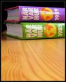
Leading Lines To Knowledgeby JonatanComment: Greetings from the Critique Club :)
Hi Jonatan...
This photo meets the challenge with no problem... the secondary colors play a strong role in the image and composition...
I like the composition you chose using the lines in the wood grain as leading lines... the depth of field is also excellent.
What is missing in this photo for me personally is a connection of some sort with the books. I'm sure these books have some meaning and relevance to a lot of people, but I'm not familiar with them and that is not your fault. I couldn't find any other way other than your excellent composition and exposure to really connect with this image.
Excellent shot... keep up the good work :)
John Setzler
|
| 05/22/2003 09:00:43 AM |
Painted Tulipsby inspzilComment: Greetings from the Critique Club :)
Hi Bob...
This is a pretty good flower photo IMO... I like the composition and the depth of field choice works really well for me. The white spot that you mention in your comments is a bit of a distraction. Items like that are where you have to evaluate the question of settling for what you have or reshooting. The crop here may be just a little 'snug' also... A little extra breathing room would probably be a good thing.
I also agree with Crab... I think the photo is missing the blue element. My personal interpretation of this challenge was to include all three colors. I know the challenge description did not say that, but, to me, a photo doesn't fit a theme of primary colors unless they are all included.... just my personal view...
Keep up the good work :)
John Setzler
|
| 05/21/2003 10:47:16 AM |
Morning Welcomeby DougPazComment: Hi Doug...
I like the composition you chose here... the square crop you chose seems to work very well in isolating your subject...
One of the things I particularly do like is the visibility of the detail behind the neon sign. It's muted enough that it's not obtrusive, but visible enough that it gives some good context to the photo. If those details were not visible, this would just look like a cartoon image or a photoshop rendering of a neon sign. Those visible details seem to keep this shot 'photographic' in nature. I have seen a lot of neon sign photos where nothing was visible except the color of the sign... I like the way this one turned out.
I think this shot would make a good 'product' photo in the neon sign industry. I have been fortunate enough to work with some sign makers in the past, and building neon signs is tough work. These people take pride in making a sign stand out like this and the inner workings of the sign is an art to them...
Nice work...
John Setzler
|
| Photographer found comment helpful. |
Home -
Challenges -
Community -
League -
Photos -
Cameras -
Lenses -
Learn -
Help -
Terms of Use -
Privacy -
Top ^
DPChallenge, and website content and design, Copyright © 2001-2026 Challenging Technologies, LLC.
All digital photo copyrights belong to the photographers and may not be used without permission.
Current Server Time: 06/22/2026 01:27:00 PM EDT.