|
|
|
Showing 201 - 210 of ~8082 |
| Image |
Comment |
| 06/01/2006 12:10:29 AM | |
| 05/31/2006 01:00:11 AM | Very Successfulby bhanubhanuComment: Originally posted by 777STAN:
Sadly, however, good photography is more about technique than content. |
Greetings...
Welcome to DPChallenge :) I noticed that this is your first submission to the site. I chose to quote from the comment that 777STAN left on your photo because it shows a situation that is all too common here and quite disturbing at the same time. I find that most novice photographers believe this statement, and I used to believe it myself. When a beginning photographer, who takes the hobby seriously, is getting started and learning how to control the camera, technique is more important to them than content. As you browse the higher scoring photographs on this site, you will see that most of them are usually more about technique than content as well. Since this site is primarly composed of beginning photographers, it seems that 'eye candy' photographs that are strong with technical merits are the ones that do better than photos that seem to have a very high value in subject content.
During the 5 years I have been experimenting with photography, I have watched people who started about the same time evolve as photographers. They all started out pursuing technical excellence regardless of subject and content. As they became proficient with the technical aspects, they began to apply those skills in pursuing meaningful subjects and content :)
For me, content often overrides EVERYTHING else about a photograph. When I look at a photo, I prefer to absorb what the photographer is trying to show me rather than how he is showing it to me. So, my quote of the day will be:
"Good photography is more about content than technique."
Technique is important, but not as important as the content :)
Just some food for thought...
John Setzler
|  Photographer found comment helpful. Photographer found comment helpful. |
| 05/31/2006 12:32:56 AM | A Blurry Visionby mrambachComment: Greetings...
Last place in a challenge is a tough situation. If you would like to become a better photographer, I can offer you some advice. Otherwise, just stop reading here and ignore the rest of what I have to say :)
The comments you received during the challenge cover the main issue with this challenge submission. It's too small. You should always make your image at least 640 pixels on the long side. When you make it smaller than the maximum possible size here, it makes it much more difficult for the viewer to absorb the image that you have submitted. I can't really see the feeling or mood that you may be attempting to relay with this photo.
When I do look a little deeper into this photo, I can attempt to draw a few conclusions about it. I believe that the blur in this photo could represent the form of failure that you had in mind. It has nothing to do with camera technicals, as people have commented already. I see so much of this nonsense here on DPChallenge with technical issues that it makes me want to throw up. It seems that no matter what you submit, you should never use a photo that has any element that could be considered a technical flaw. Blur in a photo causes people to focus on it for the WRONG reasons rather than the reason you probalby intended.
I can look at this photo and believe that your subject has experienced a failure of some magnitued that blurs her vision. That failure can be represented by the blurry photo quite well. Anger, fear, disappointment, and sadness are all emotions that can be nicely represented in a blurry photo. I think you should be commended for attempting to be unique with the idea here.
I could also be totally in left field. You, as the photographer and submitter of this photo, should make the effort to put your own thoughts in the "photographer's comments" box when you submit the image. As a person who gives critique, I find it useful to know what your intentions are in a photo. I can also provide you a much stronger critique if I know those things. When you leave that field blank, it makes me think that you don't care about your own photo. If that's the case, why bother submitting it? I could be wasting my own time by providing you with critique if you don't care :)
John Setzler |
| 05/27/2006 12:36:19 AM | | | Photographer found comment helpful. |
| 05/24/2006 04:07:59 PM | Stealthby TommyMoe21Comment: Greetings from the Critique Club...
Since you didn't post any of your own thoughts on this image, my critique will be short and sweet...
This is an excellent black and white but it didn't score well because the photo doesn't meet the challenge in a standard way. People generally think of portraits as shots of 'people'. Better luck next time :)
John Setzler
|
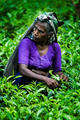
| 05/24/2006 04:06:15 PM | Tea Pickerby JohnBeebeComment: Greetings from the Critique Club...
My critique will be short and sweet since you didn't post any of your own thougths on the photo...
This photo scored high enough in the challenge to not require much critique. Everyone seemed to like it.
I think it's an excellent image. The color saturation is a little heavy for my personal taste though.
John Setzler | | Photographer found comment helpful. |
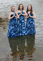
| 05/23/2006 04:32:17 PM | Down in the River to Prayby angela_packardComment: Greetings from the Critique Club...
Hi Angela :)
The idea behind this photo and your execution of it are both excellent. The photo seems to have received a rather poor audience in the challenge though. Trying to evaluate why that happened is difficult. I think there may be several reasons that I will discuss. There are two that come to mind for me immediately.
To begin with, the 'river' is not viewed by most as a holy place, even though it IS in the context you chose. Your photo is challenging more traditional thought on 'holy places'. When you do that on this website, you are going to get mixed reviews. This is a competition site and you can't normally ask your voters to think outside of their own box when voting on your image. There is no incentive for them to give you leeway since they are, indeed, your competition :)
Secondly, the photo lacks visual impact. Visual impact is the most important element of any photo on DPChallenge. You have to grab the viewer by the eyeball when your image pops up in front of them. If you accomplish that, they are more likely to think a little deeper into your ideas.
The blue color in the dresses here seem to become the focal point of the image since the rest of the photo is rather monochromatic. You are drawing the viewer's eye to that element of the image. When I look at this photo, especially within the context of this challenge, their dresses aren't what I really need to focus on. I need to see beyond that to your theme, as described in your title. White or black dresses would accomplish that with a little more strength, or converting the image to black and white would do the same thing to some extent.
I still think it's a good photo and better luck next time :)
John Setzler
| | Photographer found comment helpful. |
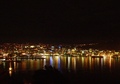
| 05/22/2006 03:57:15 PM | Wellington, New Zealandby KiwiShotzComment: Greetings from the Critique Club...
Hi KiwiPix :)
City skyline photos at night over water usually make excellent images. The lights and the reflection create some excellent postcard images dappled with color. This shot has a lot of those qualities, but in my opinion, there is simply too much negative (or unused) space within the frame. Maybe a tighter composition with a longer lens would create more impact in this image. Since I'm not familiar with Wellington, there is nothing within this image that identifies your city from any other city that might be photographed this way. This image is more about light and some possible texture rather than a portrait of a city, in my opinion. I challenge you to reshoot this photo and fill your frame with some of this beautiful light and reflection :)
John Setzler
| | Photographer found comment helpful. |
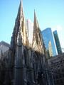
| 05/22/2006 12:21:54 AM | St. Patrick's Cathedralby likewh0aComment: Greetings from the Critique Club...
Hi likewh0a :)
I think your own comment sums up the validity of this photo. It doesn't look like you put much effort into it. Some of your comments also talk about the shadow and time of day, and that is a big issue here also. Time of day is everything for outdoor photos, and this one simply is at a very bad time. I can't offer you much critique and I don't believe the image warrants any more than this unfortunately.
John Setzler
|
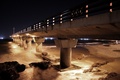
| 05/20/2006 02:53:50 PM | Midnight Pierby PeterPicComment: Greetings from the Critique Club...
Hi pieterw2008 :)
The composition of this photo is excellent, and the exposure also creates a nice sense of sound and motion for me. I think you did an excellent job with this image, and it appears that the voters feel the same way :)
As I was reading your information about post processing, I may be able to offer you some assistance in 'perfecting' this photograph. It seems that the orange glow of the light wasn't your preference, so learning to shift the white balance may be useful to you. If you are shooting in raw mode, you can shift the camera white balance after the shot during the raw conversion process. If not, you can use the levels dialog box in photoshop to select a poing within the image that is supposed to be 'white' and it will do some color correction for you. This option doesn't always work out well, but it can in a lot of cases. Your third option is to make it a black and white :) My personal preference in photography is black and white. If I create a photo where the color is not playing a key role, it ends up as a black and white anyway :)
Excellent work...
John Setzler
| | Photographer found comment helpful. |
|
Showing 201 - 210 of ~8082 |
Home -
Challenges -
Community -
League -
Photos -
Cameras -
Lenses -
Learn -
Help -
Terms of Use -
Privacy -
Top ^
DPChallenge, and website content and design, Copyright © 2001-2026 Challenging Technologies, LLC.
All digital photo copyrights belong to the photographers and may not be used without permission.
Current Server Time: 07/16/2026 03:50:02 PM EDT.
|