| Image |
Comment |
| 07/03/2006 12:27:21 AM |
Tulip Seasonby JudiComment: This is a very well executed photo as far as lighting and exposure go, but the composition is a problem. When you have objects close to the edge of the frame, you either need to cut them off where it looks intentional or include them completely within the frame. When your subjects just barely touch the edge, it creates an uncomfortable view... |
 Photographer found comment helpful. Photographer found comment helpful. |
| 07/03/2006 12:21:30 AM |
Daybreakby sailracer_98Comment: A little more depth of field and a little less negative space would probably benefit this image quite a bit. |
| Photographer found comment helpful. |
| 06/21/2006 12:40:43 AM |
|
| Photographer found comment helpful. |
| 06/20/2006 12:28:56 AM |
|
| Photographer found comment helpful. |
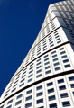
| 06/20/2006 12:26:09 AM |
Turning Torso - Luxury Apartmentsby GuGiComment: I think this is a nice architectural photo but maybe it's slightly oversharpened. "Indulgence" isn't something that comes to mind immediately for me when I see the photo though. |
| Photographer found comment helpful. |
| 06/20/2006 12:25:09 AM |
Gelato deliciosoby paddlesComment: The theme and composition of this photo are both excellent but the color cast is having a negative impact on the 'flavor' of this photo. You should also try to use the maximum size available to post photos to challenges. It makes it easier to enjoy the detail :) |
| Photographer found comment helpful. |
| 06/01/2006 12:27:20 AM |
|
| Photographer found comment helpful. |
| 06/01/2006 12:13:57 AM |
|
| 06/01/2006 12:13:14 AM |
|
| Photographer found comment helpful. |
| 06/01/2006 12:12:20 AM |
|
| Photographer found comment helpful. |
Home -
Challenges -
Community -
League -
Photos -
Cameras -
Lenses -
Learn -
Help -
Terms of Use -
Privacy -
Top ^
DPChallenge, and website content and design, Copyright © 2001-2026 Challenging Technologies, LLC.
All digital photo copyrights belong to the photographers and may not be used without permission.
Current Server Time: 06/10/2026 04:42:14 AM EDT.