| Image |
Comment |
| 07/02/2009 07:39:40 AM |
NOT ON MY CAR!by picksterComment: Boy, voters did not like this one. Hot Wheels don't do well at dpchallenge (at least in my experience). These are indeed old cars (42 years for 3 of them, and around 40 for the 56 'Bird). The shot has a lot of competing elements, and thus does not center the viewer on a primary subject.
I find it fun to see the old Hot Wheels - brings back lots of fun memories! These look like they've provided hours of enjoyment over the years.
|
| 07/02/2009 07:33:03 AM |
Pristine !by judojoeComment: Certain manufacturers do a great job of maintaining their "look" for decades, making it difficult to tell the age of one of their cars. Jaguar is one of these. Someone unfamiliar with the marque could see a model from the 60's and think it was a current model. This was a very nice picture. "Old" is subjective - to a child, anyone over 15 is old. To a senior citizen, only things that they encountered in childhood or before are old.
You've got to admit (and you do through your title) that this looks like a brand new car. Take the low scores as a compliment that you accurately captured the car and its condition.
Message edited by author 2009-07-02 07:34:35. |
 Photographer found comment helpful. Photographer found comment helpful. |
| 07/01/2009 07:32:12 AM |
Side Pipesby wdammanComment: Nice shot. It was good to see someone else found a Cord to enter... |
| Photographer found comment helpful. |
| 06/23/2009 10:49:13 PM |
|
| Photographer found comment helpful. |
| 06/18/2009 07:29:01 AM |
|
| Photographer found comment helpful. |
| 06/17/2009 09:31:08 PM |
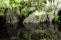
a gneiss spot for reflectingby krnodilComment: How did I know you were going to get blasted for this? You even gave them a HINT in the title - not for looking; for reflecting. To me, this is a dreamy, calming picture. I "see" someone lying on their back, enjoying the sunshine, eyes half-closed, relaxed, in no hurry to do or be anything. Take a deep breath and let the calm overwhelm you. Thanks for the stress break.
|
| Photographer found comment helpful. |
| 06/17/2009 09:21:50 PM |
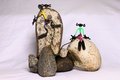
Rock Climbing Buddiesby JLSmithComment: Look at the distribution of your scores. This easily would have been at least a mid-5's picture if it were not for the background issues. So, now you've learned how not to do a background! Just on your own, you might re-try this shot with two pieces of white cardboard or tack board - one under and one vertical for the back. The back should be at least 12 inches from the back of the rocks. Don't know where you got the figures, but they add a TON to the shot. Tying the two together is just priceless - especially with the "effort" of the climber juxtapositioned with the la te da attitude of the sitter.
Judging by the number and content of comments you got, lots of folks enjoyed your picture. That should make you smile...
|
| Photographer found comment helpful. |
| 06/15/2009 10:37:44 PM |
Side View Fallsby rlewisComment: This is so nicely done - wispy water, crisp foliage, nice line from upper left to lower right, great color. Very, very nice.
|
| Photographer found comment helpful. |
| 06/13/2009 11:16:21 PM |
9by MelonMusketeerComment: These are the shots high ISO is made for - get the shot, even if it is a bit grainy. This turned out very nice, and is a great memory keeper. |
| Photographer found comment helpful. |
| 06/13/2009 11:13:53 PM |
|
| Photographer found comment helpful. |
Home -
Challenges -
Community -
League -
Photos -
Cameras -
Lenses -
Learn -
Help -
Terms of Use -
Privacy -
Top ^
DPChallenge, and website content and design, Copyright © 2001-2026 Challenging Technologies, LLC.
All digital photo copyrights belong to the photographers and may not be used without permission.
Current Server Time: 07/27/2026 06:03:09 PM EDT.