| Image |
Comment |
| 10/21/2009 06:56:24 PM |
|
| 10/21/2009 06:54:42 PM |
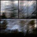
Commuting Artby korpenComment: This is a bit dark and foreboding, and surreal. Nothing really in focus. However, you've done a masterful job of using basically the same palette in all three panes, as well as even carrying some diagonal lines from the bottom pane in parallel with the upper right pane. The hint of pink provides a nice offset to the black and blues. 7 |
 Photographer found comment helpful. Photographer found comment helpful. |
| 10/21/2009 06:51:49 PM |
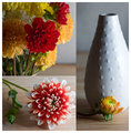
Day brightenersby MelethiaComment: All three shots are very nice. For me, a bit more DOF on the vase (to get the vase in focus as well, since it is the major object in the shot) would have been better. IMO you've run into a bit of issue when arranging the shots. The wood grain surface used in all three shots appears very differently from panel to panel. In addition, it makes a stark horizontal that doesn't align from top left to right panel. Then, there is the differences in lighting on all three images that form stark contrasts between the panels that do not seem to perform any function. To me, it looks like an oversight, rather than a planned transition. Very nice colors, pleasing subjects. 6 |
| Photographer found comment helpful. |
| 10/14/2009 10:37:47 PM |
Candelabraby dtremainComment: Thanks for the comments. Original has wood lap siding as the background, so I probably went too contrasty and dark to try to get rid of the hot spots in the background (this being basic, and I really don't need a 2nd DQ anytime soon). If you look closely, I still didn't get all of them. Don't do much with low key, so this is really out of my comfort zone. Good to stretch from time to time...
|
| 10/14/2009 10:34:59 PM |
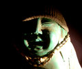
STEVEby jnix1asdfComment: FWIW (probably not much) - lighting is too much. Try using a lesser light source, or moving it further away from the subject, or putting a filtering material between the source and subject (even a white piece of paper in front of the light will cut it a lot, but you can also use a white translucent piece of plastic - like a thin cutting board). At least you didn't do my mistake of camera too close and use the on-camera flash, with harsh front-on lighting and a very distinct shadow on the background. Interesting subject, and interesting use of the hat and necklace - the brown contrast with the green of the statue. Keep playing around with it, try different things and see what you like. |
| 10/09/2009 08:08:24 PM |
|
| Photographer found comment helpful. |
| 10/09/2009 08:07:05 PM |
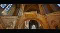
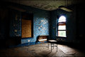
Forgotten Placesby jegerComment: Seems like I've seen this room before in another challenge. I love the blue peeling paint on the wall, the abandoned look of the lone desk. A bit too much dark on the left & right sides, and there was probably no way to lose the (relatively) modern light fixture... |
| 10/09/2009 08:05:04 PM |
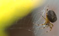
A web of treasureby AnnabellaComment: Sorry - not a fan of blurry shots. To me, there is not enough in focus to catch your attention. The spider is the main object in the shot, and it is OOF. Only a very small part of the web looks to be in focus (probably the "silk" treasure), and then you have a large chartreuse blob in the upper left corner taking up about 1/3 of the shot. It does add color, but does not seem to serve an obvious purpose in your message. |
| Photographer found comment helpful. |
| 10/09/2009 08:01:27 PM |
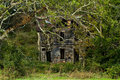
I said HIDDEN NOT HAUNTED!!!by riderComment: The lighting and detail on this is very, very nice. It draws you into its mystery and story. The glow in the upper window is an awesome touch. |
| Photographer found comment helpful. |
| 10/09/2009 07:59:29 PM |
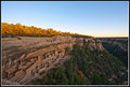
Dwelling on a Cliffby delinComment: Tough lighting - from dark in the canyon to the last rays of sunlight over lighting the trees on the top. Yet it is the same lighting that is absolutely gorgeous on the adobe buildings. I would suggest a much tighter crop on this - left side to just right of foreground rock; right to just left of 3rd large rock cropping, and top down to just above the rim rocks. I think that would leave enough of the shot to communicate cliff dwellings and remove a lot of distracting elements. Your shot has a lot of "bonus"es - the moon, the golden trees, the very nice blue sky, the line of the canyon leading back, to the left, and behind. IMO, none of these are strong enough to add to the shot. Instead the temptation is to include them, which dilutes the attention focal point of the picture. |
| Photographer found comment helpful. |
Home -
Challenges -
Community -
League -
Photos -
Cameras -
Lenses -
Learn -
Help -
Terms of Use -
Privacy -
Top ^
DPChallenge, and website content and design, Copyright © 2001-2026 Challenging Technologies, LLC.
All digital photo copyrights belong to the photographers and may not be used without permission.
Current Server Time: 07/26/2026 10:31:49 PM EDT.