| Image |
Comment |
| 06/06/2003 06:30:08 PM |
Loud!by jodiecostonComment: I really love the high key in this! I am not sure if I totally like that half her face is missing, but its so cool, I'll call it artistic and run with it! :) gets the message across...loud and clear (couldn't resist!) :) |
 Photographer found comment helpful. Photographer found comment helpful. |
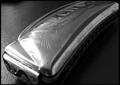
| 06/06/2003 06:28:23 PM |
Antique Echoby cmrk74Comment: I wish the foreground part of the harmonica was in focus, but I like the composition and choice of BW. :) |
| Photographer found comment helpful. |
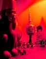
| 06/04/2003 12:12:21 AM |
Where the Wild Things Areby sagestudioComment: I don't know why it didn't score higher either. It was the most pure interpretation of the challenge. I think maybe it was the lighting that hurt the shot..perhaps it needed to be a bit warmer so the whole scene looked a little warmer? You couldn't ask for better models though. :) |
| Photographer found comment helpful. |
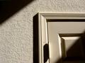
| 06/03/2003 12:41:56 PM |
Hallway in morning lightby caroleeComment: I find this shot a bit stark and without emotion. I don't get a feeling of home as much as I feel like its a sterile asylum.
edit to add: I do think it is an interesting with the lines of the light. |
| Photographer found comment helpful. |
| 06/03/2003 12:35:35 PM |
Where the Wild Things Areby sagestudioComment: this is the most perfect interpretation of the challenge. :) I love the excited looks on all the children's faces, the little bag of snacks, and the interested and involved look of david. ;) Might have benefitted from a bit softer light, maybe tungsten light yellow cast? :) I don't know, but you still got my 10. |
| Photographer found comment helpful. |
| 06/03/2003 12:32:17 PM |
|
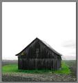
| 06/03/2003 12:29:12 PM |
No Huntingby mariomelComment: the sky is too white here to be so much of the shot. I think composition would be improved if you cropped some of that out, or waited until the sky was more interesting. :) |
| Photographer found comment helpful. |
| 06/03/2003 12:24:06 PM |
my houseby redhedComment: wow, that's one freaky shot with that lighting! This shot makes your house look like a scary place to be! :) |
| 06/03/2003 12:19:35 PM |
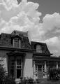
My Money Pit - 1871by vtruanComment: I would have loved to see this how presented with a wider angle and landscape rather than portrait, seems like a very pretty manor. I like the clouds you've captured though, they add interest. :) |
| Photographer found comment helpful. |
| 06/03/2003 12:11:22 PM |
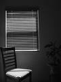
Minimalby briphotoComment: not fond of the tilt on the window,it seems your camera needed to be higher up. I like the lines on the chair from the light and the bw. :) |
Home -
Challenges -
Community -
League -
Photos -
Cameras -
Lenses -
Learn -
Help -
Terms of Use -
Privacy -
Top ^
DPChallenge, and website content and design, Copyright © 2001-2026 Challenging Technologies, LLC.
All digital photo copyrights belong to the photographers and may not be used without permission.
Current Server Time: 04/30/2026 03:07:33 PM EDT.