| Image |
Comment |
| 06/02/2003 06:06:14 PM |
Backyard Resident, at least until he can fly!by smellyfish1002Comment: i think this is a stretch on the challenge, and probably your score will reflect that reality. But the picture itself is really good, though I would have cropped a bit off the top of the shot and did somethnig different with the borders, they are uneven. Did you use even or odd numbers of pixels to create it? If you use even numbers, you always get even borders. I like the focus on the eye, and the slight out of focus of the beak, it softens the image. |
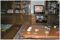
| 06/02/2003 06:04:22 PM |
Creative messby sselmanComment: very literal interpretation of the challenge. I think you used your flash here, which has the effect of being too bright in the foreground, leaving the rest of the shot looking dark. Nothing else really wrong with it, except that its not the most rivetting composition. I think that will probably explain your placement more than anything. There just isn't any interest in the shot besides a documentation of your livingroom. :) (lovely and cosy though it seems!) |
| 06/02/2003 06:00:27 PM |
|
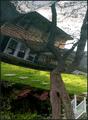
| 06/02/2003 05:59:33 PM |
reTURNing homeby adineComment: guess: its an upsidedown reflection of your house in your car hood? Phew, that was a lot of work to figure out! I don't know if that was what you wanted us to have to do, but when we do have to work that hard to figure it out, it detracts from the impact of the photo. I like the reflection though, its a very creative idea bringing home and travel together. |
 Photographer found comment helpful. Photographer found comment helpful. |
| 06/02/2003 05:57:50 PM |
Another Day without the Dryer by SonifoComment: bit of a stretch on the challenge, but I'll give it to ya. :) Nice shot, good use of duotones. I like the graininess as well. Only nit is the pixely sky, but its not a big problem. |
| Photographer found comment helpful. |
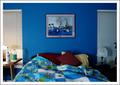
| 06/02/2003 05:56:23 PM |
My Place of Refugeby giseleComment: reminds me of a magazine shot, doesn't feel enough like refuge because of the inclusion of the side tables..I would have gotten a little closer to the bed. :) |
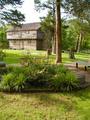
| 06/02/2003 05:40:12 PM |
Home 1800sby NitenComment: nice angle. I like the distance from the house, but I don't see the value in the foreground and would probably have cut it out if this was my shot. :) |
| 06/02/2003 01:08:32 AM |
Introspectiveby ToddhComment: congrats, Todd! I really did like this shot a lot, and I agree with sher...beautiful capture with the eyes. You ought to be extremely pleased with this shot, its wonderful. |
| Photographer found comment helpful. |
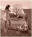
| 06/02/2003 12:58:25 AM |
Beaute Naturelle by lmhrComment: this was my very favourite of the challenge. I'm sorry I didn't have time to comment during the challenge, but i wanted to say that everything about this shot was perfect. The DOF the lighting and your model is very lovely, she has a caring and beautiful face. :) I hope you thank her with a print of this photograph, its beautiful. Congratulations. |
| Photographer found comment helpful. |
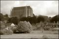
| 06/01/2003 11:18:15 PM |
Lancing collageby marboComment: this is a great shot. I'm not fond of this dreamy effect though..it looks a bit over NI'd. |
| Photographer found comment helpful. |
Home -
Challenges -
Community -
League -
Photos -
Cameras -
Lenses -
Learn -
Help -
Terms of Use -
Privacy -
Top ^
DPChallenge, and website content and design, Copyright © 2001-2026 Challenging Technologies, LLC.
All digital photo copyrights belong to the photographers and may not be used without permission.
Current Server Time: 04/30/2026 10:07:55 PM EDT.