| Image |
Comment |
| 06/17/2003 12:26:56 PM |
The Gardenerby JonatanComment: I like this macro and simple composition. I like that there is shadow there, but I wish it was not so much, it seems a tad overpowering. :) |
 Photographer found comment helpful. Photographer found comment helpful. |
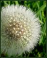
| 06/17/2003 12:24:24 PM |
Lawn and Garden Magazineby DianaComment: I think I would have liked this in portrait form, and just a bit off centre to fit around the copy and be a little more pleasing. Its a very "pointed" little flower isn't it? :) |
| Photographer found comment helpful. |
| 06/17/2003 12:07:12 PM |
jazzhands.jpgby PedroComment: I absolutely love it, Pedro! You two look like you were having so much fun here, and I don't think your background is distracting at all. :) |
| Photographer found comment helpful. |
| 06/16/2003 10:07:54 PM |
LIFEby swaroskjiComment: motion blur on her hand and really all of her really throws this shot off, though I like the smile on her face and the general composition. Good use of bw too, gives it a timeless feel. |
| Photographer found comment helpful. |
| 06/16/2003 09:42:09 PM |
ELLEby jenaromComment: the shadow under her chin makes her head look a bit disconnected from her body, or perhaps its that her skin looks two different colours. Strange effect anyway. Maybe a bit of fill light from below could have helped? |
| Photographer found comment helpful. |
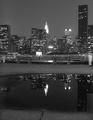
| 06/16/2003 09:26:10 PM |
New YorKby jpb56nyComment: was this taken from New Jersey? I almost recognize the promenade as one from Jersey City! :) Nice reflection in the puddle, not sure I agree with the bw presentation, but the contrast is very good. |
| Photographer found comment helpful. |
| 06/16/2003 09:18:10 PM |
Stuff Magazine - or - Playboyby DrJOnesComment: maybe a little too much nipple and "love path" for stuff, but could certainly see it on a racier magazine cover. I love how you have gotten her skin to look so smooth, I guess that's the neat image. Composition is very nice, and I like the simple background, the blue looks good against the yellow. |
| Photographer found comment helpful. |
| 06/16/2003 09:15:05 PM |
Strawberry smileby MikuComment: I think the strawberry needs a bit more light, and a vertical presentation to be more effective. I like the DOF choice though. :) |
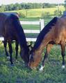
| 06/16/2003 09:13:50 PM |
Thoroughbredby LeahStephenComment: I like the symmetrical composition, but the graininess seems out of place, as does the blueish and white cast over the whole scene. Did you try to play with levels to sort that out in post processing? |
| Photographer found comment helpful. |
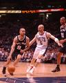
| 06/16/2003 09:07:57 PM |
Sports Illustrated by RiderGalComment: must have been a very exciting game! :) I like the action in the shot, I know there were probably more action packed scenes to be captured here, but I like the mostly uncluttered composition here (if that #21 would have gotten out of your shot, how insensitive of him! ;)) One of the best of teh challenge, and one of only a tiny tiny handful that I think could actually be considered for a cover. Nicely done. Can't wait to read all the neato details about what it was like to take this. :) |
| Photographer found comment helpful. |
Home -
Challenges -
Community -
League -
Photos -
Cameras -
Lenses -
Learn -
Help -
Terms of Use -
Privacy -
Top ^
DPChallenge, and website content and design, Copyright © 2001-2026 Challenging Technologies, LLC.
All digital photo copyrights belong to the photographers and may not be used without permission.
Current Server Time: 04/28/2026 05:50:55 PM EDT.