| Image |
Comment |
| 06/18/2003 05:35:16 PM |
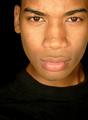
Look Deeper.by GeocideComment: beautiful. :) I wish you didn't cut your head off. Great job capturing skin tones though. bravo! |
 Photographer found comment helpful. Photographer found comment helpful. |
| 06/18/2003 05:34:01 PM |
Hand on my heartby KaveyComment: teeny bit grainy, but I like the tones. Skin is beautiful, as are bodies, male or female, and yours is a beautiful body with lovely tones. I like how you let your wee nipple poke out. This is exactly what all of us FEEL like when we take a picture of ourselves, like we are naked and waiting for the world to judge us based on the outside. I got a body a lot like yours...cocoa and ample, and most days, I'm pretty happy with it. Thank you for posting this and being brave. Now..for the lighting..its a little strange, where part of you is blown out and other part of you is very shadowed, but its dramatic. Not sure I would have chosen this angle for presentation either, but its art, and we all love it! I like the inclusion of your hand with the wedding ring, reminiscent of love. :) |
| Photographer found comment helpful. |
| 06/17/2003 06:14:24 PM |
Surfer Magazineby jab119Comment: nicest of the surf pictures! :) I would have liked a vertical persentation, but the colours are vibrant and the scene is clear, well done! |
| 06/17/2003 06:11:48 PM |
Reptilesby Krawf47Comment: I would have cut out the foreground because those woodchips are distractingly bright. I like the hollow log though, it makes for an interesting composition. |
| Photographer found comment helpful. |
| 06/17/2003 06:07:49 PM |
Parents Magazineby chelseayankieComment: i like the chubby arms, but the right side seems blown out. Also, its easier for voters to see pictures that are submitted larger. :) |
| 06/17/2003 04:21:56 PM |
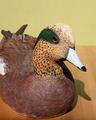
Wildfowl Carving Magazineby camelotnorthComment: lovely carving but the shadow is distracting. Also, I would love to see more of the detail on the duck, did you try a different angle to show more if its side? :) |
| Photographer found comment helpful. |
| 06/17/2003 03:45:38 PM |
The Chocolatierby briphotoComment: I like the subject matter a lot, but I find the plate a bit distracting. The addition of the mint was a very nice touch. I think a warmer sort of lighting might have avoided the sort of flat look some of the chocolate in the foreground has. :) |
| Photographer found comment helpful. |
| 06/17/2003 12:42:16 PM |
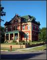
Old House Journalby kebmod54Comment: the shadows of the trees are very harsh on the house and the street, otherwise, I think the angle is great! Maybe a tighter composition where you got closer to the house or were higher up to cut out the street might also work? Good work. |
| 06/17/2003 12:33:41 PM |
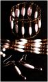
Beadworkby rickhd13Comment: seem to have lost a bit of detail on the earrings because of the black background. I like the composition though with the necklace going off the screen. |
| Photographer found comment helpful. |
| 06/17/2003 12:32:42 PM |
Crafts 'n Things: Soapmakingby qachykComment: I like this, but the colours seem a little off and the carpet isn't complementing the composition well. Also seems a bit grainy and out of focus without real purpose. |
| Photographer found comment helpful. |
Home -
Challenges -
Community -
League -
Photos -
Cameras -
Lenses -
Learn -
Help -
Terms of Use -
Privacy -
Top ^
DPChallenge, and website content and design, Copyright © 2001-2026 Challenging Technologies, LLC.
All digital photo copyrights belong to the photographers and may not be used without permission.
Current Server Time: 04/28/2026 03:05:09 PM EDT.