|
|
|
Showing 1021 - 1030 of ~1402 |
| Image |
Comment |
| 05/06/2003 12:37:08 PM | Not Your Everyday Carby frd91gtComment: Hmm...what sort of car is this? its a shiney engine, so maybe if you either shot closer or even wider we'd have a bit of context, but I suspect you were going for the abstract feel of an engine, in which case, zoom on in and go a bit to your left to get a better view on those cool engine parts, rather than cutting off the corners of it. :) |  Photographer found comment helpful. Photographer found comment helpful. |
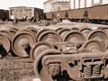
| 05/06/2003 12:34:53 PM | Keepin the Rails Goingby OneSweetSinComment: Good focus on the subject, but I would have chosen a shallower DOF to throw those distracting background items out of focus. I like that you played on the brown tones in the rusted old wheels when colouring this picture, but I can't say I agree with how you choose to compose this shot. I thought about whether I wanted a tighter crop or a wider angle, and come to the conclusion that neither would have improved this one for me. Perhaps if you shot just the round wheels in behind sitting on the rails without the big one in front, it would have been a more interesting shot? These are just a few ideas -- feel free to disregard some or all! :) | | Photographer found comment helpful. |
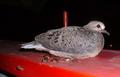
| 05/05/2003 09:53:23 PM | bird on a bannisterby DoorskidderComment: Hello from the Critique Club
Let me try my hand at picking apart this photo for you, and hopefully you find it helpful. :)
Composition
Nothing wrong with the shot of a bird, but the combination of the darkness surrounding the creature and that freaky look in its eye, this guy scares me! My problems with the composition arise with the placement of the bird. He's too far right, if you had left a bit more space in front of him, the picture would probably yield a more pleasing 'rule of thirds' placement. The pole behind the bird is distracting as well, and if those are turds on the bannister... EWW!
Color
The red of the bannister is bright and saturated (bravo!), which leads me to believe this is the actual colour of the bird that you have captured. That said, there is a definite coldness to these colours which may add to the stark feel of the shot overall. Warmer tones, perhaps through some manipulation in photoshop might half softened up the harshness of the shot.
Focus
You have no problems with focus or DOF as far as I can see.
Lighting
This the root of the problem I think. You used your flash here to light this bird, which almost always destroys the true feel of a good picture. Onboard flash is harsh and has a tendency to wash out colours and characters while highlighting things that ought to be downplayed.
A softer form of light, allowing the bird to remain a part of its surrounding by leaving a bit of the natural darkness rather than like the poor thing is under the interrogation lights!
I agree that the use of flash on so close an object really gives it a "snap shot" feel which has the effect of turning off a more critical eye.
Subject matter
Birds are fauna, you nailed that one. :)
Overall
The subject matter (scary looking bird plus turds) combined with the use of your flash at close range are probably the single biggest factors in your score/placement. I am encouraged by your incorporation of colour with a plain coloured subject though, and your focus, which I think was spot on (though it might be a bit oversharp, probably from me looking too hard at the shot!) Happy shooting! :) |
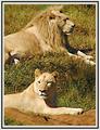
| 05/05/2003 07:35:57 PM | Lyin' Lionsby sulamkComment: Sandy,
Hello from the Critique Club! :)
I enjoyed this shot during voting, and am pleased to be able to expand on my initial comments.
Composition
Concentrating on how you decided to place these two lions within your frame, I applaud your choice to use a portrait set up. I think its a creative choice that adds a sense of intimacy to the shot, as if we're looking in on these two lions and their private lives, rather than just a shot from the window of the safari tour bus! I appreciate these weren't exactly co-operative and willing models, but if the lion had his head turned just a bit more toward you, it would have matched the lioness without giving away the aloofness of his pose.
I find the crop to be a little tight, as I want something more to the left of the frame and a tiny bit more space above the lion's head. I think the lioness is fine with just her upper body in the shot, but the lion is cut off at a strange part of his body and it makes it seem as if we're missing something important in his pose.
HOWEVER, for a harsher crop, you could cut the lion out all together and get a very interesting shot with just the lioness with green grass behind her and the red earth underneath, since she is the most infocus item in the shot.
Color
There are a lot of similar edgy golden tones in this shot, from the dirt to each of the beast's hair, even the grass is has a harsh brownish tone. Perhaps a bit more saturation would leave the grass looking a little more lush (though I recognize that it was probably pretty dry out there)? In the end, I have to say that the colour seems pretty "on" for a picture of two lions in the savanna on a very sunny day. The redness of the earth by the lioness clinches the colour issue for me.
Focus
This is something that a few of the comments touched on. The whole shot seems soft, with really only the lioness' face at sharpness I would consider "in focus." As suggested, a greater DOF might have helped, or if you were closer to your subject (haha!). I don't know if you can control your aperture settings, I suspect not, so don't take comments about DOF too much to heart on this particular shot, the thing I'd try to do, is understand what your camera's range is for how much it can keep in focus depending on things like the lighting and whether you are using zoom, and create your compositions within those boundaries.
If you're having to use "digital zoom" for a shot or you were very far away from your subject and you cropped and used photoshop to get a bigger picture, I'd suggest you interpolate in small increments, I think there is a tutorial on this topic that is very helpful. If not, nevermind all this!
Lighting
Its an extremely bright and sunny day, and that has really impacted the feel of this picture. There are shadows below the lion's face and at the left side of the lioness which might have been more muted had you taken this shot later in the day, but I appreciate that you are restricted to zoo hours and get your shot of creatures as you can!
Subject matter
I love lions, being a Leo myself, but you really took this up a notch by including both a lion and a lioness and capturing them in a natural setting without any wires or fence in the way.
Overall
Overall, I liked this picture a lot, you certainly met the challenge. I thought your composition choice was refreshing, and I like the feeling this shot creates. The colours and focus especially could have been improved upon to really bring this picture to life. Message edited by author 2003-05-05 19:40:19. | | Photographer found comment helpful. |
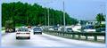
| 05/04/2003 03:59:33 PM | On the go...by zerocusaComment: something you've done in processing or rather, post processing has left the trees an unnaturally saturated green, and its blown out some of the highlights on the shot, but I like wide angle look of this shot. :) | | Photographer found comment helpful. |
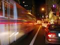
| 05/04/2003 02:28:07 PM | Hop on the Busby tolyanchikComment: the still items are out of focus, which really takes away from the impact of a motion blur/long shutter picture. | | Photographer found comment helpful. |
| 05/04/2003 02:18:06 PM | Traffic Jamby SpeedsterFComment: I don't think the cars had to be "real" in order to meet this challenge.. very creative of you to think to use toy cars! :) However, they aren't in focus, which really detracts. |
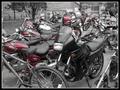
| 05/04/2003 01:08:16 PM | Odd One Outby starblazerComment: heya! ;) I did a similar thing with my photo! I like the idea of this shot, but my two critiques are: its way too busy. there are too many bikes going in too many different directions to really get a feel for what you are trying to convey. Is it the one black motorcycle? Is it the bike? (in which case, we only see the back end of it, like an afterthought).
Also, there is some bit of funny digital pattern effect on some of the bikes and seats, which might just be a results of your post-processing. If you had a more shallow DOF, that might have helped to unclutter the picture and if you pulled back from the bikes more, then I think we'd have it! :) | | Photographer found comment helpful. |
| 05/04/2003 02:04:35 AM | Blue Bicycleby KingLokComment: i realize you were probably going for something wild, creative and abstact, but so much detail is lost with the way blown out whites that its really hard to tell how good of a digital photograph this is vs. your skills in post processing. Still a neat bit of work though. :) |
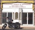
| 05/04/2003 02:03:07 AM | Deliveranceby RefocusedComment: what a great find! :) I wonder if the two riders of this "hell machine" are inside that church? LOL I would have preferred a little more saturation on that yellow valance, just because it contrasts nicely against the dark bricks, nice shot! | | Photographer found comment helpful. |
|
Showing 1021 - 1030 of ~1402 |
Home -
Challenges -
Community -
League -
Photos -
Cameras -
Lenses -
Learn -
Help -
Terms of Use -
Privacy -
Top ^
DPChallenge, and website content and design, Copyright © 2001-2026 Challenging Technologies, LLC.
All digital photo copyrights belong to the photographers and may not be used without permission.
Current Server Time: 04/29/2026 05:09:49 PM EDT.
|