| Image |
Comment |
| 04/02/2008 10:38:20 PM |
|
 Photographer found comment helpful. Photographer found comment helpful. |
| 04/02/2008 10:35:58 PM |
tn-04-01-08-5630 Vinca Minor.jpgby fixedintimeComment: This is a feast for the eyes. The soft focus is perfect. The biege areas are a little confusing at first, because they're hard to resolve, compared to the blue flowers and green foliage which are easy to identify right away.
|
| Photographer found comment helpful. |
| 04/02/2008 10:33:41 PM |
|
| Photographer found comment helpful. |
| 04/02/2008 06:31:01 PM |
Day 2: Good Morningby socalsteveComment: I'm not sure the vignette was necessary; the trees provide a sort of natural vignette already. Nicely composed and very pastoral. |
| 04/02/2008 06:26:59 PM |
Sky and Clouds (April 1)by karmatComment: I like it. The framing/placement of the cloud is perfect, and I like the textures. I might have toyed with the color balance to brighten/whiten the cloud a little bit, but that might not have been the look you were after. |
| Photographer found comment helpful. |
| 04/02/2008 06:12:27 PM |
|
| 04/02/2008 06:11:34 PM |
Aloneby silverscreenComment: I love this. Excellent contrast and DOF. I love the geometry and the textures too. BW was the only choice here. Congrats! |
| Photographer found comment helpful. |
| 04/02/2008 06:09:57 PM |
p a p e rby yankoComment: These colors are terrific. Excellent composition and processing too. Congrats! |
| Photographer found comment helpful. |
| 04/02/2008 06:08:40 PM |
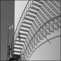
Stair Study by SeanachaiComment: Terrific shadows and lines. Clean BW processing also. Congrats on the ribbon! |
| Photographer found comment helpful. |
| 04/01/2008 09:45:37 PM |
lincoln.jpgby idpComment: Excellent subject and lighting. Would like to have seen more clarity, sharpness in those wonderful textures. |
| Photographer found comment helpful. |
Home -
Challenges -
Community -
League -
Photos -
Cameras -
Lenses -
Learn -
Help -
Terms of Use -
Privacy -
Top ^
DPChallenge, and website content and design, Copyright © 2001-2026 Challenging Technologies, LLC.
All digital photo copyrights belong to the photographers and may not be used without permission.
Current Server Time: 07/24/2026 01:06:33 AM EDT.