| Image |
Comment |
| 05/31/2004 12:17:03 PM |
3 Ducklingsby RUEDISCHMUTZComment: I like how the ducks "posed" for you - this line-up makes a nice composition. The lighting is a bit harsh - the shadows on their faces take away from the picture a bit. |
| 05/31/2004 12:15:37 PM |
Three of a Kindby PaulMdxComment: What I like about this pic vs, the picture of the 3 queens cards is that this one has dimension - the shadows and angles give us a feeling for the objects in space. A photo of cards lying flat might as well just be the cars themselves. I like this! The cards look like they are floating! |
 Photographer found comment helpful. Photographer found comment helpful. |
| 05/31/2004 12:13:49 PM |
Three fingersby tmb1070Comment: I like the radical red! The tree trunk background in nice too. A picture with real attitude! |
| Photographer found comment helpful. |
| 05/31/2004 12:11:38 PM |
three leftby ursulaComment: I like the lighting and natural setting in this one a bit better than the studio dandilion. The B&W brings out the textures even better and the dapples of the backgound give context. |
| Photographer found comment helpful. |
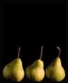
| 05/31/2004 12:07:18 PM |
Packhams Trioby HRoxasComment: great light - very "painterly" I like how the light catches the stems of the pears, makes them look like they are dancing (a bit like Renoir's onions) Wish we could see the bottoms of the pears better -and the frame is unnecessary. |
| Photographer found comment helpful. |
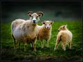
| 05/31/2004 12:00:46 PM |
Family of threeby arnitComment: Heida? I like the darkening of this photo - particularly with the light catching the sheeps wool and highlighting them. It is very Icelandic - the darknesss and the light - I like the way it happens naturally as the sun and clouds sweep over the land - your artistic version works well. Wish the sheep were just a tad sharper! |
| Photographer found comment helpful. |
| 05/31/2004 11:55:06 AM |
|
| Photographer found comment helpful. |
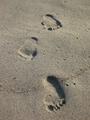
| 05/31/2004 11:52:15 AM |
Walk Along The Beachby RohnComment: Nice idea - two foot prints isn't enough to show a walk - add the third an the meaning is clear! I like the light and texture - I wonder if a diagonal composition would be more interesting? |
| Photographer found comment helpful. |
| 05/31/2004 11:45:45 AM |
Purrrrfect Trioby TrollManComment: beautiful.I love the mix of colors and those eyes! I'd crop on the top just a little, a mayeb a bit left and right - bring the composition right in on those lovely faces! Wish there was more detail in the white fur. |
| Photographer found comment helpful. |
| 05/31/2004 11:43:19 AM |
Atkins Who?by Beerme425Comment: yum! Fun! I like the bite taken out of the 3rd donut - it makes the photo personal. I would tilt to the left - so the bottom of all the donuts line up. Nice lighting and textures |
| Photographer found comment helpful. |
Home -
Challenges -
Community -
League -
Photos -
Cameras -
Lenses -
Learn -
Help -
Terms of Use -
Privacy -
Top ^
DPChallenge, and website content and design, Copyright © 2001-2026 Challenging Technologies, LLC.
All digital photo copyrights belong to the photographers and may not be used without permission.
Current Server Time: 07/20/2026 08:01:53 AM EDT.