| Image |
Comment |
| 08/06/2004 02:33:02 PM |
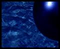
reflectionsby dinnyComment: Nicely done - simple idea with a real "wow!" look to it. I like the deep blues and the reflection in the ball makes it look like a planet hovering in a nebula. 9 |
 Photographer found comment helpful. Photographer found comment helpful. |
| 08/06/2004 02:30:10 PM |
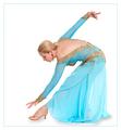
Eleganceby AnastasiaComment: Very true to the title. A nice image, composition. The lighting makes the subject seem a bit flat, and the resolution seems low - not a lot of details when you look close. |
| Photographer found comment helpful. |
| 08/06/2004 02:23:02 PM |
bludolphby byoungComment: I love the riples in the water! The reflection of the dolphin and the shades of blue and purple. I'm not overly fond of photos of cute toys, but this one is well thought out and executed. 8 |
| Photographer found comment helpful. |
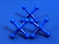
| 08/06/2004 02:19:11 PM |
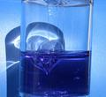
Bubble Toyby steingComment: An intriguing subject - It has interesting range of blues and intertsing shapes. It seems a little tilted to the right. It might be a more focused composition (themeatically) to skip the reflection on the wall, crop down even more so we don't see the edges of the container - just the colors and the grat abstract shapes. |
| Photographer found comment helpful. |
| 08/06/2004 02:17:09 PM |
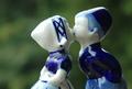
First Kissby ruffianComment: I like the DOF - the blurred greenery makes a nice background. Perhaps entirely desaturating the green would make the blue "pop" even more. The figures don't seem quite in focus, and I wish the bits of dust on them had been brushed off before the photo was taken. |
| Photographer found comment helpful. |
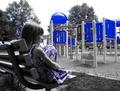
| 08/06/2004 02:14:49 PM |
Blue Park Bluesby taterbugComment: Fun selective desaturation. I like how the blue is both in the girls dress and in the play structure - as if she is being invited to play, loose the blues. The blue on the play structure seems hyper saturated, perhaps something a little more realistic would be better? It is too bad this was a basic editing challenge - you can get rid of the blue in the trees... |
| Photographer found comment helpful. |
| 08/06/2004 02:12:42 PM |
Blues and Cloudsby banmornComment: A nice abstract - the diagonal lines and the blue ranging to white makes and interesting composition. |
| Photographer found comment helpful. |
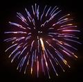
| 08/06/2004 02:10:51 PM |
Blue Fireby wargloryComment: A lovely busrt of fireworks. I wish the color were more saturated. |
| 08/06/2004 12:12:36 PM |
Blue on Blueby GraciousComment: I like your subject. I wish there were greater contrast between the subject and the background either by use of color or by lighting. |
| Photographer found comment helpful. |
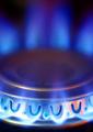
| 08/06/2004 12:10:26 PM |
Everyday Blue Flameby pottersclay75Comment: This makes an interesting abstract. The vents at the bottom are sharp, and the metal makes nice reflections, The flame is a great color blue. Perhaps a greater DOF (longer exposure, smaller apature) would put the whole burner in focus and leave the flames blurred and impressionistic. Might give more strength/impact to the image. |
| Photographer found comment helpful. |
Home -
Challenges -
Community -
League -
Photos -
Cameras -
Lenses -
Learn -
Help -
Terms of Use -
Privacy -
Top ^
DPChallenge, and website content and design, Copyright © 2001-2026 Challenging Technologies, LLC.
All digital photo copyrights belong to the photographers and may not be used without permission.
Current Server Time: 07/18/2026 03:37:27 AM EDT.