| Image |
Comment |
| 06/05/2006 07:01:19 AM |
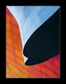
EMPby cabaComment: This is gorgeous! The silver and the black and the curves and the lines! |
 Photographer found comment helpful. Photographer found comment helpful. |
| 06/05/2006 12:27:27 AM |
Memorialby DefyTimeComment: Darn! I thought I'd find this on the first or second page... this is a shot that deserved to be rated higher! |
| 06/05/2006 12:25:00 AM |
|
| Photographer found comment helpful. |
| 06/05/2006 12:21:03 AM |
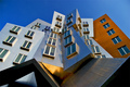
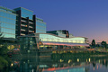
Working the Anglesby adineComment: Thanks for the votes and comments all!
Going to the Stata Center at MIT was not my idea. magnus thought of this building as soon as the architecture challenge came up. What a great building! And the sun was just coming out after the rain. Magnus and I share the one camera and kept passing it back and forth - one taking shots while the other scoped ahead around the building. We took 150 shots. I got to look through mine first and picked a few. Magnus helped me narrow it down to this one. Only once this was submitted he looked at his shots and found one very similar but felt he couldn't post it with mine already there. Poor Magnus!
Magnus' version:

I took more pics too:


 Message edited by author 2006-06-05 11:35:17. Message edited by author 2006-06-05 11:35:17. |
| 06/04/2006 03:15:58 PM |
|
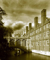
| 06/04/2006 11:12:50 AM |
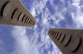
Since 1831 ADby arminComment: Nice sepia tone - appropriate to a place with so much history. When I was in Cambridge - I was frustrated by the shadows that fell on this bridge. You have tried to emphasize it by putting it on the thirds line and that does make a nice composition, but the bright lighting on the college draws the eye away from that wonderfully detailed bridge with its details in the shadows. Great sky though! And I like the detail of the punt in the water and the punter with a white shirt helps us to see him. Maybe a bit of doging in the shadows on the bridge, or a judicious use of curse to pull the details out a bit. |
| Photographer found comment helpful. |
| 06/04/2006 11:08:28 AM |
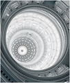
Texas State Capitol Buildingby yankoComment: You have made something massive seem very delicate - like lace. I would have been tempted to make the composition symetrical around the diagonal (bottom left to upper right) but perhaps that would be too convetional and the tension between the angles and the curves makes it more dynamic. For me it feels too tight on the right, and the cropping of the curves at various intersections creates too much chaos. |
| Photographer found comment helpful. |
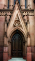
| 06/04/2006 11:08:19 AM |
The Out Doorby dahkotaComment: I like the rosey glow and soft texture you've created. Feels a bit too tightly cropped. |
| Photographer found comment helpful. |
| 06/04/2006 11:07:29 AM |
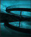
Down by the Lakeby FirstyComment: Nice pastel colors you have made this place look inviting. But a very busy shot that doesn't focus on any particular part of the architecture. Wish there were some anchor point, some direction of interest. With a different angle you could use the unusual curveof the lower structure to lead the eye to the sky reflected in the taller structure. |
| Photographer found comment helpful. |
| 06/04/2006 11:04:15 AM |
Curvyby stare_at_the_sunComment: A very different subject than most here - the shadows and light emphasize the billowing curves. The line of poles leads the eye into the frame and accentuates the curves by contrasting with them. |
| Photographer found comment helpful. |
Home -
Challenges -
Community -
League -
Photos -
Cameras -
Lenses -
Learn -
Help -
Terms of Use -
Privacy -
Top ^
DPChallenge, and website content and design, Copyright © 2001-2026 Challenging Technologies, LLC.
All digital photo copyrights belong to the photographers and may not be used without permission.
Current Server Time: 07/16/2026 03:01:39 AM EDT.