| Image |
Comment |
| 12/20/2006 07:33:40 PM |
Wish You Were Hereby terjeComment: lovely lonely image. The colors are marvelous - the cold blue of the snow and the hot orange of the reflections in the water. The edgy composition works well - the subject feels isolated at the far edge of the frame, but is emphasized by all the lines that point to him - the dock, the horizon and the line of clouds. 8 |
 Photographer found comment helpful. Photographer found comment helpful. |
| 12/20/2006 07:31:35 PM |
|
| Photographer found comment helpful. |
| 12/20/2006 07:30:10 PM |
|
| Photographer found comment helpful. |
| 11/20/2006 04:53:35 PM |
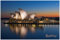
Sydney by FirstyComment: Luminous, gorgeous. A fine composition, beautiful evening colors, and thoughtful use of text - I like how the font picks up on the shape of the moon. A winner! |
| Photographer found comment helpful. |
| 11/20/2006 04:52:17 PM |
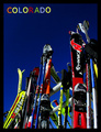
Ski Coloradoby RebeccaComment: I enjoy the way you combine the color from the photo and the color and the text - makes a wonderful vivid image against the blue - makes me long to go skiing. |
| Photographer found comment helpful. |
| 11/20/2006 04:51:22 PM |
|
| Photographer found comment helpful. |
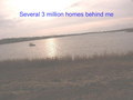
| 11/20/2006 04:50:22 PM |
Million dollars viewby whiterookComment: I HOPE you are going for the brown ribbon. Should I list my concerns or have you been very mindful in your inclusion of photographic flaux-pas already? I'll be redundant just in case - tilted horizon, no dicernable color, yet not black and white, no tonal range, no subject or focal interest, bad focus, odd text in jarring blue that makes little sense... are there 3, 6, 9 million homes behine you or are there 3 million dollar homes behind you... and are you laughing at the people who shelled out that kind of money just for this view? |
| Photographer found comment helpful. |
| 11/20/2006 04:45:46 PM |
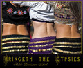
Preserve The Heritageby edchuahComment: Good energy and color, but several things really bring this postcard down. The heavy shadow over the woman's eyes is unfortunate - such a nice smile one should be able to see her whole expression better. The lettering on the flag, cropped the way it is, is very distracting, I keep thinkng, "preserve the cow." the full flag with all the words might work, but then I wouldnt put text on the card. Both the color and font of the text you have do not relate to anything in the picture. Finally, I am really distracted by the odd effect you've used to blur the photo into the edges of the card. All put together this postcard is just too busy and distracting - the simpler the better. |
| Photographer found comment helpful. |
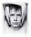
| 11/09/2006 11:46:44 AM |
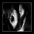
Concentration by DjabordjaborComment: Wonderful wonderful range of tone, detail, negative space - the framing is ingenious and works perfectly. |
| Photographer found comment helpful. |
| 11/08/2006 10:31:02 AM |
|
| Photographer found comment helpful. |
Home -
Challenges -
Community -
League -
Photos -
Cameras -
Lenses -
Learn -
Help -
Terms of Use -
Privacy -
Top ^
DPChallenge, and website content and design, Copyright © 2001-2026 Challenging Technologies, LLC.
All digital photo copyrights belong to the photographers and may not be used without permission.
Current Server Time: 07/15/2026 07:23:47 PM EDT.