| Image |
Comment |
| 11/14/2003 01:28:14 PM |
Networking for Dummiesby melkingComment: concrete representaion of an abstract idea. Wish the light on the bottom wasn't so bright - leaves no detail. Might be a better composition to fill the frame more by making your subject more diagonal. |
 Photographer found comment helpful. Photographer found comment helpful. |
| 11/14/2003 01:26:17 PM |
The Shinning(Here's Johnny)by spacebrushComment: whille it is a cute/funny photo of a kid's face, I don't think the title works - yes there are pictures from the movie of Jack Nicholson like this but...On its own the pic has some merit. The facial expression makes the viewer curious "what is going on?" pretty sharp, decent composition, I'd like to see more a tiny more space below the chin |
| Photographer found comment helpful. |
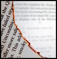
| 11/14/2003 01:23:06 PM |
fahrenheit 451by thelselComment: very nice. That glowin orange line really pops out of the simple b&w composition, the curve of the diagonal really suggest how the paper is being eaten up. I like the DOF - havinf the suggestion of more pages in the backgound work well - 9 |
| Photographer found comment helpful. |
| 11/14/2003 01:20:03 PM |
|
| Photographer found comment helpful. |
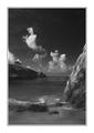
| 11/13/2003 09:49:47 PM |
Point Lobosby ronnersComment: Gorgeous B&W One to hang on the wall next to your Ansel Adams. nice range of grays. nice composition with differrent layers of depth and brightness. 10 |
| Photographer found comment helpful. |
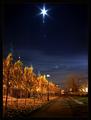
| 11/13/2003 09:46:39 PM |
Evening Starby mariomelComment: great lighting and colors! Those golden trees and that blue sky! A bit of glare in the lens, not a big deal. I like the path coming down to meet the viewer, the lighter line of clouds lower in the sky. Wish the buildings on the left weren't there, but they aren't too distracting. 8 |
| Photographer found comment helpful. |
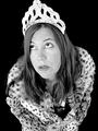
| 11/13/2003 09:40:57 PM |
grimm fairy talesby photogirl66Comment: I love the "grim" expression on your princess here. I liike the composition of her leaning out at the viewer, looking up - creates a nice oval shape, very contained in the black background, and frames the face well,. I wish her crown weren't cropped so tight at the top, and I might add a little black space to the left and above, for her to be looking into - the diection of the story kind of...I think it woud work better less grainy too - I don't mean to sound so critical I just REALLY like what you've done here and It has inspired me to see a few more details I's change. 8 |
| Photographer found comment helpful. |
| 11/13/2003 09:36:01 PM |
The Color of Moneyby PDavisComment: by stacking and spreading out the bills randomly and using a narrow DOF you have given 2D objects some thre dimesionality. |
| Photographer found comment helpful. |
| 11/13/2003 09:34:16 PM |
|
| Photographer found comment helpful. |
| 11/13/2003 09:33:18 PM |
Femme Fataleby magnetic9999Comment: I like how her face is in the shadows, and the white of the cigarette pops out of the darkness - 2 details of a very well thought out composition, well lit. 9 |
| Photographer found comment helpful. |
Home -
Challenges -
Community -
League -
Photos -
Cameras -
Lenses -
Learn -
Help -
Terms of Use -
Privacy -
Top ^
DPChallenge, and website content and design, Copyright © 2001-2026 Challenging Technologies, LLC.
All digital photo copyrights belong to the photographers and may not be used without permission.
Current Server Time: 07/22/2026 05:04:50 AM EDT.