|
|
|
Showing 391 - 400 of ~4058 |
| Image |
Comment |
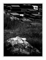
| 01/17/2009 09:37:21 PM | In Sand, we find our 'Rest'.by WeJayComment: This is Kari Ann, greetings from the Critique Club:
composition: A little cropping off the top of the image would have placed the grave in a more interesting spot. But, im in a tie here, because i like the background, and what it adds. so i think you did well.
color: love the colors, very dark and moody
contrast: again, very moody, and fits the subject beautifully
focus: perfect for the one grave in focus
depth of field: i like the aperture you used, sets the grave off beautifully from the surrounding death
lighting: stunning. the stone is highlighted just...stunningly!
other: I very much enjoyed critiquing this photo. I love dark, moody images that make you think and feel other than product shots that make you go, "wow,.....sand." Your process and different eye took this image to another level, and i hope the misunderstanding of the voters didn't let you down. I feel though, this was probably doomed from the first. Voters tend to look for almost copycat images of the challenge title, and don't give shots like this a chance. I have to agree with the border though, its not my cuppa tea Keep up the awesome work, and PM me if you have any further questions.
-Kari Ann Message edited by author 2009-01-17 21:45:15. |  Photographer found comment helpful. Photographer found comment helpful. |
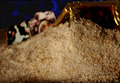
| 01/17/2009 09:28:11 PM | Photographer Cow discovers tomb at the beach!by snafflesComment: This is Kari Ann, greetings from the Critique Club:
composition: strange.
color: The blues are very strange, it dosent seem to tie into any other aspect of the photo.
contrast: a little strong on the background, but i like the contrast in the sand, very nice.
focus: good focus on the sand, sharp and crisp.
depth of field: Perhaps a smaller aperture would have been better, i find the cow and treasure chest out of focus is a distraction.
lighting: I actually like the lighting you did. Just wish more of it was in focus.
other: Some sort of editing line (clone, or heal brush) is visible around the cow and the "tomb". That's a big distraction. Overall, i wish a little more effort would have went into making this into a more acceptable photo. But, you got a ribbon (even a half of one counts for something), and that's more than I can say, so I'll just shush now. If you have any more questions, feel free to PM me.
-Kari Ann | | Photographer found comment helpful. |
| 01/17/2009 09:21:17 PM | Hoppin good time at the Beachby tangsooComment: This is Kari Ann, greetings from the Critique Club:
composition: the strong orange against the neutrals leads the eye to the frog, but he seems a bit out of place in the frame. Perhaps a different composition would have set him along a different line in the frame, making him more appealing.
color: reds are nice, yellows are vibrant, the greens are a little lost in the red though. but other then those minor nits, coloring is pleasing
contrast: pretty good, maybe more contrast between the red and sand to bring more interest.
focus: You got the focus dead on-great detail in those eyes
depth of field: I, along with another commenter, would have liked to see this with a smaller aperture used. i think the sand more in focus would have attracted nicer voters, and a higher score.
lighting: maybe toning down the brightness of the umbrella would have helped pull the eyes through the frame smoother. it kinda sticks out for me.
other: I find this photo humorous, it made me smile. I can also tell you had to put some time into catching that little critter. Kudos for that! The subject is something new and unusual, which is kinda risky with voters. They either love it or hate it. I feel they were a little harsh on you. Keep up the photography, don't let those voters get ya down! PM me if you have any other questions.
-Kari Ann | | Photographer found comment helpful. |
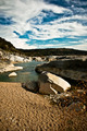
| 01/17/2009 09:12:45 PM | I shall wear white flannel trousers and walk along the beachby SchmeldontinoComment: This is Kari Ann, greetings from the Critique Club:
composition: very nicely framed with the grass in the corner, but i feel the sand in the bottom could have been cropped a little more, as its not a very interesting peace of the photo. But then again, i see why you kept it for keeping in the challenge guidlines. So, with that aside, i love it in portrait, very nice leading lines.
color: The colors work together very well. The greens compliment the blue sky nicely, and vise versa. sand is the perfect shade, which is hard to achieve.
contrast: perhaps a little more contrast between the water and rocks would have helped emphasize the lines.
focus: Perfect focus. good use of the small aperture, keeping everything from the grass to the far distant trees in focus.
depth of field: As noted earlier, nicely done.
lighting: everything is well lit, the shadows and textures in the sand are emphasized by the good lighting, and the sky is perfectly lit. great choice of time to shoot!
other: this is a good photo. voters probably voted it down a little because the minimal amount of sand in the bottom. But, i dont think that should have been an issue anyways, seeing as it was supposed to be how you incorporated the sand. Voters are odd like that though. Also, i think people got confused with the title. not even I am sure what It means! im sure you had good intentions though. keep up the good work, and hope to see you around more. PM me if you have any further questions.
-Kari Ann Message edited by author 2009-01-17 21:46:34. | | Photographer found comment helpful. |
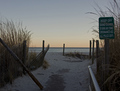
| 01/17/2009 09:04:10 PM | The Path To Lonely Beachby EssAreDubyaComment: This is Kari Ann, greetings from the Critique Club:
composition: A bit offputting with the horizon being dead center. maybe more of the path could have been included to tie in with the title better.
color: I love the neutral tones, very pleasing and just perfect for the scene
contrast: contrast could have been too soft for some, but I think it fits the mood quite well. a very peaceful and serene spot
focus: very nice and even across the entire scene presented
depth of field: I like the use of a wide aperture, it gives the photo a soft yet sharp look.
lighting: I would suggest the fill light as well, or a bump in shadows in photoshop. perhaps it would have given this photo more kick. but a very nice sunset in the background
other: All in all, i think this was a nice image. But nothing popped off the image or made me go, "WOA!". i think that's why most voters gave this an average or lower score. But, for technical processes props, you did very well in my eye. just try different compositions when viewing a scene, and give it a whirl. Hope this helped you some, if you have any more questions, feel free to PM me. keep shooting!
-Kari Ann |
| 01/17/2009 08:56:54 PM | "Don't let the world bring you down."by incubusComment: high five for us being awesome and using Incubus songs. Great interesting lighting, and i the focal length you chose, enough to keep your face sharp, but slightly denote your body. awesome job. love the song as well. | | Photographer found comment helpful. |
| 01/17/2009 08:21:39 PM | Linesby ColeyComment: coley, you continue to stun me. | | Photographer found comment helpful. |
| 01/15/2009 08:42:32 PM | | | Photographer found comment helpful. |
| 01/15/2009 08:39:48 PM | Heidiby JessiComment: agreed, very natural and lovely in black and whtie | | Photographer found comment helpful. |
| 01/15/2009 08:39:28 PM | | | Photographer found comment helpful. |
|
Showing 391 - 400 of ~4058 |
Home -
Challenges -
Community -
League -
Photos -
Cameras -
Lenses -
Learn -
Help -
Terms of Use -
Privacy -
Top ^
DPChallenge, and website content and design, Copyright © 2001-2026 Challenging Technologies, LLC.
All digital photo copyrights belong to the photographers and may not be used without permission.
Current Server Time: 06/16/2026 11:49:49 AM EDT.
|