|
|
|
Showing 341 - 350 of ~4058 |
| Image |
Comment |
| 01/26/2009 12:23:59 AM | Romulan Aleby stupidcatComment: i agree, the only thing bothering me is how forward her shoulder is (the one closest to the camera) its kinda obscuring the rest of the shot. But yes, im so glad to see your work improving! |  Photographer found comment helpful. Photographer found comment helpful. |
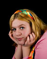
| 01/26/2009 12:22:57 AM | She sits, boredby stupidcatComment: WOW! look at that improvement! you did great on this one, its focused, and her pose is adorable. great job! | | Photographer found comment helpful. |
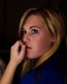
| 01/26/2009 12:22:10 AM | Heather-v5.jpgby incubusComment: her face looks a little on the red side, but otherwise, a very beautiful portrait of her contemplating. great work | | Photographer found comment helpful. |
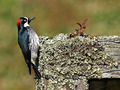
| 01/25/2009 09:06:58 PM | Life Formsby RgarciaComment: This is Kari Ann, greetings from the Critique Club:
composition: the use of the rule of thirds works well here, putting the bird into the cross hairs of two intersections. but maybe having it positioned a little lower in the frame would have helped the eye focus on it more.
color: nice rich colors, and i like the soft pale greens you were able to retain in the picture in the moss.
contrast: good contrast on the wood, but it almost overpowers the woodpecker, making my eyes sporadically move from one to the other.
focus: seems almost a little out of focus, by the increased amount of sharpening and USM.
depth of field:good depth of field, that background is so silky smooth
lighting: good lighting, but maybe a little too much light on the wood, again, it starts to overpower the woodpecker.
other: overall, a nicely done image, with a few distractions. the wood is a major contender for the spotlight in the photo, making the eye not sure of where or when to rest. also, the halo around the bird (particularly along his backside) is easily avoidable. You have some amazing work in your portfolio, keep it up. i always enjoy perusing aruond it in the wee hours of the morning, it really inspires me. If you have any other questions at all, you are more than welcome to PM me anytime.
-Kari Ann | | Photographer found comment helpful. |
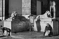
| 01/25/2009 08:57:30 PM | Life is where you areby Rino63Comment: This is Kari Ann, greetings from the Critique Club:
composition: a very balanced image, the man and dog compliment each other to a T.
color:black and white was the way to go with this image, i am so glad you chose it. It adds such a dramatic narrative to the image, almost as if it never existed at all
contrast: the way you handled all the unique shadows and highlights is amazing. nothing is lost in shadow, yet nothing is overexposed.brilliant.
focus: nice and sharp, able to decipher all the detail
depth of field:being able to see all the way back in the courtyard behind makes this image even more mysterious and looming
lighting: the harsh lighting was controlled wonderfully in this image, as i stated before, its really an acheivement to capture this kind of light.
other: i wish this would have scored higher, but this is one of those gems that people underrate without taking a moment to really sink their teeth into the image, really processing what is going on, and how awesome it is. I hope your glad how this came out, its a real beautiful shot. If you have any other questions, feel free to PM me anytime.
-Kari Ann | | Photographer found comment helpful. |
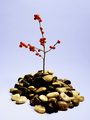
| 01/25/2009 05:58:30 PM | Island of Hopeby Schnitzer17Comment: This is Kari Ann, greetings from the Critique Club:
composition: the centered composition adds to the image in this case, and the leading pebbles up to the little tree add interest
color:strong, vibrant colors work well against the pale blue backdrop
contrast: contrast in the rocks is a little too dark imo, loosing some of their detail
focus: great focus on the tree, its nice and sharp
depth of field: as  tygerr tygerr said, a deeper DOF would have helped this image. All the pebbles in focus would have pulled the viewer in and made them look for longer
lighting: good lighting, but the small shadows underneath the pebbles are a little distracting
other: I feel this image is extremely zen. I feel at peace when looking at it, and congratulate you in capturing such an inspiring photo. With a few more tweaks here and there, I feel this could have been much higher in the ranks. glad to see you here on DPC, and keep up with the challenges and expanding your horizons. I hope to see you around here more, and see what you can come up with. if you have any more questions, feel free to PM me whenever, anytime.
-Kari Ann | | Photographer found comment helpful. |
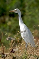
| 01/25/2009 05:52:55 PM | Stalkerby OmanOtterComment: This is Kari Ann, greetings from the Critique Club:
composition: the bird is set in a good spot in the frame, right along the rule of thirds. the out of focus weeds in front also help to the composition by filling up the negative space.
color:vibrant and rich, great work
contrast: good, not overpowering, but enough to separate the subject from the background
focus: sharp and awesome.
depth of field: shallow depth of field was used beautifully here, sets the subject off just enough
lighting: a little bit harsh on the birds neck and head.
other: overall, a well accomplished photo of a hard to capture bird. I think what may have been your downfall is entering just another bird shot. Try looking through all past winning bird photos. They mostly depict the animals in movement, or at an interesting angle. But props on the find, its a beautiful bird. I hope to see more of your Africa Shots, your donig great so far. If you have any other questions, you are more then welcome to PM me.
-Kari Ann |
| 01/25/2009 05:47:39 PM | Why are they looking at me?by tangsooComment: This is Kari Ann, greetings from the Critique Club:
composition: the position of the eyes in frame works wonderfully to pull the viewer in.
color: a little on the desaturated side, but i feel it adds to the sadness of the photo
contrast: more contrast should have been added to make the photo pop more, and introduce more feeling into the photo
focus: on the soft side, through glass? manual focus could have helped that out
depth of field: good, but more in focus would have helped analyze this part of the image
lighting: soft, natural lighting works very well here.
other: i can see a lot of potential in this shot, but it has a few flaws that are very distracting. The focus is off, for one, perhaps if you could have leaned up against something it would have helped the camera focus better. the flat contrast, for two, makes the image very boring. but, you did find a great moment in time to press the shutter. Those eyes are staring into my soul, with questions that I cannot answer. Why do we lock up animals for the sake of us being able to stare at them through glass? That, i may never know. but, as  dahkota dahkota said earlier, i think it was your equipment that set you back, not your eyes. Keep up the good work, I hope to see more of your work in the future, and be able to comment on it. If you have any more questions, you are more than welcome to PM me anytime.
-Kari Ann | | Photographer found comment helpful. |
| 01/25/2009 05:40:10 PM | Preludeby hazeComment: This is Kari Ann, greetings from the Critique Club:
composition: perhaps the arm a little lower in frame would have helped this composition wise. it feels too scrunched to the top
color:the reds are a little strong in some parts, so toning those down would help, that or converting all the way to b/w or sepia would be strong as well
contrast: good contrast between the background and the arm
focus: precise focus, and i know it must have been hard with a mother trying to hold her daughter in that position for awhile or so.
depth of field: seeing as its not a real issue for this image, i'll skip this
lighting: nice lighting, a little bright on the mothers wrist, but not enough to cause a distraction
other: overall, the parents must have been trhilled with this shot. its beautiful, and lit wonderfully. a little more interest composition wise would have really sold this for me, and as another commenter suggested, less sleeve would have been an improvement as well, great job. If you have any other questions, feel free to PM me.
-Kari Ann | | Photographer found comment helpful. |
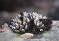
| 01/25/2009 05:25:56 PM | Centerpieceby jnenvirComment: This is Kari Ann, greetings from the Critique Club:
composition: too center, try different compositions to grab the eyes and make them want to look at it
color: a little dull, perhaps a bump in saturation or more background color would have enhanced it.
contrast: good contrast, a little more on the subject couldn't of hurt though
focus: good focus, nice and clear on the subject
depth of field: i am liking this shallow depth of field, really gives a sense to how small this is
lighting: too flat, needs a bit more variety to spice things up a bit.
other: As other commenters said, this lacked in a lot of ways. The composition is really lacking in anything creative, its right in the middle with no leading lines to help the eye stay focused. a rule of thirds position may have helped this. Second, the subject was hard to understand and did not pack enough punch to make the viewers even care about what the picture is of. and third, the light is way too normal and bland for this type of subject, it needed some back lighting, or 3/4 lighting to show off more interesting textures. I hope this doesn't sound too harsh, im just trying to help you improve. Another viewer commented on how a closer crop or a macro shot of this would have been better. I agree, a more abstract or diverse angle on this situation could have helped your score ten fold. Keep on trying new and different approaches to your photography, and if you have any other questions, feel free to PM me anytime.
-Kari Ann |
|
Showing 341 - 350 of ~4058 |
Home -
Challenges -
Community -
League -
Photos -
Cameras -
Lenses -
Learn -
Help -
Terms of Use -
Privacy -
Top ^
DPChallenge, and website content and design, Copyright © 2001-2026 Challenging Technologies, LLC.
All digital photo copyrights belong to the photographers and may not be used without permission.
Current Server Time: 06/15/2026 04:08:14 AM EDT.
|