| Image |
Comment |
| 02/01/2008 01:51:07 PM |
|
 Photographer found comment helpful. Photographer found comment helpful. |
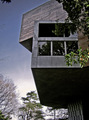
| 02/01/2008 01:50:19 PM |
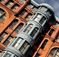
Lewis' Boxesby mcieslakComment: I believe getting closer or cropping closer could enhance your picture.the branches on the left and right are not really adding anything. on the other side - I like the reflection of the trees in the windows, gives it some nice depth. somehow a bright halo creepted into your pic. I don't think it comes from oversharpening as the branches don't have the halo. |
| Photographer found comment helpful. |
| 02/01/2008 01:46:06 PM |
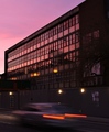
Old Townby VenomComment: I like the timing of your picture: tha sky is not black but has some interesting colors and cloud features. excellent night shot. |
| Photographer found comment helpful. |
| 02/01/2008 01:45:04 PM |
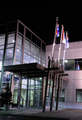
Sunset collegeby jellybellyComment: good timing of your exposure. you could capture one car with its motion blur. I have to admit this is the one part of your picture that caught my eye. |
| Photographer found comment helpful. |
| 02/01/2008 01:42:43 PM |
|
| Photographer found comment helpful. |
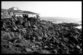
| 02/01/2008 01:34:18 PM |
Tea Houseby pacpintoComment: I can't say I like the subject too much, but I like your capture regarding exposure, DOF, sharpness. Even hiding the details of the horizon by brightening up the area adds an interesting touch. |
| Photographer found comment helpful. |
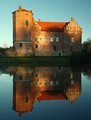
| 02/01/2008 01:30:26 PM |
Torup castleby birkinComment: lovely centered and mirrored display. most photogs would have taken the shot earlier with no shadows on the castle, but I like the beak up of the wall by the shadow. |
| Photographer found comment helpful. |
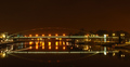
| 01/31/2008 10:39:29 PM |
The Bridgeby david1707Comment: It's very hard for me to find the right words. So please take it as my impression, what I see in your shot. Although you have real strong colors and an interesting object, I don't receive what you tried to accomplish. If it's for the colors, then there is too much black and darkness in your picture. If it's about composition, it's neither centered, nor symetrical. If it's about lines, there are too many interruptions , e.g. in the reflection of the arc, the line of light covered by the trees. I'm not sure that the position you took the picture is the best one to show off this bridge in its beauty. You might consider going back and reshooting, e.g. showing the traffic over the bridge and framing the traffic with the bridge. Having the arc crossing diagonally through the picture, something unusual about the bridge, not just as it spanns the river. Just some initial thoughts looking at your picture. |
| Photographer found comment helpful. |
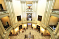
| 01/31/2008 10:29:34 PM |
The Rotundaby elemessComment: I like your composition for 2 main reasons: nicely balanced and symetrical, the secon part is the discribution of light: bright in the center and then getting darker to the outside. |
| Photographer found comment helpful. |
| 01/31/2008 08:21:21 PM |
|
| Photographer found comment helpful. |
Home -
Challenges -
Community -
League -
Photos -
Cameras -
Lenses -
Learn -
Help -
Terms of Use -
Privacy -
Top ^
DPChallenge, and website content and design, Copyright © 2001-2026 Challenging Technologies, LLC.
All digital photo copyrights belong to the photographers and may not be used without permission.
Current Server Time: 06/26/2026 06:38:54 PM EDT.