| Image |
Comment |
| 07/11/2004 04:19:18 PM |
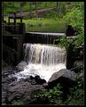
Water Power Good for the Natureby MonaComment: In terms of your 'ad copy', I think there is an ESL difficulty. That kind of ruins the advertisement qualityt of this photo, which didn't have much to begin with.
Photographically, it is a bit high contrast. There are very few middle values. |
 Photographer found comment helpful. Photographer found comment helpful. |
| 07/11/2004 04:16:56 PM |
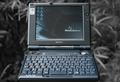
Outdoor Typeby MAKComment: The selective desaturation ruins the outdoor feeling since we can't see the green grass. Weird choice for this. The product is prominently displayed but in a pretty boring way. The cropping at the lower edge is too close. It looks like the laptop is falling off the edge of the frame. |
| Photographer found comment helpful. |
| 07/11/2004 04:15:19 PM |
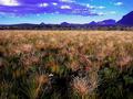
Chapada dos Veadeiros - Brasilby DoMoreiraComment: This is way too small, for starters. You are allowed a 640 pixel maximum. I suggest you take advantage of it next time. As for the challenge, I don't understand what is being advertised. Tourism? The blue in the clouds and the mountains looks bizarrely unreal. |
| 07/11/2004 04:13:58 PM |
The Source of Our HONEY..!by ridvanerkanComment: As the text referring to the clover (one source of honey) or the bee (the only source of honey I know of)? This doesn't really say 'advertisement' to me since there is no actual product being displayed. In a real ad I would expect to see the honey. This photo says to me, the participant couldn't think of anything better and entered a bee/flower photo instead. |
| Photographer found comment helpful. |
| 07/11/2004 04:11:37 PM |
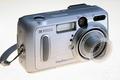
Kodak EasyShare DX6340by BooZonComment: I don't understand the transparent area over the lens. Is that a lens cover or is it a blurred effect showing the lens zooming? I don't know enough about the product to tell. The lighting is good and the product is prominently, if rather uninterestingly, displayed. |
| Photographer found comment helpful. |
| 07/11/2004 04:09:25 PM |
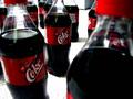
Cherry coke surplusby altoidgreenComment: This seems rather derrogatory for advertisement. A surplus suggests people aren't buying the product. It's a rather random looking composition although kind of interesting in a weird way. |
| 07/11/2004 04:07:31 PM |
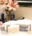
So Fresh & So Cleanby timganierComment: It looks like you set this up in front of your dishwasher or some other big appliance. Not a great choice for a background. I don't understand the choice to show two boxes. The box on the left is just more business in an already busy composition. A single (REAL) flower, the suds, soap, and one box would have been much more effective. The swans and silk flower arrangement are just kind of cheesy looking. After viewing it for awhile, a finally get that the background I'm seeing is the bathroom tile and the lower edge of a mirror. I was seeing the mirror as a chrome handle on an appliance.
Next time, create a still-life on a table against a simple background (matte white paper or poster board) with only the product and one or two other items (like flowers, petals, etc.). |
| Photographer found comment helpful. |
| 07/11/2004 04:01:36 PM |
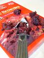
Right Out of the Boxby aguinnComment: Brownies should look much tastier than this. This looks rather yucky and unappealing. The fork seems to be the main subject which is not good for advertising. The viewer should be able to see the entire label of the product. The composition is just weird. After viewing it for a couple of minutes, I've only just realized that the fork is poking into a hole in the box. This foreshortened view was a bad choice. The cropping is far too narrow. The image itself is too small. Next time, take advantage of the 640 maximum DPC allows. |
| 07/11/2004 03:58:18 PM |
Water You Waiting For?by Sharpie1kComment: I can't see the product label clearly. I don't understand the choice to crop the bottom of the glass. This is not a great liquid shot. The water looks murky and unappetizing. This is quite overexposed. The blown-out bottle almost disappears into the blown-out sky. |
| 07/11/2004 03:56:10 PM |
|
| Photographer found comment helpful. |
Home -
Challenges -
Community -
League -
Photos -
Cameras -
Lenses -
Learn -
Help -
Terms of Use -
Privacy -
Top ^
DPChallenge, and website content and design, Copyright © 2001-2026 Challenging Technologies, LLC.
All digital photo copyrights belong to the photographers and may not be used without permission.
Current Server Time: 07/23/2026 09:08:40 PM EDT.