| Image |
Comment |
| 03/17/2007 09:19:55 AM |
Don't let them fade away.by MarkComment: This is a fantastic photo but imo would look better with no grain. At the moment, the grain is too similar to the texture of the fur and I feel, adds nothing to the photo. Great composition though, especially the way he is looking over his shoulder at the camera. |
 Photographer found comment helpful. Photographer found comment helpful. |
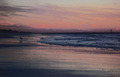
| 03/17/2007 09:17:14 AM |
out for a skate...by ralphComment: I think this is an amazing image! I like the placement of the main subject in the bottom right corner and the blue/red colour scheme. The out of focus, people in the background have an impressionist/painterly feel which I find really beautiful. It would be interesting to see this photo without the grain and maybe in b&w, although I think losing the blues and reds would actually detract from the photo. This is one of those images I could look at again and again. There is actually a great impressionist image 'lurking' in the top of this photo. Just thinking, if you cropped just under the skates of the man with the blue jumper around his waist, then cloned out the girls head and the 'half' man on the right......hmmmmm. |
| Photographer found comment helpful. |
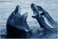
| 03/17/2007 09:04:20 AM |
Seals In Conflictby ndsComment: Great action shot! The blue hue makes the water seem really cold but I'm not too sure if I like it. I would like to see this photo in b&w to decide. Nevertheless, it is still a great shot! |
| Photographer found comment helpful. |
| 03/17/2007 08:56:19 AM |
Lil' Spotby quiet_observationComment: I like the mood created by the colours and grain but would have preferred to see someone walking 'into' the scene on the left rather than 'out' on the right hand side. I feel including the sidewalk would also have improved the photo. |
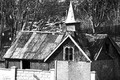
| 03/17/2007 08:53:11 AM |
Still Standing; Justby GrandadComment: For me, the crop on this photo feels a bit tight, especially only including half of the wall in the front. Maybe you should have demolished the wall in front alltogether. Lol. Sure no-one would have noticed! The grain is good though and suits the subject matter although there are some blown out highlights on the bottom left and on the 'chimney'. |
| Photographer found comment helpful. |
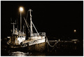
| 03/17/2007 08:49:47 AM |
1938by HizzleComment: I really love this picture but for this challenge, I feel the grain is not evident enough. The only areas where I can see real grain is around the lights. The composition is excellent though as is the tonal range. Well photographed! |
| Photographer found comment helpful. |
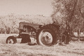
| 03/17/2007 08:48:15 AM |
Bad day on the north 40.by seeComment: Good grain and subject matter but imo the image does not have a good tonal range and feels a bit washed out. |
| Photographer found comment helpful. |
| 03/17/2007 08:46:52 AM |
The Ludgate Furyby shenanigansComment: I like the tight crop and the eyes staring straight into the lens, almost defiantly. Would have liked to see more grain but I think the tonal range is good. |
| Photographer found comment helpful. |
| 03/17/2007 08:44:39 AM |
Seagullby veganmegan23Comment: Personally, I don't usually like colour with grain, but this one works really well with the blue and purple hues. I would suggest a shift in the horizon though, either higher or lower, depending on whether the sky or foreground was the most interesting as I feel it is too close to the centre of the photo. |
| Photographer found comment helpful. |
| 03/17/2007 08:41:51 AM |
moew I take a picture?by emyleoComment: I love the grain and shallow depth of field but would have preferred to see the cats head. Good thinking on the title! |
Home -
Challenges -
Community -
League -
Photos -
Cameras -
Lenses -
Learn -
Help -
Terms of Use -
Privacy -
Top ^
DPChallenge, and website content and design, Copyright © 2001-2026 Challenging Technologies, LLC.
All digital photo copyrights belong to the photographers and may not be used without permission.
Current Server Time: 07/16/2026 06:18:03 PM EDT.