| Image |
Comment |
| 08/23/2004 04:30:00 AM |
A subtle patience by heidaComment: A nice shoot here overall.
I think the idea and lighting is great - her hand position equally as good. The things that let this image down is the face position and softness. To me she looks very uncomfortable bending her neck like that - it's putting a strain which shows in her face. If she was in perfect profile I feel this would be much stringer composition wise.
Apart from that, i do like it, and I like the edge burning bringing your eyes into the middle.
|
 Photographer found comment helpful. Photographer found comment helpful. |
| 08/23/2004 04:26:50 AM |
Black Mistby NatatorComment: Great lighting here - really like the spot behind her - giving her a defined edge.
The tones and colors are ideal, and almost a grainy feel which i like a lot.
My only dislike is the way in which the fabric has been placed - I like the textures that come with it, but in the middle it's so creased up it looks like tissue paper which gives at an amature feel to an otherwise professional looking shot.
More careful positioning would aid this image. Maybe nice to have it covering her whole body as it does give off great textures and tones.
|
| Photographer found comment helpful. |
| 08/23/2004 04:23:19 AM |
Squeeky Cleanby HeavyComment: Is this your shower door? If so then it's pretty funky. If not then I can't see why you have done that.
The two parts don't seem to bond well together in my opinion. I think the shower door (the white part_ would have worked quite well on it's own as it contains a very strong pattern.
|
| Photographer found comment helpful. |
| 08/23/2004 04:21:21 AM |
Self-Censoredby annasenseComment: I really like your idea here - very much indeed!
Kind of punky, rorcky type idea which works very well. But i think the execution has let it down - the white sheet I feel should eb pure white, as it is it looks like a bed sheet which really hinders a photographan nd gives it a real amature feel.
Perhaps in black and white with some more contrast would help it. |
| Photographer found comment helpful. |
| 08/23/2004 04:18:34 AM |
mother natureby SeanachaiComment: Quite a Nice composition, kind of statue-esq if you like. I am guessing that is why you decided to make her Grey? I think this scene has a lot of potential, but that has been wasted by the selective desaturation.
The right arm behind the back looks uncomfortable. |
| Photographer found comment helpful. |
| 08/23/2004 04:16:39 AM |
Fantasy Glovesby NodeComment: The first thing that strikes me is where do I look? My eyes seem to wander all over this shot.
Quite an interesting photograph, but not one that is for me unfortunately.
I don't really understand why a hand has been painted on a plastic dummies breast, or why a straw hat appears at the top.
Looks like you placed a lot of effort into this photo though - which is nice to see. |
| Photographer found comment helpful. |
| 08/22/2004 12:30:22 PM |
Reach for the sky by smokeditorComment: Very well lit!
Nice and sharp flooring, and glass is well defined. Subject a little bland for me, but the lighting and composition make it a lot more pleasing to look at.
Good work! |
| Photographer found comment helpful. |
| 08/19/2004 11:45:01 AM |
Graceby arpitaComment: Greetings from the Critique Club Arpita
Only your 3rd challenge and another fine effort again.
The first thing that strikes me about your image is the bracelets on the feet - they add so much to this shot and a lot of others didn't think to dress their feet at all, so my full marks for that alone.
The lighting is subtle, yet warm and nice - the direction from the right really brings out the anklet, and end of feet nicely.
Composition wise i feel could be improved upon - there is a lot of wasted black space at the top right which i feel is unnecessary. A tighter crop - perhaps in square format would be more effective IMHO.
Overall I think 5.6 was a fair score, and i really look forward to critiquing and viewing you images again.
Good luck
JP |
| 08/19/2004 11:41:15 AM |
bigFOOTby AngelisComment: Hey greetings from the Critique Club Angelis
I see i commented on this during the challenge ;)
Again i think it's a brave effort to go with something different - however if your after a big score one must be as obvious as one can be to cover all voters perception of the topic.
That aside, the image shows some nice action and is pretty well focused. The composition leaves me a little flat though, perhaps moving to the side a little would have shown the front end of the truck and this made it more 3D - as it is the truck is quite flat and dimensional.
The colors are subdued which gives it a nice hazy feeling.
Overall i would say that 4.39 is a bit lower than I think it should deserve in general -I would imaging you lost at least 1 whole point for it not being a human foot,
JP |
| 08/19/2004 11:37:06 AM |
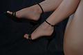
Leggyby rameviComment: Greetings from the Critique Club ;)
Ramon, I think your idea is very nice, the legs are soft and the skin is smooth;) Quite a sexy scene.
However their are a few things with the photograph that I think could be improved upon.
The first thing is the focusing - I imagine your intended focal point is the shoes / feet considering this is a feet challenge, yet they are very soft which is a real shame.
There is a lot of detail in the shoes which really needs to be pin sharp to show it's full detail.
The second thing is the background. Now I may be wrong here, but most people go for a pure black background - if that was your intention then you needed to under expose a stop or two as i can see the ripples and creases.
Finlay, the overall exposure is a little under exposed on the legs, a quick fix in photoshop would be to adjust the levels which would sort it out. To get it right in camera I would have shined less light on the background, and a little more on the models legs.
Overall I find 5.7 a fair score and a worthy effort.
JP |
| Photographer found comment helpful. |
Home -
Challenges -
Community -
League -
Photos -
Cameras -
Lenses -
Learn -
Help -
Terms of Use -
Privacy -
Top ^
DPChallenge, and website content and design, Copyright © 2001-2026 Challenging Technologies, LLC.
All digital photo copyrights belong to the photographers and may not be used without permission.
Current Server Time: 07/17/2026 11:38:16 AM EDT.