| Image |
Comment |
| 08/24/2004 06:05:12 AM |
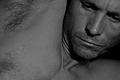
No More Viagra From Chernobylby kadac00Comment: Lol, for humor thios rocks - photo quality isn't all that as i am sure your aware, but then if it was it wouldn't be as effective.
Expression is simply perfect! 10 |
 Photographer found comment helpful. Photographer found comment helpful. |
| 08/24/2004 06:04:30 AM |
|
| Photographer found comment helpful. |
| 08/24/2004 06:03:51 AM |
Roughby flip89Comment: focus and quality ruin an otherwise greatly composed shot. |
| Photographer found comment helpful. |
| 08/24/2004 06:03:26 AM |
Sweet Dreamsby BobsterLobsterComment: Very cool and pop-esq, but don;t like the red cast maybe a little less red or a darker red would suffice.
Apart from that, a very grand picture. |
| Photographer found comment helpful. |
| 08/24/2004 06:02:39 AM |
Body checkby kiwinessComment: Mmmm this model seems vaguely familiar..
Very nice pose and composition - I like the way the vagina is just out of sight - with it may have cheapened it somewhat. The lighting is OK -I would prefer more shadows casting across for some definition, but that's just me.
Nice skin tones and model.
A big fat 10. |
| Photographer found comment helpful. |
| 08/24/2004 06:00:48 AM |
Red Lingerieby DrJOnesComment: Mr Jones i presume. That is guessing by breast size shape and definition not photography :D
Well I don;t need to critique or comment on this surely. You know it's good and well lit etc so i shant bore you with my drivel.
One thing i personally dislike is the sand / grit (maybe it's even water?) on her breasts. I like my breast smooth and soft so that doesn't work for me.
Apart from that everything else rocks dude you have my ten
|
| Photographer found comment helpful. |
| 08/24/2004 05:57:54 AM |
|
| 08/24/2004 05:57:11 AM |
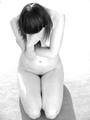
36 Weeks Pregnantby nathaliedooComment: fantastic photograph - but way to light. Needs at least a Little contrast to give some definition. The border has more definition than the photo which can never be a good sign.
Such a shame as everything else - lighting, pose, composition is perfect.
What a waste of potential I see before me - gutted.
Edit: After looking some more i think it would be OK like this if it were not for the border being so much stronger than the image. A nice White would be perfect.
|
| Photographer found comment helpful. |
| 08/24/2004 05:54:20 AM |
aloneby brunasComment: very badly focused - not sure if that was intended or not, if it was I don't really see the need for it. A bit too high-key for the subject here. I would expect it to be darker for a photo entitled alone.
The floor was a bad choice, it's pure white at the back and dark at the front with no real detail.
I would suggest a reshoot that involved a better location like an old hut or crouched against the bottom of a wall / chair as in real life. Having her floating nowhere is a bit odd.
The pose and model are great though -as is the message.
|
| 08/24/2004 05:51:21 AM |
|
Home -
Challenges -
Community -
League -
Photos -
Cameras -
Lenses -
Learn -
Help -
Terms of Use -
Privacy -
Top ^
DPChallenge, and website content and design, Copyright © 2001-2026 Challenging Technologies, LLC.
All digital photo copyrights belong to the photographers and may not be used without permission.
Current Server Time: 07/17/2026 12:25:31 PM EDT.