| Image |
Comment |
| 01/27/2004 11:59:38 PM |
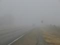
Speeding Into Oblivionby illit-AfflictionComment: One must ask oneself why on earth doesn't this person have his lights on??? He must be one of my fellow Californians. As a group we don't have the road sense of an opossum. (Which are found dead on the road around here all the time) |
 Photographer found comment helpful. Photographer found comment helpful. |
| 01/27/2004 11:56:27 PM |
Low 80'sby cainnComment: It took me ages to figure out what you meant. Of course once I did it becomes all too obvious. The photo is nice and sharp but I think a little dark behind the clubs. I think also that removing the dirt and scratch marks would improve the photo. Creative and clever though. |
| 01/27/2004 11:51:55 PM |
Confusedby MarjoComment: Clear and bright but just a tad too tight in the crop. A little more room on the left and bottom would be nice. |
| Photographer found comment helpful. |
| 01/27/2004 11:49:45 PM |
Halted Developmentby jcordinaComment: I've waffled on this for some time now. While I think you make a very strong statement with this photo, in the end I think I must vote for the spirit of the challenge. As such I don't think this image meets the challenge because there isn't a road sign. As for the photo itself I very much like the concept. I have two minor issues though. First is the relatively shallow DOF. I would prefer a tighter aperture and the same level of sharpness in the fore and backgrounds. The second issue is the strong line of the pole and the building mirror each other and are too close. If you came around slightly to the right you could have both virticles but the added distance between them I think would make the image overall stronger. Have you considered a B&W version? It seems it like it would be appropriate for this type of image. |
| Photographer found comment helpful. |
| 01/27/2004 11:40:59 PM |
KEEP LEFTby mrblobbyComment: While I like the idea the execution could be a little better. The main problem is the over exposure of the signs. A shorter flash duration might help there. It's hard to say because they are so reflective. A slight bump in contrast and some sharpening should help bring out the signs as well. Perhaps an even longer shutter to get more of the "crazy" lights would increase interest as well. As I said a very solid concept. I wouldn't hesitate to keep at this. |
| Photographer found comment helpful. |
| 01/27/2004 11:37:32 PM |
Stopby Crafty SueComment: This is much too grainy, soft, and bland in composition. Was digital zoom used? If so I would avoid that in future shots. High ISO? If so I would use the lowest ISO your camera has and use a tripod to reduce noise to the lowest possible levels for your camera. I would also try to find something unique in either the setting or the sign itself and try to more clearly show that or those elements you found interesting. |
| 01/27/2004 11:34:07 PM |
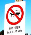
21º Century - No Chariots Allowedby GoodEndComment: I don't know if it happened in camera or in post but this is seriously over-saturated. Looks like what ever smoothing action or program you've used has also made the edges of the sign go completely fuzzy. Compositionally there just isn't much here. A straightforward shot of the sign from what appears to be from a typical adult viewpoint. The sign itself is certainly something you don't see every day. A more interesting angle, perhaps showing some of the surroundings, would improve the shot as well as reducing the over done processing. |
| 01/27/2004 11:30:11 PM |
|
| 01/27/2004 11:26:21 PM |
|
| Photographer found comment helpful. |
| 01/27/2004 11:18:38 PM |
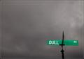
"Sign of a Dulled Existence"by Nowhere_ManComment: Very appropriate sign. I like the contrast between the green and the gray. A little noisy in the sky but not a distraction. I like the very low placement of the sign in the frame. Well done. |
| Photographer found comment helpful. |
Home -
Challenges -
Community -
League -
Photos -
Cameras -
Lenses -
Learn -
Help -
Terms of Use -
Privacy -
Top ^
DPChallenge, and website content and design, Copyright © 2001-2026 Challenging Technologies, LLC.
All digital photo copyrights belong to the photographers and may not be used without permission.
Current Server Time: 07/16/2026 02:54:38 AM EDT.