| Image |
Comment |
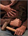
| 06/14/2005 07:41:11 PM |
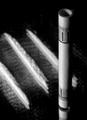
Pat and Jillyby Bear_MusicComment: Nice color and good sharpness. The third hand seems out of place, doesn't really add much to the photo except to fill negative space. Might better be filled with a tool belt slung over the shoulder or some other topical prop. |
 Photographer found comment helpful. Photographer found comment helpful. |
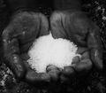
| 05/26/2005 12:59:47 AM |
Salt Of The Earthby naomikComment: The center of the salt pile seems to wash out. I would like this better if it had the same sense of rich detail as the hands. |
| Photographer found comment helpful. |
| 05/26/2005 12:57:24 AM |
|
| Photographer found comment helpful. |
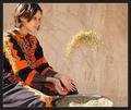
| 05/26/2005 12:55:57 AM |
Spice Up Your Life!by glodaComment: Outstanding image! If I had to change one thing it would be to add grit to the body as well but even so this is one of my top two picks for this challenge. |
| Photographer found comment helpful. |
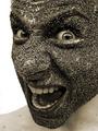
| 05/26/2005 12:54:28 AM |
Blowby danderson107Comment: Great photo. I hope it isn't marked down by the Puritans on this site. |
| Photographer found comment helpful. |
| 05/26/2005 12:49:09 AM |
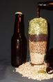
Grain & Hopsby hopnjohnComment: As a homebrewer the subject is obviously of interest to me but the photo itself I find lacking.
I think this would have been better on a light background instead of dark. The glare from the flash on the glass and bottles is troubling. I think if you cleaned the glass so it didn't look so dirty and used multiple well diffused lights set to the sides and back rather than the front you'd get a better shot.
I would also change the backdrop material and placement. Right now the ripples in the fabric draw attention and because subject is so close to the background you get some really harsh shadows. Moving them forward several feet at least will lessen the shadows. Then using proper lighting you can eliminate them all together.
You may also want to consider spreading out the grains at the base. Having a few extra grains sprinkled around might look a little more natural.
Looking at the photography in beer ads and magazines like BYO and Zymurgy (which you probably already have) will give great hints as to how to light this sort of scene. |
| Photographer found comment helpful. |
| 05/25/2005 12:10:13 AM |
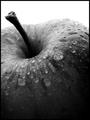
Apple B&Wby theDEFComment: I gave this a 10, I assumed it would also be in the top 10. Looks like I jinxed another photo. |
| 05/24/2005 11:23:52 PM |
|
| 05/24/2005 11:15:51 PM |
|
| 05/24/2005 04:40:07 AM |
Reaching for the skyby PhilipDyerComment: I think perhaps this is a little underrated. There's a little blotchyness in the sky but overall this is a very compelling photo. |
| Photographer found comment helpful. |
Home -
Challenges -
Community -
League -
Photos -
Cameras -
Lenses -
Learn -
Help -
Terms of Use -
Privacy -
Top ^
DPChallenge, and website content and design, Copyright © 2001-2026 Challenging Technologies, LLC.
All digital photo copyrights belong to the photographers and may not be used without permission.
Current Server Time: 07/16/2026 04:53:01 AM EDT.