| Image |
Comment |
| 02/22/2007 08:35:27 PM |
Crossing the lineby CraftyComment: I'm not a big fan of images with their heads cut off (no pun intended, or, then again, maybe there was). Seriously, showing the expression on the face would have helped here. Nice exposure, sharp focus, good idea. |
 Photographer found comment helpful. Photographer found comment helpful. |
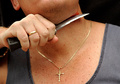
| 02/22/2007 08:34:11 PM |
i hate him!by LoreComment: Would have worked better to show the picture of the guy you're burning; showing the back of the photograph doesn't work. Maybe with a blurred image of yourself in the background, doing the burning, which would have added some more visual interest to the composition. Not sure if the grain (noise) is by choice but I can see how it might work here. If it wasn't by choice, lower your ISO if you can. |
| 02/22/2007 08:28:42 PM |
|
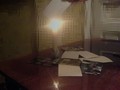
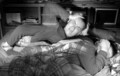
| 02/22/2007 08:27:59 PM |
I hate waking up early!by cajayComment: Nice exposure, but what throws it off for me is that his arm is coming down from above, which makes it look he's standing next to the alarm clock, rather than sleeping next to it (and hating to hear it go off), in which case the arm would have been on the same plane or slightly below the clock. Maybe a shot with the arm extending out from just under the lens towards the clock would have worked better. |
| Photographer found comment helpful. |
| 02/22/2007 08:25:22 PM |
|
| Photographer found comment helpful. |
| 02/22/2007 08:24:22 PM |
|
| Photographer found comment helpful. |
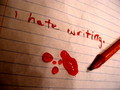
| 02/22/2007 08:23:43 PM |
A Wakeup Callby idnicComment: Nice composition, although I doubt that someone sending that message would have had such nice penmanship! |
| Photographer found comment helpful. |
| 02/22/2007 08:22:05 PM |
|
| Photographer found comment helpful. |
| 02/22/2007 08:19:23 PM |
|
| 02/22/2007 08:18:18 PM |
Insomniaby Sting11165Comment: Good use of multiple exposures and nice composition. Only thing I would suggest is that for the shot on the left to have kept the eyes open, since it would have conveyed insomnia better (looks like he's sleeping over there). |
| Photographer found comment helpful. |
Home -
Challenges -
Community -
League -
Photos -
Cameras -
Lenses -
Learn -
Help -
Terms of Use -
Privacy -
Top ^
DPChallenge, and website content and design, Copyright © 2001-2026 Challenging Technologies, LLC.
All digital photo copyrights belong to the photographers and may not be used without permission.
Current Server Time: 06/23/2026 01:01:57 PM EDT.