| Image |
Comment |
| 05/20/2007 02:24:41 PM |
|
 Photographer found comment helpful. Photographer found comment helpful. |
| 05/20/2007 02:24:09 PM |
Deep Purple Lullabiesby xtianComment: Nice image, and good processing choice for an album cover. looks more like a line drawing than a photograph, but works for me. 7 |
| Photographer found comment helpful. |
| 05/20/2007 02:23:15 PM |
designing perfect livesby bdennyComment: This is a very cool idea and image ... reminds me of something the talking heads would do. Focus is too soft on the pills, or I would have scored this higher. 7 as it is. |
| Photographer found comment helpful. |
| 05/20/2007 02:22:15 PM |
|
| Photographer found comment helpful. |
| 05/20/2007 02:21:37 PM |
|
| Photographer found comment helpful. |
| 05/20/2007 02:20:58 PM |
|
| Photographer found comment helpful. |
| 05/20/2007 02:18:17 PM |
Devotional Prayers Lightby yankoComment: Nice job ... really looks like something you'd see on the shelves. Picture looks a little washed out, but on this cover that looks like an intentional choice. 8 |
| Photographer found comment helpful. |
| 05/20/2007 02:17:25 PM |
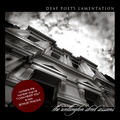
DEAF POET'S LAMENTATION by hotpastaComment: One of my top 2 picks from the challenge. Great picture and b/w tones, and a good job using it to create a very realistic looking album. 10 |
| Photographer found comment helpful. |
| 05/20/2007 02:16:31 PM |
|
| Photographer found comment helpful. |
| 05/20/2007 02:15:36 PM |
Dfunk'd: Postmillenial Landscapeby noranekoComment: One of my favorites from the challenge. Great picture to start with, good title to fit the image and the album, and looks like a real album cover. My only quibble is the shape is a little too rectangular for an album cover, so I dinged you a point for that. 9 |
| Photographer found comment helpful. |
Home -
Challenges -
Community -
League -
Photos -
Cameras -
Lenses -
Learn -
Help -
Terms of Use -
Privacy -
Top ^
DPChallenge, and website content and design, Copyright © 2001-2026 Challenging Technologies, LLC.
All digital photo copyrights belong to the photographers and may not be used without permission.
Current Server Time: 06/23/2026 02:59:30 AM EDT.