| Image |
Comment |
| 04/20/2006 08:34:09 PM |
Old Kicksby fauxphenomenaComment: Good topic idea but lacking a bit in the execution. A different background and moving the item in the top righthand corner out of the way would help this to look less like an accidental shot of the first thin you saw. Looks slightly out of focus as well. |
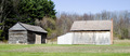
| 04/20/2006 08:31:59 PM |
Barn at Hale Farmby STEINRComment: The one on the left especially looks old. The lighting here is rather harsh - a later time in the day might have helped you out some. It's a difficult range here and the area in the tree on the left seems well exposed but the light on the barn on the right is somewhat blown. |
 Photographer found comment helpful. Photographer found comment helpful. |
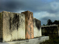
| 04/20/2006 08:29:31 PM |
Two Old Friendsby aberrationComment: Overall lighting here seems rather harsh and the stone on the front corner is rather distracting. |
| Photographer found comment helpful. |
| 04/20/2006 08:28:30 PM |
Old Fenceby Duke22Comment: I love the detail of simple things. Nice DOF and coloring. Could maybe use a *touch* more contrast. |
| Photographer found comment helpful. |
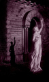
| 04/20/2006 08:23:49 PM |
Waiting Foreverby NeuferlandComment: I love the coloring on this and the textures of the brick and the flowing statue. I am slightly bothered by the fact that she is looking out of the frame, rather than into it. |
| Photographer found comment helpful. |
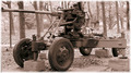
| 04/20/2006 08:22:14 PM |
War Antiques.....by mercolinoComment: Old indeed. Picture could have used a bit of a wider crop - the way it butts against the left side and is maybe even cut off a bit on the top makes it feel cramped. Sepia toning is a good idea but this seems a tad on the pinky side. |
| Photographer found comment helpful. |
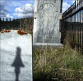
| 04/20/2006 08:20:38 PM |
Good Ol' Dooleyby Perfecti0nComment: Hang down your head, Tom Dooley?
I like the colors in this and the sky is impressive. The line of the headstone leads your eye into a bit of a dead end though, ending at the next headstone. Perhaps a more straight on shot would help this? |
| Photographer found comment helpful. |
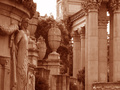
| 04/20/2006 08:18:17 PM |
Palace of Fine Artsby floydroweComment: I wonder if a black and white might have done this subject more justice? In any case, the cast is a bit on the reddish side for a sepia. |
| Photographer found comment helpful. |
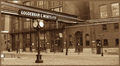
| 04/20/2006 08:17:23 PM |
The Distillery Historic District circa 2006by Rae-AnnComment: Nice post-processing, that and the clock make it look like it definitely could have been take quite awhile ago. Without knowing what's down the street, it's hard to say, but perhaps a view looking more down the street would help separate the detail a bit? |
| Photographer found comment helpful. |
| 04/17/2006 10:34:37 AM |
mi amor, mi queridoby ursulaComment: Tu querido aparece un poco triste, no? Lovely lighting and colors and good job with the glasses. |
| Photographer found comment helpful. |
Home -
Challenges -
Community -
League -
Photos -
Cameras -
Lenses -
Learn -
Help -
Terms of Use -
Privacy -
Top ^
DPChallenge, and website content and design, Copyright © 2001-2026 Challenging Technologies, LLC.
All digital photo copyrights belong to the photographers and may not be used without permission.
Current Server Time: 07/18/2026 10:39:11 AM EDT.