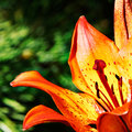
DPChallenge: A Digital Photography Contest You are not logged in. (log in or register
 
Browse Settings
Currently viewing:
Registered UserPGerst

Show comments:

Per page:

Order:

Comments:


Comments Made by PGerst
Pages:   ... ... [107]
Showing 381 - 390 of ~1061
Image Comment
Symphony of colors
07/23/2009 11:03:56 PM
Symphony of colors
by pall

Comment:
** Hello from the Critique Club **

First, very nice shot.

Composition
The use of complementary colors is a very prominent aspect of the composition of this photograph: blue and orange, violet and green. The placement of the center of the flower on the lower right 1/3 point adds proportionality to the photo. The very shallow DOF isolates the flower center well. The only issue with the DOF is that the leftmost petal falls right in the middle of the DOF plane making it seem slightly out of focus, even though this is due to DOF. With the angle and lens it is understandable how difficult of a shot this was. I also do like the tricolor background: green to blue to violet as this gives a sense of movement and progression. This photo is very calming, and attribute obtained from the colors used.

Technical
Focus is sharp, which is one reason why this scored so high. Sharpness in floral macro shots is the most important technical objective. I noticed that you shot this on a bright sunny day. That was probably the most important aspect for lighting as flowers tend to look more vibrant in sunlight than artificial. With that said, I'm wondering if a little off camera fill light would have been helpful for the center of the flower. Finally, the DOF suggestions above would have been minimized by using a different angle, slightly higher and aimed down; I don't think the composition strength would have been diminished.

Again, very nice shot, certainly one worthy of its score and position.
Photographer found comment helpful.
Fire Lily
07/23/2009 08:26:16 PM
Fire Lily
by indridistefans

Comment:
** Hello from the Critique Club **

My comments are broken down into technical and composition sections.

Composition
First, I like the way you concentrated on complementary colors. The bright orange/yellow is complemented well with the green background. This provides a bold, excited photograph, as intended by your subject and title "Fire Lily". You also have the flower along 1/3 lines which offers a pleasing proportion. The flower extends from the upper right to the lower left leaving the stamens along the right third. However, the angle from where you are shooting directs the opening of the flower in a parallel plane to the background, this tends to flatten the image.

If the flower was angled so that the stamens was pointed more toward the viewer it would add an additional dimensional plane, as well as expose more of the center of the flower.

You did a good job of isolating the flower from the background although a little more blur would help separate the flower even more.

Technical
The main problem is that any flower shot, especially ones with macros need to be sharp, razor sharp. The lens you were using was a 70 - 200 mm lens so I'm surprised you used macro tubes. Personally, I have not seen very good macro tubes, teleconverters, etc and I have always experienced image degradation from them.

When shooting, did you shoot this free hand? The best flower shots are performed on a tripod or monopod. If it is windy, a monopod may be better since you can move with more freedom than with a tripod.

At f/11, there should be enough DOF to get a sharp image. I have quite a few questions, so feel free to answer and I can comment more. How far were you from the subject? How much of the flower took up the viewfinder? How much did you crop?

If you have any questions or would like to discuss further, please feel free to send me a PM.

Photographer found comment helpful.
Vines
07/19/2009 08:08:05 AM
Vines
by Melethia

Comment:
I definitely like this; the textures are more prominent which really helps to add a lot of feeling to this photo.
Photographer found comment helpful.
Week 12
07/19/2009 08:06:32 AM
Week 12
by Ken

Comment:
Good contrast enhancement.
Photographer found comment helpful.
Wiesbaden square
07/19/2009 08:03:06 AM
Wiesbaden square
by Melethia

Comment:
Very nice accentuation!
Photographer found comment helpful.
Dandy
07/19/2009 08:02:36 AM
Dandy
by Melethia

Comment:
While the color version was very nice, the conversion here really brings out the texture. I love it.
Photographer found comment helpful.
Howdy!
07/19/2009 08:00:59 AM
Howdy!
by Yo_Spiff

Comment:
Definately a good edit. The conversion really helps to isolate the subject whereas in the original, she blended in.
Photographer found comment helpful.
Autoscopy
07/06/2009 08:49:32 AM
Autoscopy3rd Place
by Ecce_Signum

Comment:
This is STILL freaking me out, now I have to see it on the front page....congrats on the ribbon. It was one of my top 3. Can't wait to hear the technique.
Photographer found comment helpful.
Little Billy
07/06/2009 08:45:06 AM
Little Billy
by kandykarml

Comment:
I voted. I can't believe this got 42nd. This was my top, followed by the ribbons.
Photographer found comment helpful.
Bad Dream
07/05/2009 10:41:23 PM
Bad Dream
by esdarby

Comment:
The Mothman Prophecies?? :)
Pages:   ... ... [107]
Showing 381 - 390 of ~1061


Home - Challenges - Community - League - Photos - Cameras - Lenses - Learn - Help - Terms of Use - Privacy - Top ^
DPChallenge, and website content and design, Copyright © 2001-2025 Challenging Technologies, LLC.
All digital photo copyrights belong to the photographers and may not be used without permission.
Current Server Time: 09/27/2025 04:08:36 AM EDT.