|
|
|
Showing 361 - 370 of ~1061 |
| Image |
Comment |
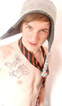
| 09/09/2009 12:09:14 AM | I'm Dead Prettyby charlcharl52117Comment: Very interesting teenage (high school) perspective. I'm sure there are those that will be dressed like that. Very nice shot. |
| 09/05/2009 09:15:19 PM | |  Photographer found comment helpful. Photographer found comment helpful. |
| 09/04/2009 11:41:41 PM | |
| 09/04/2009 11:38:54 PM | | | Photographer found comment helpful. |
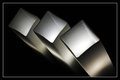
| 09/01/2009 10:49:39 PM | Pillars of Light by CheerzComment: ** Hello from the Critique Club **
What a fantastic shot! Congratulations on your ribbon!
Composition
This composition fits well. The black space around the pillars really help to isolate and draw the focus to the light source. What a fantastic job you did capturing the reflection as this allowed you to get a vantage point that you would not normally be able to get. This is certainly a prime example of how the best angle for a photo can't be seen by standing up! The group of 3 lights was a good choice as we normally relate to objects in threes. The texture of the lamps really help to accentuate the light itself. Finally, what a fitting object for the challenge!
Technical
The exposure on this photograph is perfect. You did an excellent job of balancing the tonal range! It is because of the balance that the texture was brought out. Nice job. Excellent depth of field as well. | | Photographer found comment helpful. |
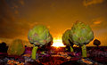
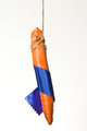
| 08/24/2009 09:24:38 PM | The Carrotby CitadelComment: ** Hello from the Critique Club **
Very cute! Dangling a carrot...a ribbon....very clever!
Composition
In a challenge such as this, composition is everything. You were quite clever in the suggestion that a blue ribbon is simply like dangling a carrot in front of you. The problem here is that the carrot is too much of the focal point, not the ribbon. Don't get confused by a major element though. In this case, the carrot is more interesting than the ribbon. To the average user, this is a photo of a carrot with a ribbon partially around it.
If you look at Time for a ribbon, the ribbon is a minor element, but a focal point of the photo. The eye is drawn to the aperture shaped ribbons. In originality, the ribbon is a minor element, but the surrounding bring the eye to the focal point, the ribbon.
Technical
Technically, this photo is well shot. It is clear, focus is on. Lighting is reasonably balanced, but seems a little bright on the top. One problem is that this appears to have been isolated from the background, digitally as there is a lack of depth and shadow around the edges of the carrot. This can be overcome by using two light sources, one to saturate the backdrop, the other to light the carrot.
After looking at your portfolio, you seem more comfortable with working with natural light, as you have some fantastic shots in there!
| | Photographer found comment helpful. |
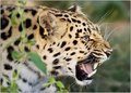
| 08/23/2009 10:36:33 PM | Def Leppardby bobonacusComment: ** Hello from the Critique Club **
Fantastic capture, certainly one deserving of its rank.
Composition
The leopard is isolated well from the surroundings, which helps to focus the eye to the subject, distinctly. What more, is that there is a subtle foreground element, the foliage, which helps to add depth and environment to the cub. I think some may see that as a distraction, especially if the image is examined quickly. But after studying the photo, it is a key element in this capture. I like the direction the cub is pointing, from left to right because it is in line with how the eye scans a photo.
Technical
At f/2.8 and 100mm you don't have too much DOF to work with. Very nice job, especially for a non IS lens! The focus is sharp and the lighting is right on, no doubt brought on by the time of day.
Again, an excellent shot! | | Photographer found comment helpful. |
| 08/22/2009 08:55:04 PM | | | Photographer found comment helpful. |
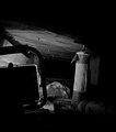
| 08/19/2009 09:49:01 PM | Private tunnelby snafflesComment: ** Hello from the Critique Club **
Of all the photos I have critiqued or commented on, I find my opinion of your photo to be far different than your score and different that others have commented on. In short, I really like this one and I think it fits the challenge description right on.
Composition
The challenge is tunnels and caves. The composition of this makes me feel cramped, trapped, looking for a way out. In other words, your photo has what I have in mind for caves. Certainly, your composition is different than all the others, but that is why I like it. First, the negative dark space and limited light provides the atmosphere I mentioned. The light, pipe, and rock, suggest a crawlspace, a personal cave, as you suggest. The photo is slightly tilted, which provides an added feel that you're trapped, pushing to get out. Very well done.
Technical
Exposure, focus, DOF, is right on. This is strictly a compositional photo. The technical aspects are minor and are secondary to the strong composition.
I'm sorry to see this scored so low. I think it is underrated. I'd be interested in seeing a discussion on this.
| | Photographer found comment helpful. |
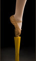
| 08/16/2009 09:21:20 PM | There you areby depugheComment: ** Hello from the Critique Club**
Composition
This photo has a very interesting perspective which definitely draws attention to it. One important element of composition is context. What is the context of the subject? If you look at the top ten photos, either the shoe was taken out of context, or specifically placed within a fitting context. For example, the 8th and 10th place (Baby's first walking shoes, and Chucks) are focused on the footwear itself, out of the environmental context. The 3rd place photo (Camouflage) puts the shoe into an environmental context that matches the shoe itself.
Your photo has a nice angle on the shoe, but the context becomes confusing and leads the viewer to ask questions such "what is the wire for", "is the green grass or a court of some type"?
You stated that you wanted the shoe to stand out from the background, so, remove the background, or make it simpler. The more complex a background is, the less you will be able to concentrate on the subject.
Technical
The focus is on, the lighting is nice a soft, two very important qualities. You mentioned you used the "remove color cast tool". Unfortunately, this tool didn't remove the color cast enough. Try using unsharp mask with a high radius. In photoshop, I use (24 7 0) as the colorcast removal options, and adjust accordingly. There are MANY ways to remove color cast and the forums are full of suggestions.
|
|
Showing 361 - 370 of ~1061 |
Home -
Challenges -
Community -
League -
Photos -
Cameras -
Lenses -
Learn -
Help -
Terms of Use -
Privacy -
Top ^
DPChallenge, and website content and design, Copyright © 2001-2026 Challenging Technologies, LLC.
All digital photo copyrights belong to the photographers and may not be used without permission.
Current Server Time: 07/22/2026 10:43:55 AM EDT.
|