| Image |
Comment |
| 08/17/2003 08:46:57 AM |
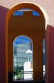
Inside Outby stuartComment: Because of the sunlight, I don't get a feeling of being inside anything. The lighting gives away that you were standing outside when you took this and looking in and then back out through the other window. The only problem is that you can't really see much out the other side. I like the pattern and shape you've chosen to photograph here. I just wish there was something more interesting on the other side. |
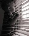
| 08/17/2003 08:45:45 AM |
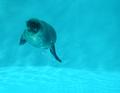
wondering about the outside world...by timmiComment: Good use of negative space, too. I like the bubbles around him and the angle you took it at. I wish there was something else in the shot to provide context, but this is good work. |
 Photographer found comment helpful. Photographer found comment helpful. |
| 08/17/2003 08:44:15 AM |
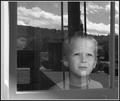
In My Little Boy's Eyes.....by christyrackComment: This is the kind of picture I was expecting for this challenge. With the exception of the line running straight through his face top to bottom, this is a great picture. 8 |
| Photographer found comment helpful. |
| 08/17/2003 08:43:38 AM |
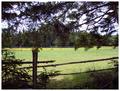
Matty's Fieldby orussellComment: Definitely gives the impression of looking out at something. I'm not sure the view is all that interesting, but it's a good picture. |
| Photographer found comment helpful. |
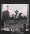
| 08/17/2003 08:40:48 AM |
view from kitchen windowby camelotnorthComment: Interesting use of desat, but I don't think it works here. There are too many artifacts of the desat along the wall and plant and sky - it looks like a hurried editing job instead of a smart color choice. This image has retained some of the overall redness, lessensing the effect of your edits. As far as the composition - it's very busy on the windowsill and the flowered thing and red birdfeeder(?) detract from the view...I'm not sure what I'm supposed to be admiring. |
| Photographer found comment helpful. |
| 08/17/2003 08:39:07 AM |
Through The Beer Monocleby ImagineerComment: I wish I could see more detail near the center and less around the edges - the 'main' subject of this picture is the bottle on the leflt side, I think. If this was meant to be abstract, you aren't close enough to the center. If its meant to have detail, there's not enough, especially top right. |
| Photographer found comment helpful. |
| 08/17/2003 08:37:56 AM |
Watching For Daddyby karmatComment: I would have cropped above the leg completely and taken quarter to half of the window out of the shot. I think it would present a much stronger composition that way. Also, the quality of the overall shot isn't bad, but there's too much grain. |
| Photographer found comment helpful. |
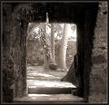
| 08/17/2003 08:36:56 AM |
Follow Meby La-LunaComment: It feels like we're on one side of something, looking to the other side. It doesn't feel like we're inside something looking out.
That said, it's an overall good picture. I like the square framing, though I wish there was more at the bottom. Nice duotone. |
| Photographer found comment helpful. |
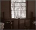
| 08/17/2003 08:36:01 AM |
Recitalby sherComment: Without the title and challenge, this is a good photo on its own, though the window is a bit too bright. The tones are overall very nicely done and the crop is good. I don't like the bed in the shot, as it takes away from the "recital." |
| Photographer found comment helpful. |
| 08/14/2003 12:15:05 AM |
|
Home -
Challenges -
Community -
League -
Photos -
Cameras -
Lenses -
Learn -
Help -
Terms of Use -
Privacy -
Top ^
DPChallenge, and website content and design, Copyright © 2001-2026 Challenging Technologies, LLC.
All digital photo copyrights belong to the photographers and may not be used without permission.
Current Server Time: 06/12/2026 04:49:33 PM EDT.