| Image |
Comment |
| 08/17/2003 09:08:28 AM |
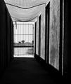
Prisonby Chilly0999Comment: Interesting view of 'prison' if that's what this is. The ceiling/roofing isn't exactly solid looking and the dark image would probably be better if your darks were even darker. I think more contrast would help set the mood. |
 Photographer found comment helpful. Photographer found comment helpful. |
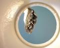
| 08/17/2003 09:07:18 AM |
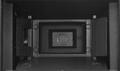
Film Plane Flim-Flamby GeneralEComment: Maybe because it's film, but I don't even know what the heck I'm looking at, let alone whether it's inside looking out. I'm just going to vote on the quality of the picture and let you decide with your other comments what is going on in this shot. |
| 08/17/2003 09:05:59 AM |
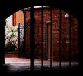
Old City Center Breezewayby shareinncComment: Very dark picture. May have looked better in b/w or a duotone because of the mood here. I like the spark of color on the left, but wish it was just a little more central to the composition. 6 |
| 08/17/2003 09:05:20 AM |
Inside looking out!by RobroComment: The right side is way over exposed and has lost all detail. Try focusing there or somewhere in the black railing to get a better exposure. Also - there's no subject of interest in the photo. It's not nice to look at it. |
| 08/17/2003 08:54:57 AM |
Queen Victoria's Gardenby marboComment: The inside-looking-out is met without the top and bottom framing devices. I think the blue/white awning takes away from a beautiful subject and the grey at the bottom just wastes space you could have shown me more of this place. It's clear you're inside looking out either way. Anyways, I like the subject matter, the shapes are nice - I think if you photographed it with better OR worse shadows (halfway down the center, eliminate, etc) would have been better. Good job tho! |
| Photographer found comment helpful. |
| 08/17/2003 08:53:23 AM |
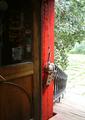
Out of Paint by barahooComment: This is one of the better takes on this challenge. I like the texture of the paint can on the left and the brush itself. I hope you didn't get paint on your cam. :) Nice blue sky is ok, but looking up at a half-painted anything may have been better. 7 |
| Photographer found comment helpful. |
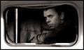
| 08/17/2003 08:52:15 AM |
Looking backby heidaComment: Excellent overall image. I think my few nits are the exposure along the bottom of the frame is way too bright and you should have used a more shallow DoF to hrow the zipper llooking thing and pole out of focus as they detract from the great expression and pose. 8 |
| Photographer found comment helpful. |
| 08/17/2003 08:50:22 AM |
The Refridgerator Police are Watching!!!by GraciousComment: I tried my hand at this same pic several times. Your milk is overexposed, the subject doesn't look all that happy to be in the fridge, and the garbage can in the background is a touch out of place. A hard shot to get right. |
| Photographer found comment helpful. |
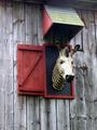
| 08/17/2003 08:49:01 AM |
Pensiveby amsmythComment: Quite an interesting object to photograph. Meets the challenge well. Not fond of the yellowy/red color the zebra has going on or the overexposed snout - but interesting subject matter nonetheless. |
| Photographer found comment helpful. |
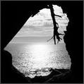
| 08/17/2003 08:47:29 AM |
Beyond The Grottoby Faye PekasComment: If the reflection wasn't overexposed, this would be a 9 or 10. I like the dark silhouettes, but should have exposed the water correctly. 7 |
| Photographer found comment helpful. |
Home -
Challenges -
Community -
League -
Photos -
Cameras -
Lenses -
Learn -
Help -
Terms of Use -
Privacy -
Top ^
DPChallenge, and website content and design, Copyright © 2001-2026 Challenging Technologies, LLC.
All digital photo copyrights belong to the photographers and may not be used without permission.
Current Server Time: 06/12/2026 08:47:09 AM EDT.