| Image |
Comment |
| 04/23/2003 12:38:24 PM |
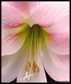
Floraby nathaliedooComment: Gorgeous. What is the bg? Wonderful shot - little soft on the left. 10 |
 Photographer found comment helpful. Photographer found comment helpful. |
| 04/23/2003 12:46:18 AM |
|
| Photographer found comment helpful. |
| 04/22/2003 01:16:19 AM |
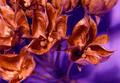
Forked Tongueby sherComment: This is an exceptional picture. I love the details and the composition. The lighting couldn't be better. Great title, too, but I don't know if the 'tongue' catches my eye as much as the center on outward. Stunning 10. |
| Photographer found comment helpful. |
| 04/21/2003 12:05:01 AM |
|
| Photographer found comment helpful. |
| 04/18/2003 11:31:31 AM |
|
| Photographer found comment helpful. |
| 04/17/2003 09:32:32 PM |
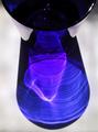
Cobalt Ripplesby magnusComment: Greetings fromt the Critique Club
Hi again, magnus! :)
Composition
I love the reflection - I see it as the majority of the shot, with the actual glass less a part of it. It is the reflection that's more interesting, but I do like the cup. I wish I could see it with more, just to see if I liked that any better.
Color
I absolutely LOVE the purple that's inside the blue here. The whole color is beautiful. The colors are what attract me to this photo and why I like it.
Focus
I like the focus on this shot and I see you closed the aperature right up to 8, so I'm not sure what else you could have done to increase the sharpness - overall it's pleasant to look at, so I wouldn't change anything here.
Lighting
It's difficult to tell what the light is and where it's coming from. I assume that the light made that reflection and since that's the most interesting part of the shot to me, nice lighting! :)
Subject matter
This is a neutral subject, somewhat of a 'stock' photo. I like that kind of thing. I think that this shot is a show-off shot, one you should be more than proud of.
Overall
Overall, I'm surprised this shot scored lower than I thought it deserved. I gave it a 7 and I thought it was one of the better color shots in the challenge. Congrats on taking an underappreciated shot.
|
| Photographer found comment helpful. |
| 04/17/2003 09:22:28 PM |
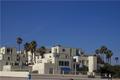
Baby's got blue skiesby darrenmeiselComment: Greetings fromt the Critique Club
Hi darren!
Composition
I like the blue on blue idea. You chose a great place to photograph. I would have stepped forward/zoomed so that the blue waste can was the leftmost thing in the shot and the rightmost awning was the most right thing in the shot. Compose it like that, with the blue sky above - seems to be a tighter shot, and since you would be closer, you'd have bigger awnings and thus more blue.
Color
I love the choice of blues - I'm glad you didn't choose the brightest colors available - this is a nicer choice and it definitely works with blue on blue.
Focus
Excellent focus and DOF for this shot.
Lighting
Because of the bright blue sky effect you were going for, the lighting is about exactly what it needed to be. Excellent capture here.
Subject matter
The awnings work as a taste of blue in this shot. This is an interesting looking building and the colors make it a pretty nice shot to look at.
Overall
I don't understand your final score except for the composition. I think people don't look hard enough at certain pics. I saw the blue, I like the blue...good shot. Good luck in the future!
|
| 04/17/2003 09:14:02 PM |
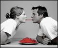
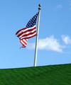
These colors don't run.by ladpupmoeComment: Greetings fromt the Critique Club
Hi ladpupmoe, nice to meet ya!
Composition
Two things and they were both already mentioned - I'd flip the image and straighten the pole. Also - what if you caught a bird sitting atop the building at the same time? Something to give the picture character? I'd have also waited for the cloud to move one way or other.
Color
Hey, I love your choice of colors. Go Red, White and Blue! As I mentioned, the cloud is a bit distracting and it makes the picture less sharply 'blue' in the sky.
Focus
Looks a tad grainy - perhaps from oversharpening or using sharpen instead of unsharp mask? I'd look into Neat Image if my cam produced this kind of grain on its own.
Lighting
The lighting on the underside of the flag is the best lighting here. I don't like the flat lighting...is this a place nearby that you could have gotten at sunset/sunrise? Maybe a different angle of light would make a slightly more appealing shot.
Subject matter
Perfect. Don't listen to the Canucks. :)
Overall
It's difficult to shoot a subject like this in light you can't control with wind you can't control and background elements you can't control. I think everything I'd do differently has been addressed above. Happy shooting.
|
| Photographer found comment helpful. |
| 04/17/2003 09:07:10 PM |
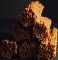
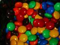
My candyby hilmarsigComment: Greetings fromt the Critique Club
Bet you didn't want to see me again!
Composition
I like the composition and idea for this shot. As I said in my original comment, I'd have moved the broken candy out of the picture and moved the focus slightly over to the right to eliminate that shadowing.
Color
There are a lot of colors here - ones we all know and love. I think they weren't vibrant enough, definitely could have used some post-shot adjustments. Good CHOICE of colors.
Focus
This shot seems out of focus to me. If you're going to get this close to the subject, it seems to work to try to capture as much detail as you can.
Lighting
I think this is a main issue with your final score. If your shot had more natural lighting, more lighting in general, I think it would have done well. It is all a bit too dark.
Overall
I viewed your other shots. There seem to be two kinds of shots you've submitted - most are really good and a few seem to need the technical help this one needs. I'd just work on learning as much as you can and applying that. And good luck in future challenges. :)
Mav
|
| 04/17/2003 09:00:28 PM |
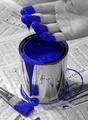
Rejuvenationby lbWhaplesComment: Greetings fromt the Critique Club
It figures I'd draw one of the top shots of last week as my second CC!
Composition
I love the things you did include - the newspaper IS black and white and it makes the photo look a lot more believable than if you'd had your hand over a flower garden full of b/w flowers. I would have liked to been able to see your whole hand, but that's minor.
Color
Amazing - I still have yet to make one of these fully desat except one color pictures. I LOVE the concept and it strikes me every time I see it. The color you chose was brilliant. It stands out very well.
Depth of field
I'm not sure how this would look with a slightly smaller DOF. Maybe we'd be able to less clearly see the paper, but I think you'd lose the clarity on the brush. I see the spots behind the can, though, and I almost wish that more was out of focus in this way.
Subject matter
You nailed the challenge perfectly. Color is the defining aspect of this shot. It's beautiful and the subject of paint for a color challenge is obviously appropriate.
Overall
I gave this shot a 9. I love it. It placed extremely well and you don't need me to tell you it's beautiful. Is there a print available, and if not, why not?
|
| Photographer found comment helpful. |
Home -
Challenges -
Community -
League -
Photos -
Cameras -
Lenses -
Learn -
Help -
Terms of Use -
Privacy -
Top ^
DPChallenge, and website content and design, Copyright © 2001-2026 Challenging Technologies, LLC.
All digital photo copyrights belong to the photographers and may not be used without permission.
Current Server Time: 06/19/2026 06:12:50 AM EDT.