| Image |
Comment |
| 11/24/2007 05:38:00 PM |
GP7L1426 (1).jpgby malinaComment: Nice shot with lovely lighting and wonderful background colours.
There are a few simple things here which (for me at least) could help the picture. One of these is the tree trunk that is behind your son - being light coloured it tends to catch the eye a little and lead it away from the main picture, and the other point is that the position of the children is a little unbalanced.
He has his arm around her - but she doesn't have her's around him. If she did, it would have brought her left shoulder around to face the camera a bit more. Also he has one thumb appearing on it's own, on her front, and the other hand (on her arm) looks more like he's grabbing her, which by this point of the photo shoot he may have been :- )
But an attractive shot, with attractive children, and a lovely setting. |
 Photographer found comment helpful. Photographer found comment helpful. |
| 11/23/2007 02:29:57 PM |
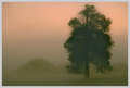
Gabeby timfythetooComment: Tim, nice natural light capture, and great faraway expression.
The placing of the tree is a bit of a challenge - on the one hand it gives a nicely coloured oof backdrop, but against that (for me) the dark trunk is just a little too close to the lads face and there is a white area to the left of the tree in line with his eye that is a bit too bright and draws the viewers eye away from his face. I wonder whether you could clone some of the leaves down and lose it ? Message edited by author 2007-11-23 15:09:46. |
| Photographer found comment helpful. |
| 11/23/2007 02:02:33 PM |
Cover Meby PixlmakerComment: "I'll post more of her once the contest is over."
Did you ever post any more shot's of Lauren ? |
| Photographer found comment helpful. |
| 11/23/2007 12:47:45 PM |
|
| Photographer found comment helpful. |
| 11/23/2007 12:17:45 PM |
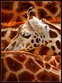
Camelopardby bubeltrubelComment: Nice shot - love the colours and textures, and the head rising out from the bodies just finishes it. |
| Photographer found comment helpful. |
| 11/21/2007 07:26:43 AM |
|
| Photographer found comment helpful. |
| 11/21/2007 07:23:38 AM |
|
| Photographer found comment helpful. |
| 11/20/2007 12:40:05 PM |
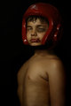
Boxer Entryby Bernard_MarxComment: Now this has the added tension and movement that was lacking from the previous one.
The chin strap is out of sight, he's moving and looking the part, much more satisfying all round.
Good shot. |
| Photographer found comment helpful. |
| 11/20/2007 12:37:45 PM |
Outtake Boxerby Bernard_MarxComment: If that's all make up it looks very good. In terms of the picture overall, I like the idea, but the whole image comes over as just a little too dark on my screen.
It might have been interesting to try and get him to do something with his hands - hold a trophy, or just have his gloves up in a defensive posture - to try and build more of a story around the image. At the moment he is just standing, but I think (for me at least) when people think of a Boxer, they think of movement, of purpose, of winners and losers (perhaps), and your lad doesn't visually seem to quite fit into any of these categories.
Is he battered because he lost ? or are they scars picked up on his way to victory ?
The only other small issue is that with the chin strap blending into the background it effectively seperates his head from his body :- )
All that said, he looks the part, the lightings good, and the make-ups great.
|
| Photographer found comment helpful. |
| 11/18/2007 01:34:01 PM |
tattoo_baby.jpgby trnqltyComment: Love the babies expression on this shot.
Interesting selective desat as well. |
| Photographer found comment helpful. |
Home -
Challenges -
Community -
League -
Photos -
Cameras -
Lenses -
Learn -
Help -
Terms of Use -
Privacy -
Top ^
DPChallenge, and website content and design, Copyright © 2001-2026 Challenging Technologies, LLC.
All digital photo copyrights belong to the photographers and may not be used without permission.
Current Server Time: 06/21/2026 07:46:04 PM EDT.