| Image |
Comment |
| 11/02/2007 02:53:29 PM |
Fire-wood-IV_dpc.jpgby NodeComment: This one appears soft in the edges as well. I do like the cracks in the center though and the roundness again. I think if the whole thing was as sharp as the upper left corner it would be awesome. |
 Photographer found comment helpful. Photographer found comment helpful. |
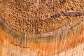
| 11/02/2007 02:50:45 PM |
Fire-wood-III_dpc.jpgby NodeComment: I'm on dialup so it is taking me a bit of time to pull up each photo, but so far this one has been my favorite as well. I love the fact that you can tell it is round and the different textures of the center versus the edge. This is really beautiful to me. I love the warm tones. |
| Photographer found comment helpful. |
| 11/02/2007 02:48:16 PM |
Fire-wood-II_dpc.jpgby NodeComment: Ahh, I see the first one was a crop of this one? I see now why it looked a little soft. This one does a little too, but I like this one better. Still I would love to see the whole thing sharp to make those textures pop. |
| Photographer found comment helpful. |
| 11/02/2007 02:46:01 PM |
Fire-wood-1_dpc.jpgby NodeComment: Awesome to see some more trees in this challenge! This seems a little oof especially in the upper left corner. I love the abstractness of this larger version, but I prefered the thumbnail because the softness when your zoomed in doesn't enhance the great texture. |
| Photographer found comment helpful. |
| 11/02/2007 02:29:51 PM |
|
| Photographer found comment helpful. |
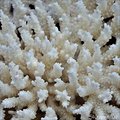
| 11/02/2007 02:27:11 PM |
White Coral - Day 2by sherpetComment: Awesome texture Sherryl. I love the smoothness of the tips of the coral contrasting with the rough textures o the rest of it. Beautiful. |
| Photographer found comment helpful. |
| 11/01/2007 08:03:45 PM |
1_CwithT_9947.jpgby dsternerComment: Wow, way to use the technique to the benifit of the final image! Very nice! I love the contrast in cold/hot that I get from this....like comeing in to a warm fire after being outside in the cold all day! |
| Photographer found comment helpful. |
| 11/01/2007 07:58:36 PM |
Texture 1by agrimaceComment: Very interesting composition, I would have never thought of taking a picture of a traffic sign for textures, but it works so well and great textures. I love the contrasting tones, and lines. Th bright yellow and white is distracting on the bottom though and I wonder if it could be rotated in any way so that you could crop but still leave the great black lines in? Either way, great shot. |
| Photographer found comment helpful. |
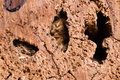
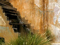
| 11/01/2007 07:54:40 PM |
Creaky Stairsby BAMartinComment: An amazing photo! I love all those wonderful textures on the wall contrasting with the smooth steps. I think it would have been a little "cleaner" and more pleasing without the grass in the foreground, but it is awesome nonetheless. Great start on the texture challenge, gonna be hard to beat that one! |
| Photographer found comment helpful. |
| 10/31/2007 09:14:48 AM |
|
| Photographer found comment helpful. |
Home -
Challenges -
Community -
League -
Photos -
Cameras -
Lenses -
Learn -
Help -
Terms of Use -
Privacy -
Top ^
DPChallenge, and website content and design, Copyright © 2001-2026 Challenging Technologies, LLC.
All digital photo copyrights belong to the photographers and may not be used without permission.
Current Server Time: 06/24/2026 09:59:12 AM EDT.